How To Make an Image Look Like a Sketch
Here is the only graphics tutorial I've ever written. In this tutorial, you will take an image from this
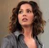
to this

There are many techniques that can make an image look like a drawing, but I like the authentic results this one produces. I use Paint Shop Pro 7, but maybe the tutorial can be adapted to Photo Shop.
Also, I wrote this tutorial for my website, and with the assumption that some who used it wouldn't be 100% familiar with thier PSP program. That's why there's so much detail.
Step One: Choose a picture. This technique doesn't work on every image, but you won't know until you try. I chose a pic of Charisma Carpenter from the Angel episode "You're Welcome". I got the original (I'm pretty sure) from The WB.com, and cropped it for this demo.

Step Two: Create a duplicate of the image. On your screen, there's a box called the Layer Pallete. Right click on the Background layer button, and a little menu will come up. Select "Duplicate" from that menu, and you'll get another layer called "Copy of Background." That's the layer you make all the changes to, so make sure it's active. (The button is dark blue with white writing.)
Step Three: Select Colors > Negative Image. This will make the image look like a film negative.
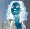
Step Four: On the Layer Pallete, you'll see a box next to each layer that reads "Normal", with a little arrow next to it. This is the Layer Blend Mode. For the Copy of Background layer, click on the arrow, and a menu will come up. Change the Layer Blend Mode from Normal to Dodge. This will make the image all but disappear. I outlined the image here so you can at least see where it is.
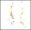
Step Five: Select Effect > Blur > Blur. This will make the image reappear, and it will look like a colored-pencil sketch.
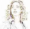
Sometimes, using Blur once will be enough. But, if the "sketch" looks too faint, or isn't as defined as you'd like, keep blurring it (you can use the Ctrl+Y repeat command) until you get the effect you want. My image was a little too light at first, so I blurred it 4 more times. See the difference?
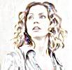
Step Six: Merge the two layers by selecting Layers > Merge > Merge All (Flatten). Now, you can pretty much end it there. You'll be left with a colored-pencil sketch (that will need a little work in some cases). But, if you want to go all the way, proceed to...
Step Seven: Select Color > Grey Scale. This will take the color out of the image and make it look more like a sketch.

Now, past this point, it's all optional. These are things you can use to refine your sketch, if you think it needs it.
Step Eight: The image still might not seem defined enough. In that case, select Colors > Adjust > Gamma Correction. The lower the setting, the darker and thicker the lines will be. Just don't overdo. For my image, I used 0.60.

Step Nine: To make the image look a little cleaner, select Effects > Noise > Salt and Pepper Filter. Make sure there's a check mark in the Include All Lower Specks box, but leave the Aggressive Action box blank. This operation will smooth out some of the specks and graininess that might be in your sketch. But don't go to far, or you might lose some of the definition. I set Speck Size (pixels) to 3, and Sensitivity to Specks to 2.

Step Ten: If something about your image looks a little blurry or out of focus, select Effects > Sharpen > Sharpen.
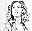
Just don't use it too much, or you might make the lines of the sketch look blurry or "scratchy".
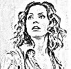
Step Eleven: If you feel your sketch could be smoothed out a little, select Effects > Noise > Edge Preserving Smooth.
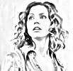
But, again, use it in moderation. Sometimes, a setting as low as 1 is all you need. Overuse this filter, and your sketch will get blurry

You can use other operations to further refine your sketch. (I might use the Retouch tool to smooth some things out here and there.) But, other than that, you're done.

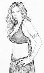
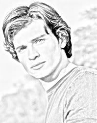
Here are some other sketches I've created using this technique. When you use this technique, some images will turn out better than others. Some will need a little work to be their best. Still, it's fun to see how an image will turn out. So, pick one of your favorite images, and give it a try.
I hope that was helpful...and coherent. I'd love to know how this technique works for you.