{Tutorial} Manga Colouring - Part I
So...finally a tutorial. People have been asking me for one for quite a while, hopefully this will be worth the wait.
Program: Adobe Photoshop CS
Difficulty: Intermediate - It uses combinations of blur and sharpening, and brushes with varying sharpness, opacity and blending mode. Requires certain amount of experience with Photoshop as I won't explain every single step in full details. It's not awfully complicated, but it does take quite a lot of patience and enthusiasm |D
From
to
Please be aware that this tutorial is image heavy. And loooooong in general.
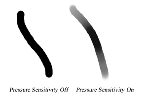
I will be using a drawing tablet with 512 pressure sensitivity for this tutorial (85% of the reason I prefer tablet over mouse is because it has pressure sensitivity), but it should be translatable to mouse users...it simply takes more time. I will try my best to show you how to achieve a similar effect with a mouse whenever possible.
I mostly self-taught myself colouring manga. This tutorial doesn't cover every secret I use, but rather, it gives you a general idea and some useful tips of how I usually colour. I am choosing a relatively simple image so it will be less tl;dr (aka boring) - this one is quite nice to colour since it's mostly screentone-free. I use an almost completely different technique to colour screentone heavy images like this one, and usually in those cases I will try to take advantage of the pre-filled screentones 'cause by the time I finish erasing them all I probably don't want to colour anymore orz (The types of images that I enjoy colouring least are those that are half screentoned and half screentone free, that way I will have to use a blend of both techniques and it's really annoying how they often conflict each other sdklfj) Lastly, I don't use the exact same techniques all the time; I choose the right style for the right image. So that means don't expect I'd use the same colours/shadings/touch-ups/whatever in another colouring - variation is gold ;'D
Image & Preparations

I am using this image of Anemone from Eureka Seven. As I have said before, this is probably one of the easiest type of manga images available to be coloured since it doesn't have awful lots of tiny parts, and is mostly free of screentone. I snagged the panel from OneManga so it doesn't have the highest quality, but it will do. I suggest you to spend around 20 minutes erasing the pixels with a white paint brush especially in areas with light colours, such as the skin, or it will look horrific once you add the colours in. Do a bit of leveling if you wish,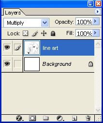
although it's not entirely necessary for this image. And I realize since there are lots of people doing this, here's an important note: Do NOT sharpen the line art yet. I prefer to sharpen only at the very end of the colouring, that way I can control the strength of the sharpening easier.
I spent 5 seconds using the pen tool to complete the top of her head, but you don't have to do that. And because I don't want this tutorial to exceed 10000 words, I'm shrinking down the image a bit. xDD
Set your background layer to solid white, and put your line art directly above the background in 100% multiply as shown on the right. Make sure your colour mode is set to RGB.
Skin

Create a new layer directly below the line art at 100% normal, choose a pale orange-ish colour and paint the base for her skin (or lasso/polygonal tool with paint bucket if you prefer). I usually use a light colour for the base, and then shade with darker colours afterwards (and maybe a little highlights if required). I'm naming this layer skin base. It doesn't matter if the base colour isn't perfect, as long as you are not colouring her skin with purple and green you can always fix the colours later with adjustment layers. xD
Notice that I'm not giving you any colour values in this tutorial as I believe the combination of colours is the signature of your style, and you really should discover what colours to use through experimenting. Some people build up their own standard set of swatches, but since I have coloured manga characters' skins a million times I can easily pick out the right colour.
Make sure your skin doesn't leak into the background, but it can goes into the hair as the hair layer will be above her skin and eventually cover the leak. Your base must totally cover up every part of the skin.
This is totally optional, but some people like to fill in a totally irrelevant colour (ie. if your colouring is mostly white and red, use blue/green like I did) in a separate layer so they can see and erase their colouring more easily. Hide this layer when you don't need it.
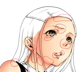
Oh, I almost forgot. Choose a light source to guide your shading later. Choose an angle which would look natural for your image, and one that you are comfortable to shade with. In this case, my light source comes from the top right corner of the image.

Create a new layer above the skin base layer, call it skin 1 and set it to 100% normal (From now on if I don't mention the layer properties, that means it's on 100% normal). This is your first layer of shading. You don't want your shading to leak out of the skin, so here's a useful trick: Look at the layer palette, and while you are on your skin 1 layer, hold down Ctrl and click on the square thumbnail of skin base. This way you have selected the area of the skin, and you can only shade inside the selected area. Magic! 8D
Choose and slightly darker colour than your base and use a large, soft brush, to shade the skin. Remember that your shading shouldn't conflict with your light source! I'm no expert on light sourcing so I can't really explain to you where to shade (and it hugely varies with different images), but you can look at other people's colouring and you will get the general idea. I hate to say this, but practice makes perfect...or at least less imperfect lol.
For mouse users: Because you don't have pressure sensitivity, set your brush opacity (notice it's the opacity of the brush, not the layer!) to something around 30%-60% and gradually build up on your colours. It will look way better than a plain 100%, trust me. Don't freak out if the shadings don't appear immediately, because remember, you have to gradually build up your colours so it will take several clicks.

Create another new layer above the previous layer, name it skin 2 and this will be your second layer of shading. Choose a darker colour (notice as my skin shades get darker, I tend to use a pinker colour), set your brush opacity approxiamtely to 75% so you can gradually build up on the colours. If your tablet has really good pressure sensitivity (I know mine doesn't orz), ignore the brush opacity as you should be able to control the strength of the brush well enough. I prefer to use a smaller, sharper brush for darker shades. Use the Smudge tool to smudge parts of your shading to make the colours more even, such as on this part of her arm.
Mouse users, again, set your brush opacity from somewhere around 25%-60%. And be patient as the colour builds up |DD

New layer, skin 3, and continue with the darker shades. This time, however, instead of pure shading we are also sharpening things.
I notice a common "mistake" that lots of people make in their colouring: when they sharpen/blur something, they sharpen the whole layer. While this method works sometimes, other times I find it does the colouring more harm than good. Basically, rarely does the entire shading layer needs to be sharpened - it's only certain parts of it.
Use your lasso/polygonal tool, set the feather between 3-50 (depends on how big your image and selection area is - in this image, I mostly used 5-14 px) so the distinction between sharpened edges and the neighbouring unsharpened ones isn't too obvious, and select the parts where you want to sharpen. Now go filter --> sharpen. You might need to do this several times to achieve the best results, and if pixels start to appear, carefully smudge them out without smudging the sharpened edges.
I recently find sharpening makes the colouring much more dynamic; the contrast between smooth shading and sharpened edges is appealing to look at.
Blurring is basically the same idea. If you want to make the colours blend better or spread them out and the smudge tool is getting ridiculously ineffective (I always feel that Photoshop's smudge tool is so weak even when I set it on 100%...), select the area with a feathered Lasso tool and Gaussian Blur. Try experimenting with Smart Blur too, sometimes it gives a more interesting effect than Gaussian Blur. The general idea is, you sharpen edges and blur the inside to make it more smooth.
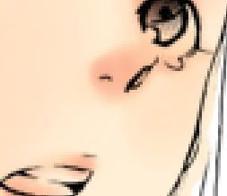

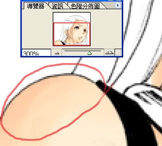
Sharpening: Before vs. After at 300% (notice the nose). Here are the parts that I sharpened in this step.

Add another layer (I swear this is the last one for the skin rofl), skin 4, but this time use a purple-ish colour to shade. The wide range shades of colours give the colouring more depth. You might need to set this layer on Normal, Multiply or Hard Light and play with the opacity to achieve the best results, it really depends on your style and the purple you used. Selective blur/sharpen if you need to.
I don't recommend it, but if you are colouring a huge image and your .psd file is getting ridiculously huge that your computer starts to freeze,
merge all the skin layers. It's difficult to edit them afterwards once you merge them, so make sure you are only doing this if you really have to!
Alright. Here's the last one on the skin, I swear orz. New layer, name it skin ref (ref stands for reflection). Use a fine, sharp brush on high opacity with a light colour (or white, although sometimes white looks too boring) and add the highlights on the skin. I also coloured her tears in this same layer. I usually sharpen this layer a few times. Depends on the colour you use, play with the blending mode (usually normal, screen, soft light, overlay or hard light) and opacity (60%-100%) for best results.
End of Part I. Comment is disabled in this post, please proceed to Part II to comment!
( Part II )
Program: Adobe Photoshop CS
Difficulty: Intermediate - It uses combinations of blur and sharpening, and brushes with varying sharpness, opacity and blending mode. Requires certain amount of experience with Photoshop as I won't explain every single step in full details. It's not awfully complicated, but it does take quite a lot of patience and enthusiasm |D
From
to
Please be aware that this tutorial is image heavy. And loooooong in general.
I will be using a drawing tablet with 512 pressure sensitivity for this tutorial (85% of the reason I prefer tablet over mouse is because it has pressure sensitivity), but it should be translatable to mouse users...it simply takes more time. I will try my best to show you how to achieve a similar effect with a mouse whenever possible.
I mostly self-taught myself colouring manga. This tutorial doesn't cover every secret I use, but rather, it gives you a general idea and some useful tips of how I usually colour. I am choosing a relatively simple image so it will be less tl;dr (aka boring) - this one is quite nice to colour since it's mostly screentone-free. I use an almost completely different technique to colour screentone heavy images like this one, and usually in those cases I will try to take advantage of the pre-filled screentones 'cause by the time I finish erasing them all I probably don't want to colour anymore orz (The types of images that I enjoy colouring least are those that are half screentoned and half screentone free, that way I will have to use a blend of both techniques and it's really annoying how they often conflict each other sdklfj) Lastly, I don't use the exact same techniques all the time; I choose the right style for the right image. So that means don't expect I'd use the same colours/shadings/touch-ups/whatever in another colouring - variation is gold ;'D
Image & Preparations
I am using this image of Anemone from Eureka Seven. As I have said before, this is probably one of the easiest type of manga images available to be coloured since it doesn't have awful lots of tiny parts, and is mostly free of screentone. I snagged the panel from OneManga so it doesn't have the highest quality, but it will do. I suggest you to spend around 20 minutes erasing the pixels with a white paint brush especially in areas with light colours, such as the skin, or it will look horrific once you add the colours in. Do a bit of leveling if you wish,
although it's not entirely necessary for this image. And I realize since there are lots of people doing this, here's an important note: Do NOT sharpen the line art yet. I prefer to sharpen only at the very end of the colouring, that way I can control the strength of the sharpening easier.
I spent 5 seconds using the pen tool to complete the top of her head, but you don't have to do that. And because I don't want this tutorial to exceed 10000 words, I'm shrinking down the image a bit. xDD
Set your background layer to solid white, and put your line art directly above the background in 100% multiply as shown on the right. Make sure your colour mode is set to RGB.
Skin
Create a new layer directly below the line art at 100% normal, choose a pale orange-ish colour and paint the base for her skin (or lasso/polygonal tool with paint bucket if you prefer). I usually use a light colour for the base, and then shade with darker colours afterwards (and maybe a little highlights if required). I'm naming this layer skin base. It doesn't matter if the base colour isn't perfect, as long as you are not colouring her skin with purple and green you can always fix the colours later with adjustment layers. xD
Notice that I'm not giving you any colour values in this tutorial as I believe the combination of colours is the signature of your style, and you really should discover what colours to use through experimenting. Some people build up their own standard set of swatches, but since I have coloured manga characters' skins a million times I can easily pick out the right colour.
Make sure your skin doesn't leak into the background, but it can goes into the hair as the hair layer will be above her skin and eventually cover the leak. Your base must totally cover up every part of the skin.
This is totally optional, but some people like to fill in a totally irrelevant colour (ie. if your colouring is mostly white and red, use blue/green like I did) in a separate layer so they can see and erase their colouring more easily. Hide this layer when you don't need it.
Oh, I almost forgot. Choose a light source to guide your shading later. Choose an angle which would look natural for your image, and one that you are comfortable to shade with. In this case, my light source comes from the top right corner of the image.
Create a new layer above the skin base layer, call it skin 1 and set it to 100% normal (From now on if I don't mention the layer properties, that means it's on 100% normal). This is your first layer of shading. You don't want your shading to leak out of the skin, so here's a useful trick: Look at the layer palette, and while you are on your skin 1 layer, hold down Ctrl and click on the square thumbnail of skin base. This way you have selected the area of the skin, and you can only shade inside the selected area. Magic! 8D
Choose and slightly darker colour than your base and use a large, soft brush, to shade the skin. Remember that your shading shouldn't conflict with your light source! I'm no expert on light sourcing so I can't really explain to you where to shade (and it hugely varies with different images), but you can look at other people's colouring and you will get the general idea. I hate to say this, but practice makes perfect...or at least less imperfect lol.
For mouse users: Because you don't have pressure sensitivity, set your brush opacity (notice it's the opacity of the brush, not the layer!) to something around 30%-60% and gradually build up on your colours. It will look way better than a plain 100%, trust me. Don't freak out if the shadings don't appear immediately, because remember, you have to gradually build up your colours so it will take several clicks.
Create another new layer above the previous layer, name it skin 2 and this will be your second layer of shading. Choose a darker colour (notice as my skin shades get darker, I tend to use a pinker colour), set your brush opacity approxiamtely to 75% so you can gradually build up on the colours. If your tablet has really good pressure sensitivity (I know mine doesn't orz), ignore the brush opacity as you should be able to control the strength of the brush well enough. I prefer to use a smaller, sharper brush for darker shades. Use the Smudge tool to smudge parts of your shading to make the colours more even, such as on this part of her arm.
Mouse users, again, set your brush opacity from somewhere around 25%-60%. And be patient as the colour builds up |DD
New layer, skin 3, and continue with the darker shades. This time, however, instead of pure shading we are also sharpening things.
I notice a common "mistake" that lots of people make in their colouring: when they sharpen/blur something, they sharpen the whole layer. While this method works sometimes, other times I find it does the colouring more harm than good. Basically, rarely does the entire shading layer needs to be sharpened - it's only certain parts of it.
Use your lasso/polygonal tool, set the feather between 3-50 (depends on how big your image and selection area is - in this image, I mostly used 5-14 px) so the distinction between sharpened edges and the neighbouring unsharpened ones isn't too obvious, and select the parts where you want to sharpen. Now go filter --> sharpen. You might need to do this several times to achieve the best results, and if pixels start to appear, carefully smudge them out without smudging the sharpened edges.
I recently find sharpening makes the colouring much more dynamic; the contrast between smooth shading and sharpened edges is appealing to look at.
Blurring is basically the same idea. If you want to make the colours blend better or spread them out and the smudge tool is getting ridiculously ineffective (I always feel that Photoshop's smudge tool is so weak even when I set it on 100%...), select the area with a feathered Lasso tool and Gaussian Blur. Try experimenting with Smart Blur too, sometimes it gives a more interesting effect than Gaussian Blur. The general idea is, you sharpen edges and blur the inside to make it more smooth.
Sharpening: Before vs. After at 300% (notice the nose). Here are the parts that I sharpened in this step.
Add another layer (I swear this is the last one for the skin rofl), skin 4, but this time use a purple-ish colour to shade. The wide range shades of colours give the colouring more depth. You might need to set this layer on Normal, Multiply or Hard Light and play with the opacity to achieve the best results, it really depends on your style and the purple you used. Selective blur/sharpen if you need to.
I don't recommend it, but if you are colouring a huge image and your .psd file is getting ridiculously huge that your computer starts to freeze,
merge all the skin layers. It's difficult to edit them afterwards once you merge them, so make sure you are only doing this if you really have to!
Alright. Here's the last one on the skin, I swear orz. New layer, name it skin ref (ref stands for reflection). Use a fine, sharp brush on high opacity with a light colour (or white, although sometimes white looks too boring) and add the highlights on the skin. I also coloured her tears in this same layer. I usually sharpen this layer a few times. Depends on the colour you use, play with the blending mode (usually normal, screen, soft light, overlay or hard light) and opacity (60%-100%) for best results.
End of Part I. Comment is disabled in this post, please proceed to Part II to comment!
( Part II )