Tutorial #2
My second tutorial for Photoshop CS2 (uses Selective Coloring)
Requested by
mscreations
Going from

to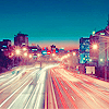
This icon is originally from this post.
This technique is similar to the one in tutorial #1, with some slight variations.
1. Prepare your base (crop, lighting, etc.)

2. Make a new layer and fill it with a yellow color (brighter yellow give it a greener look when its finished), I am going to use a pale yellow (#fef798) to give it a bluer tone once its finished. Set it to soft light at 100%.

3. Create a new adjustment layer --> Selective color. Use these settings (will vary according to your image!):
Reds: -100, +5, -10, +5
Yellows: -100, -100, -100, -100
Neutrals: +20, -5, +15, -20

4. Create a new adjustment layer -->Selective color. Use these settings (will vary according to your image!):
Reds: -5, +75, +20, +30
Yellows: -100, +35, +5, +35
Neutrals: +35, +25, -5, +15

5. Make a new layer and fill it with a dark blue (almost black). I used #030829, and set it to exclusion at 100%. This step isn't required, but it gives the colors a softer tone.

6. Create a new adjustment layer --> Selective color. These are the settings I used (I want to make my image bluer and give it a little magenta tone):
Reds: -100, +15, +5, 0
Yellows: -90, +5, +10, +30
Neutrals: +30, 0, -35, 0

You can stop here if you want, because the icon is basically done, or you can follow these optional steps:
*Add a Hue/Saturation layer, and set both the cyan and blue saturations to +25.

*Create a Selective color layer. These are the settings I used to give the icon a little brighter feel:
Reds: -100, 0, +25, 0
Yellows: 0, -40, -100, 0
Cyans: +35, 0, 0, 0
Blues: +57, 0, 0, 0
Whites: 0, 0, 0, -41
Sharpen the image and you're done!

I hope this was helpful, and I'd love to see your results :)
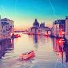
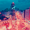
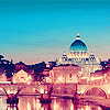
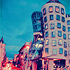
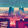
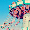
Others made using similar techniques:
Requested by
mscreations
Going from

to
This icon is originally from this post.
This technique is similar to the one in tutorial #1, with some slight variations.
1. Prepare your base (crop, lighting, etc.)

2. Make a new layer and fill it with a yellow color (brighter yellow give it a greener look when its finished), I am going to use a pale yellow (#fef798) to give it a bluer tone once its finished. Set it to soft light at 100%.

3. Create a new adjustment layer --> Selective color. Use these settings (will vary according to your image!):
Reds: -100, +5, -10, +5
Yellows: -100, -100, -100, -100
Neutrals: +20, -5, +15, -20

4. Create a new adjustment layer -->Selective color. Use these settings (will vary according to your image!):
Reds: -5, +75, +20, +30
Yellows: -100, +35, +5, +35
Neutrals: +35, +25, -5, +15

5. Make a new layer and fill it with a dark blue (almost black). I used #030829, and set it to exclusion at 100%. This step isn't required, but it gives the colors a softer tone.

6. Create a new adjustment layer --> Selective color. These are the settings I used (I want to make my image bluer and give it a little magenta tone):
Reds: -100, +15, +5, 0
Yellows: -90, +5, +10, +30
Neutrals: +30, 0, -35, 0

You can stop here if you want, because the icon is basically done, or you can follow these optional steps:
*Add a Hue/Saturation layer, and set both the cyan and blue saturations to +25.

*Create a Selective color layer. These are the settings I used to give the icon a little brighter feel:
Reds: -100, 0, +25, 0
Yellows: 0, -40, -100, 0
Cyans: +35, 0, 0, 0
Blues: +57, 0, 0, 0
Whites: 0, 0, 0, -41
Sharpen the image and you're done!

I hope this was helpful, and I'd love to see your results :)
Others made using similar techniques: