TUTORIAL NUMBER SEVEN.
colorful tutorial psp9.
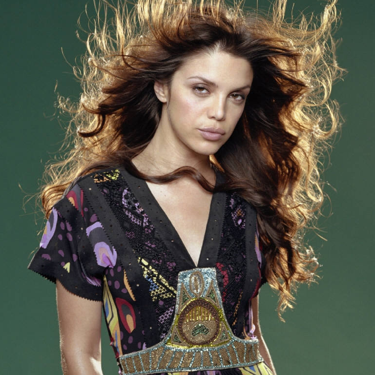
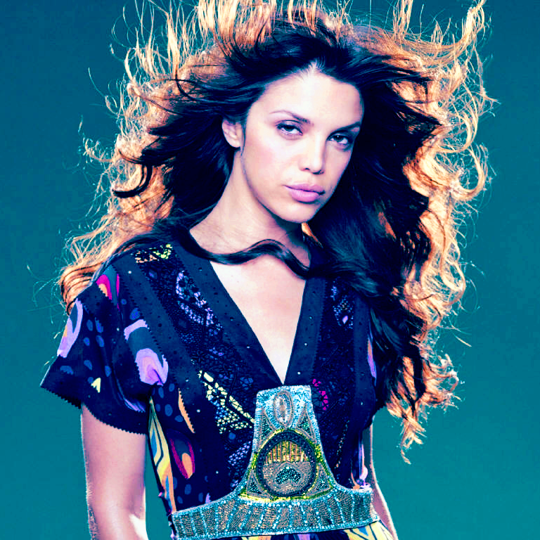
Going from THIS to
First you need to open your program you'll be using. I'm using PSP9.
Open up you image. I'll be using THIS picture of Vanessa Ferlito.
I cropped it to 768x768 just to make a smaller pallate. It works best if you use a large base to start. I usually do that with all of my icons.

Duplicate your base & set layer to SCREEN / OPACITY 100 (sometimes i need to duplicate the base twice & have two screen layers)

Add a new layer. Set this layer to SOFT LIGHT / OPACITY 100. Fill with #ffd991.
Add a new layer. Set this layer to BURN / OPACITY 100. Fill with #3399ff.
Add a new layer. Set this layer to SOFT LIGHT / OPACITY 100. Fill with #ff5b90.
Also play around with different shades of orange, blue, & pink & the opacities.

Merge all.
Go to Hue/Saturation/Lightness & set SATURATION to 50. Leave hue & lightness alone.

Merge all.
Resize to 100x100.
IF NEEDED - I didn't do it but some icons need it.
ADJUST >> SHARPNESS >> UNSHARP MASK
Radius: 0.70
Strength: 50
Clipping: 0
& make sure luminance only is UNCHECKED.

Your done. =]
Keep in mind that depending on your base your icon will turn out different & may require different settings. No other examples, as I didn't want to use the same colors used in other icons so like I said play around with saturation, colors, & opacities.
Like what you see? Join the community.
Going from THIS to

First you need to open your program you'll be using. I'm using PSP9.
Open up you image. I'll be using THIS picture of Vanessa Ferlito.
I cropped it to 768x768 just to make a smaller pallate. It works best if you use a large base to start. I usually do that with all of my icons.

Duplicate your base & set layer to SCREEN / OPACITY 100 (sometimes i need to duplicate the base twice & have two screen layers)

Add a new layer. Set this layer to SOFT LIGHT / OPACITY 100. Fill with #ffd991.
Add a new layer. Set this layer to BURN / OPACITY 100. Fill with #3399ff.
Add a new layer. Set this layer to SOFT LIGHT / OPACITY 100. Fill with #ff5b90.
Also play around with different shades of orange, blue, & pink & the opacities.

Merge all.
Go to Hue/Saturation/Lightness & set SATURATION to 50. Leave hue & lightness alone.

Merge all.
Resize to 100x100.
IF NEEDED - I didn't do it but some icons need it.
ADJUST >> SHARPNESS >> UNSHARP MASK
Radius: 0.70
Strength: 50
Clipping: 0
& make sure luminance only is UNCHECKED.

Your done. =]
Keep in mind that depending on your base your icon will turn out different & may require different settings. No other examples, as I didn't want to use the same colors used in other icons so like I said play around with saturation, colors, & opacities.
Like what you see? Join the community.