Tutorial #4 and 5.
I come bearing two tutorials that have been asked for, so enjoy these! Please keep asking if you have any questions.
TUTORIAL #4 - Vanessa in CONCERT
Turn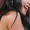
into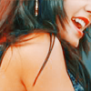
Original image: here
Hannah's First Rule:
I never sharpen, crop or do anything like many others do in the beginning, I simply open the original picture in PS, it opens up for interesting croppings later on and you don't feel hindered by the small base.
Selective Colouring Layer 1 - Normal, 71%
R: -100, 0, +100, 0
Y: -54, +100, +100, +100
Curves Layer 1 - Normal, 100%
Input; 185 - Output; 203
Input; 124 - Output; 155
Duplicate the first Curves Layer - Normal, 100%
Selective Colouring Layer 2 - Normal, 100%
R: -54, 0, +33, 0
Y: -100, +56, +28, 0
C: +67, 0, -63, 0
B: +35, 0, -37, 0
N. +17, -1, +1, 0
Duplicate the second SC Layer - Normal, 39%
Now, you crop, sharpen and add whatever you want. DONE! Yay.
(You guys know that Ctrl+Z is your best friend and cropping it many ways before you decide which one(s) you love the most is great!)
I added some light by the help of a big, round brush a light gray/white colour and set it to Raster, 100% and the text "Vanessa" in Calisto MT in bold italic, size 10, in a light blue colour set to Exclusion, 100%.
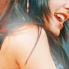
and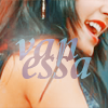
Other examples made with this colouring:
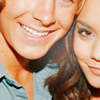

PSD file can be found here.
- - - -
TUTORIAL #5 - At the TEEN CHOICE Awards
Turn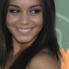
into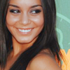
Original image: here
Hannah's First Rule:
I never sharpen, crop or do anything like many others do in the beginning, I simply open the original picture in PS, it opens up for interesting croppings later on and you don't feel hindered by the small base.
Curves Layer - Normal 100%
Input; 121 - Output; 156
Input; 165 - Output; 199
(If the original image has a lot of contrast already, skip the second point)
Selective Colouring Layer 1 - Normal, 100%
R: -100, 0, +65, 0
Y: -52, +7, +15, 0
G: +49, -69, +30, +14
C: +100, 0, -100, 0
B: +100, 0, -100, 0
W: +47, -20, -48, 0
N: -4, 0, -2, 0
Selective Colouring Layer 2 - Normal, 100%
R: -34, 0, 0, 0
(This was just to enhance the red, it's skipable)
Now, crop your image, sharpen and add whatever you feel like. DONE! Awesome.
(You guys know that Ctrl+Z is your best friend and cropping it many ways before you decide which one(s) you love the most is great!)
My additions: A texture by arisubox positioned to the right, set to Multiply 100%, a lighten texture by droppingtear set to Lighten 100% and the text "Hudgens", size 3, and "Vanessa", size 2,5, in Calisto MT in italic, in white set to Overlay 100%.

and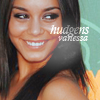
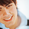
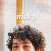
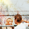
Other examples made with this colouring:
PSD file can be found here.
SIXTY-SIX | SIXTY-FIVE
TUTORIAL #4 - Vanessa in CONCERT
Turn

into

Original image: here
Hannah's First Rule:
I never sharpen, crop or do anything like many others do in the beginning, I simply open the original picture in PS, it opens up for interesting croppings later on and you don't feel hindered by the small base.
Selective Colouring Layer 1 - Normal, 71%
R: -100, 0, +100, 0
Y: -54, +100, +100, +100
Curves Layer 1 - Normal, 100%
Input; 185 - Output; 203
Input; 124 - Output; 155
Duplicate the first Curves Layer - Normal, 100%
Selective Colouring Layer 2 - Normal, 100%
R: -54, 0, +33, 0
Y: -100, +56, +28, 0
C: +67, 0, -63, 0
B: +35, 0, -37, 0
N. +17, -1, +1, 0
Duplicate the second SC Layer - Normal, 39%
Now, you crop, sharpen and add whatever you want. DONE! Yay.
(You guys know that Ctrl+Z is your best friend and cropping it many ways before you decide which one(s) you love the most is great!)
I added some light by the help of a big, round brush a light gray/white colour and set it to Raster, 100% and the text "Vanessa" in Calisto MT in bold italic, size 10, in a light blue colour set to Exclusion, 100%.

and

Other examples made with this colouring:


PSD file can be found here.
- - - -
TUTORIAL #5 - At the TEEN CHOICE Awards
Turn

into

Original image: here
Hannah's First Rule:
I never sharpen, crop or do anything like many others do in the beginning, I simply open the original picture in PS, it opens up for interesting croppings later on and you don't feel hindered by the small base.
Curves Layer - Normal 100%
Input; 121 - Output; 156
Input; 165 - Output; 199
(If the original image has a lot of contrast already, skip the second point)
Selective Colouring Layer 1 - Normal, 100%
R: -100, 0, +65, 0
Y: -52, +7, +15, 0
G: +49, -69, +30, +14
C: +100, 0, -100, 0
B: +100, 0, -100, 0
W: +47, -20, -48, 0
N: -4, 0, -2, 0
Selective Colouring Layer 2 - Normal, 100%
R: -34, 0, 0, 0
(This was just to enhance the red, it's skipable)
Now, crop your image, sharpen and add whatever you feel like. DONE! Awesome.
(You guys know that Ctrl+Z is your best friend and cropping it many ways before you decide which one(s) you love the most is great!)
My additions: A texture by arisubox positioned to the right, set to Multiply 100%, a lighten texture by droppingtear set to Lighten 100% and the text "Hudgens", size 3, and "Vanessa", size 2,5, in Calisto MT in italic, in white set to Overlay 100%.

and

Other examples made with this colouring:


PSD file can be found here.
SIXTY-SIX | SIXTY-FIVE