Icon Tutorial
Requested by mun_rikki.
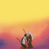
to
1: Start by cropping your image. In this image, I wanted more negative space, so I created a new layer and filled it with the light yellow of the background, erasing some of the areas where I line might show.

2: Next duplicate the image, Gaussian Blur, and put the layer to Hard Light at about 72 Opacity. This will add some brightness, and smooth away the poor image quality.
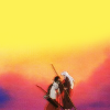
3: Next I simply added a few of my go-to textures.
by sanctuarylight

by unknown
Both are on an Overlay layer at about 75 Opacity.
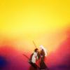
4: Then I selected my font. The font used in this icon was URANIUM MAFIA. I got the text all placed where I wanted it to be, and then by pure accident I discovered that if I placed the text between the bottom yellow layer, and the half-erased starting image it made a nice gradient.
So first place your basic text...
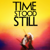
Place it between the layer of the yellow, and the half-erased original image...

Then duplicate the layer, place it above everything else, and make it a reddish color...
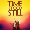
Then put that layer on Overlay.
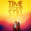
5: The final step was to create a new layer from visible, and put it on Hard Light at about 45 Opacity to deepen the colors.

And that's it! Save as a .png for best quality.
And now I'm going to bed. Goodnight~

Ask The Maker || My Thread
to
1: Start by cropping your image. In this image, I wanted more negative space, so I created a new layer and filled it with the light yellow of the background, erasing some of the areas where I line might show.
2: Next duplicate the image, Gaussian Blur, and put the layer to Hard Light at about 72 Opacity. This will add some brightness, and smooth away the poor image quality.
3: Next I simply added a few of my go-to textures.
by sanctuarylight
by unknown
Both are on an Overlay layer at about 75 Opacity.
4: Then I selected my font. The font used in this icon was URANIUM MAFIA. I got the text all placed where I wanted it to be, and then by pure accident I discovered that if I placed the text between the bottom yellow layer, and the half-erased starting image it made a nice gradient.
So first place your basic text...
Place it between the layer of the yellow, and the half-erased original image...
Then duplicate the layer, place it above everything else, and make it a reddish color...
Then put that layer on Overlay.
5: The final step was to create a new layer from visible, and put it on Hard Light at about 45 Opacity to deepen the colors.
And that's it! Save as a .png for best quality.
And now I'm going to bed. Goodnight~

Ask The Maker || My Thread