Under request, the Gaussian tutorial!

New tutorial made in Photoshop CS. It uses Selective Colors, but there is an alternative step for users of other programs that will permit everyone to get the same results! :) So, 100% translatable! This was made under request to: pernille-is-me, eyre-lasgalen and polar-ice-cubes.
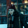
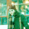
This is my base from Harry Potter and The Prisoner of Azkaban. It was cropped and resized. Nothing else was done. Since we'll be using a blur, do not sharpen it.
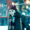
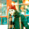
Now, you will duplicate it twice and set both layers to screen. Take the last one and go to filter > blur > gaussian blur ( radius 2,2 ). Then, take the erase tool and erase the parts of Hermione's face.
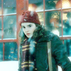
Create a new color fill layer in tan. I got #E1AA7E. Set to softlight. The icon now looks pretty soft already. But the colors are still a bit 'dead'.
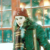
Create a new color fill layer in green ( mine is # 90E57C ). Set it to softlight. Now you don't have a very beautiful output, but this will be corrected. Observe how the base now has a more illuminated aspect.
Create a color balance layer and fill with the following adjustments: +15 / -84 / -38. The color balance will fix the excess of green in the icon. Now it is ready to more 'detailed' adjustments.

Time to work on colors. Create a new Selective Colors layer and have the following adjustments:
REDS -100 / +20 / +100 / +12
YELLOWS -100 / -19 / +21 / -32
CYANS +100 / +22 / +1 / -20
Basically, in this step I choose the appearance of the reds and made then stronger, increased the profundity of yellows and fixed the cyans in the background windows. Pretty, huh? A nice change from the hyper-saturated icons we are all used to see.
PSP AND OTHER PROGRAMS USERS
Here is how you will substitute this
step:
Create a new Hue/Saturation layer and set
the following adjustments:
MASTER 0 / +25 / 0
REDS 0 / +58 / 0
YELLOWS -5 / +8 / -16
CYANS 0 / +14 / +38
Now, go on normaly with the next steps.
You see? The Saturation of specific colors will get almost the same result.

Create a new Hue/Saturation layer and increase the saturation to +15. I do not recommend that you increase it much more than this. The it of this icon is the very soft coloring, so popping out the colors too much will spoil the desired effect.
To get your final result, create a Brightness/Contrast layer and increase the contrast to +16. This final step is just to 'illuminate' the icon.
For PSP users, this is final result:
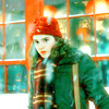
You're done! How do you like it?
Comment if you find this useful, alright? :) Well, Wednesday was my birthday, so be nice and join cokeandmint if you love this community and its icons and tutorials :P
Hope you like that, I am so glad it turned out to be translatable.
Hugs, Renata.