Tutorial Post #1.
As requested. I tried to get it as close as I could, since I didn't have a .PSD saved. I didn't remember exactly how, so I included a bunch of things in here.
Go from:
to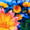
.
*Used Adobe Photoshop CS.
*Image Heavy.
Here's the original image: HERE. You can use this one for this tutorial. Of course, using this tutorial on different pictures achieves different results, but once you get the idea of it, you can change it up based on what colours your base image has. ONE REALLY IMPORTANT THING I'D LIKE TO POINT OUT. It's highly important that the picture you choose to make an icon with be pretty nice in the first place. As you can see, the one we're using is really clean and clear. It's almost perfect. If you start out with a really grainy, blurred image, don't expect your end result to be the best.
MAKING YOUR BASE
Use your cropping tool with the settings at 100 Width and 100 Height:

.
This makes it so when you resize the image, it will be perfectly square, exactly what you need for an icon.
Drag the cropping tool across the picture until you make a square around what you want. Right click inside that square, click CROP. You should now have a cropped picture of the original image.
This is what I got:
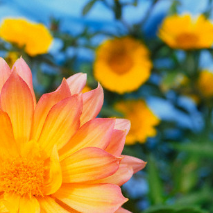
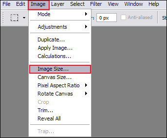
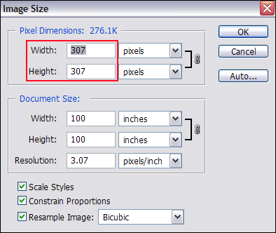
Now that the dimensions are even (thanks to setting your cropping tool to 100 x 100), go to IMAGE > IMAGE SIZE. And change whatever numbers are in the PIXEL DIMENSIONS section to 100. You can change only one of them to 100 and it will automatically change the other because a box that says "CONSTRAIN PROPORTIONS" has been checked. Hit OK.
In pictures:
1. IMAGE > IMAGE SIZE
2. CHANGE THE NUMBERS IN PIXEL DIMENSIONS
You should now have an icon sized picture. This is what mine looks like:

Now you have what is called your BASE. You can do this for every picture you find. After you do this, you spiff it up, which is what I've been doing all along. Then you can add brushes, text and nifty things. SOOO, moving right along.
****
SHARPENING/SOFTENING/BLURRING
1. Sharpen it.
Go to FILTER > SHARPEN > SHARPEN.
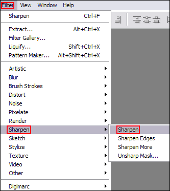
Sometimes pictures don't even need to be sharpened. Be careful when sharpening because oversharpened things look bad.
IE: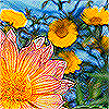
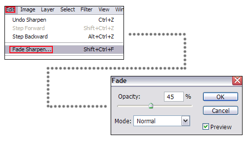
If the sharpening is too harsh with just the one time, go to EDIT > FADE SHARPEN, and fade it to your liking. It's really subtle, but it can make a difference.
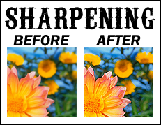
With this icon, I sharpened once, then sharpened again. After the second sharpen, I did EDIT > FADE SHARPEN, and faded it to 45% opacity. Fade it to whatever number you want. Or don't fade it at all. Your call!
FADING.
SHARPEN RESULT
****
2. Soft Light it.
I loveeeeeeee this.
Go to LAYER > DUPLICATE LAYER [a screen will come up, just click OK] > and change the mode of the layer to SOFT LIGHT.
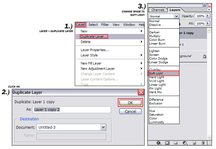
SOFT LIGHT RESULT
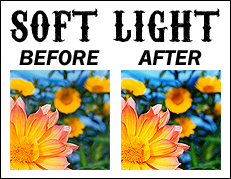
3. Blur it.
Now to blur it. Blurring it makes the image a bit smoother in appearance.
Make sure that you have the soft light layer selected. If you don't, when you do this, your whole image will be blurry.
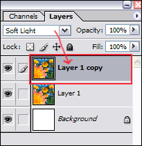
See how the top layer has SOFT LIGHT in the drop down box? If you clicked on the bottom layer, it would change to normal. MAKE SURE YOU HAVE THE SOFT LIGHT LAYER SELECTED.
Go to FILTER > BLUR > GAUSSIAN BLUR.
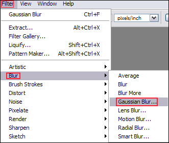
A screen will pop up allowing you to change the degree of blurring. The more you blur it, the less you'll be able to see the softness in the icon. As you change it, you can see what it looks like in your icon off to the side:
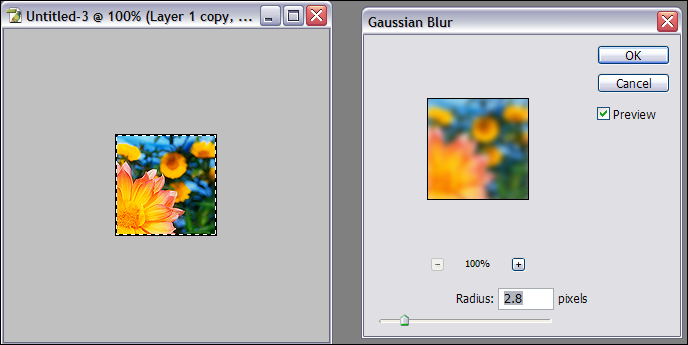
I've chosen a radius of 2.1. Click OK when you've decided on your blur of choice.
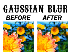
See how it's softened the edges where the sharpening was a little harsh? Yep. It's all about subtle changes.
****
* COLOURING *
1. Exclusion
LAYER > NEW > LAYER. A screen will come up. Click OK.

Choose the paintbucket icon. Click on the colour swatch to choose the colour that you need to make the exclusion mode work.
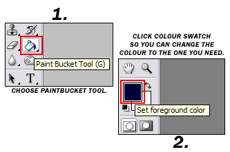
You need to choose deep, dark blues, so anything within the blues on the right bar within the dark range works:
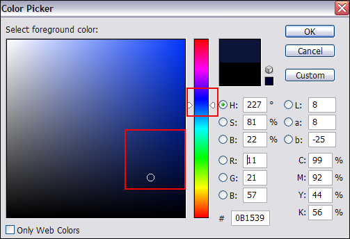
Try multiple shades. There are always subtle differences. For this icon, I'm going to use #080231, which was found here:

Here's a swatch of it for you if you just want to copy and paste onto your icon, instead of copying/pasting the numbers into the area to find the colour...

When you choose your color, and hit okay, that colour is now in your 'paintbucket,' or in the brushes, etc if you're going to use those. That's how you change the colours of what you want to use. Ok?
Now that you have your paintbucket as the tool of choice, just click into the newest layer that you created (it should be blank:
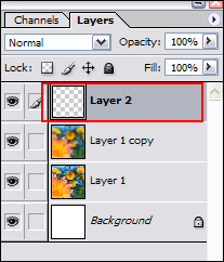
Now you can't see anything. The icon is covered by the blue colour. NO PROBLEM! Just change the mode of the dark blue layer, [like you did with the soft light layer], only this time, change it to EXCLUSION.
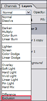
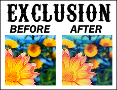
EXCLUSION RESULT
****
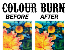
2. COLOUR BURN.
You need to follow all of the same directions for the EXCLUSION tutorial for this. Except you need to use a different colour and mode.
LAYER > NEW > LAYER.
Paintbucket. Choose the swatch. For this one, you need a very light aqua green. I chose #CDF8ED. Here's the swatch for you to copy/paste if you don't want to copy/paste the numbers into the area and click the colour into the new layer.

Once again, if you pasted the swatch, or clicked the colour onto the newest layer, you can't see anything except this new bright aqua colour. Change the mode of the layer to COLOR BURN.
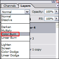
WOO! There should be a definite difference. Greener...burn..ier. lol.
COLOR BURN RESULT
****
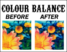
3. COLOUR BALANCE
Now, I went to LAYER > NEW ADJUSTMENT LAYER > COLOUR BALANCE. [This makes it so you can balance the colouring of the entire icon without making it all into one icon, in case you decide you want to change something. It's best to keep everything seperated out into layers until you are absolutely certain you are done.] A new window will pop up. Just click OK. The COLOUR BALANCE window will pop up. Here's where you'll be making the changes that will affect your icon.
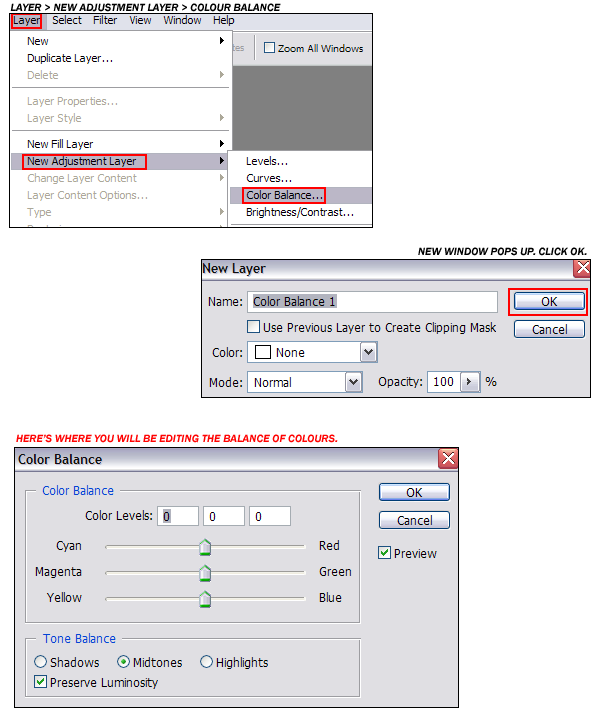
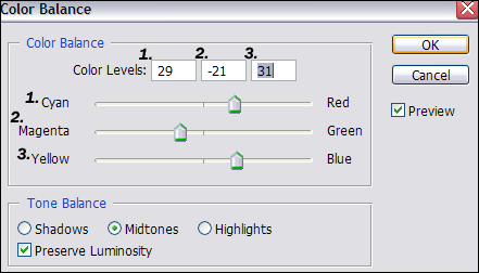
The settings I used were:
CYAN ...+ 29... RED
MAGENTA ...- 21... GREEN
YELLOW ...+31... BLUE
Click OK.
COLOUR BALANCE RESULT
****
4. Curves
I'm not going to go too far into curves here. Only a few screen shots. You can play with Curves and find some tutorials. I learned on my own. It's just a way of tweaking colours, and if you learn how to use it, it's great fun.
So, go to LAYER > NEW ADJUSTMENT LAYER > CURVES.
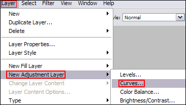
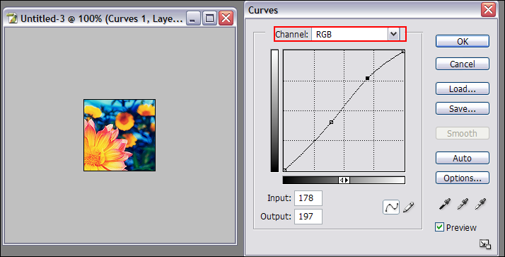
Another screen will pop up. Click ok. Now you're in the CURVES screen. Stay in RGB mode. I'm just doing screen shots from here on out. To get the points on the grid, you click then pull the point to where you want it to be. If you need further explanation, I'll try, but don't ask too much. Ehhh. Yeah.
Channel: RGB
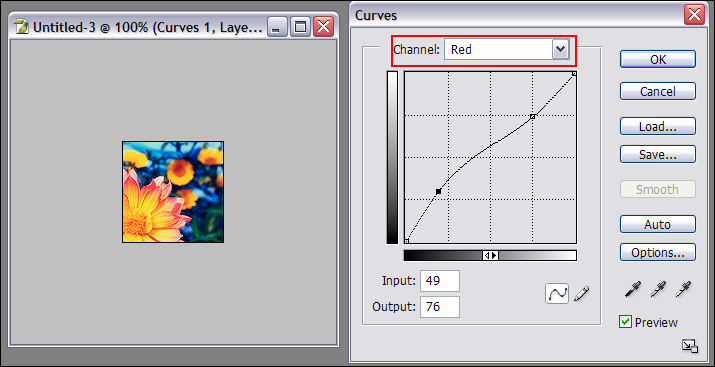
Channel: Red
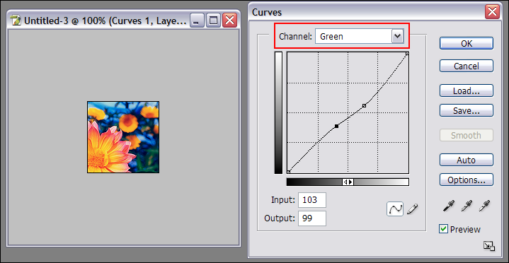
Channel: Green
Channel: Blue
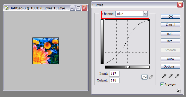
Make sure to mess with all of the channels before clicking OK.
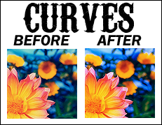
CURVES RESULT
****
END
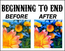
So...your end result, from the beginning crop to this is...
And all of the layers:
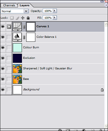
You can go to LAYER > FLATTEN IMAGE before saving. Or you can just save it. I HIGHLY recommend saving in .PNG. It's my favourite and it's what I always use. ALWAYS ALWAYS. =]
Thanks and this concludes the end of my first tutorial! Show me what you get, with this picture, or with others! If you have questions, or if there's any confusion with a direction, let me know.
Pimpage!:
thisdelicateone
reversescollide
etc.etc.etc.:

Like what you see? Please join my community.

Don't want to miss a thing here? Add
clockwork_arts to your friends' list.

Have a graphics journal of your own? Why not affiliate with me!
Go from:

to

.
*Used Adobe Photoshop CS.
*Image Heavy.
Here's the original image: HERE. You can use this one for this tutorial. Of course, using this tutorial on different pictures achieves different results, but once you get the idea of it, you can change it up based on what colours your base image has. ONE REALLY IMPORTANT THING I'D LIKE TO POINT OUT. It's highly important that the picture you choose to make an icon with be pretty nice in the first place. As you can see, the one we're using is really clean and clear. It's almost perfect. If you start out with a really grainy, blurred image, don't expect your end result to be the best.
MAKING YOUR BASE
Use your cropping tool with the settings at 100 Width and 100 Height:

.
This makes it so when you resize the image, it will be perfectly square, exactly what you need for an icon.
Drag the cropping tool across the picture until you make a square around what you want. Right click inside that square, click CROP. You should now have a cropped picture of the original image.
This is what I got:

Now that the dimensions are even (thanks to setting your cropping tool to 100 x 100), go to IMAGE > IMAGE SIZE. And change whatever numbers are in the PIXEL DIMENSIONS section to 100. You can change only one of them to 100 and it will automatically change the other because a box that says "CONSTRAIN PROPORTIONS" has been checked. Hit OK.
In pictures:
1. IMAGE > IMAGE SIZE

2. CHANGE THE NUMBERS IN PIXEL DIMENSIONS

You should now have an icon sized picture. This is what mine looks like:

Now you have what is called your BASE. You can do this for every picture you find. After you do this, you spiff it up, which is what I've been doing all along. Then you can add brushes, text and nifty things. SOOO, moving right along.
****
SHARPENING/SOFTENING/BLURRING
1. Sharpen it.
Go to FILTER > SHARPEN > SHARPEN.

Sometimes pictures don't even need to be sharpened. Be careful when sharpening because oversharpened things look bad.
IE:

If the sharpening is too harsh with just the one time, go to EDIT > FADE SHARPEN, and fade it to your liking. It's really subtle, but it can make a difference.
With this icon, I sharpened once, then sharpened again. After the second sharpen, I did EDIT > FADE SHARPEN, and faded it to 45% opacity. Fade it to whatever number you want. Or don't fade it at all. Your call!
FADING.

SHARPEN RESULT

****
2. Soft Light it.
I loveeeeeeee this.
Go to LAYER > DUPLICATE LAYER [a screen will come up, just click OK] > and change the mode of the layer to SOFT LIGHT.

SOFT LIGHT RESULT

3. Blur it.
Now to blur it. Blurring it makes the image a bit smoother in appearance.
Make sure that you have the soft light layer selected. If you don't, when you do this, your whole image will be blurry.

See how the top layer has SOFT LIGHT in the drop down box? If you clicked on the bottom layer, it would change to normal. MAKE SURE YOU HAVE THE SOFT LIGHT LAYER SELECTED.
Go to FILTER > BLUR > GAUSSIAN BLUR.

A screen will pop up allowing you to change the degree of blurring. The more you blur it, the less you'll be able to see the softness in the icon. As you change it, you can see what it looks like in your icon off to the side:

I've chosen a radius of 2.1. Click OK when you've decided on your blur of choice.

See how it's softened the edges where the sharpening was a little harsh? Yep. It's all about subtle changes.
****
* COLOURING *
1. Exclusion
LAYER > NEW > LAYER. A screen will come up. Click OK.

Choose the paintbucket icon. Click on the colour swatch to choose the colour that you need to make the exclusion mode work.

You need to choose deep, dark blues, so anything within the blues on the right bar within the dark range works:

Try multiple shades. There are always subtle differences. For this icon, I'm going to use #080231, which was found here:

Here's a swatch of it for you if you just want to copy and paste onto your icon, instead of copying/pasting the numbers into the area to find the colour...

When you choose your color, and hit okay, that colour is now in your 'paintbucket,' or in the brushes, etc if you're going to use those. That's how you change the colours of what you want to use. Ok?
Now that you have your paintbucket as the tool of choice, just click into the newest layer that you created (it should be blank:

Now you can't see anything. The icon is covered by the blue colour. NO PROBLEM! Just change the mode of the dark blue layer, [like you did with the soft light layer], only this time, change it to EXCLUSION.

EXCLUSION RESULT

****
2. COLOUR BURN.
You need to follow all of the same directions for the EXCLUSION tutorial for this. Except you need to use a different colour and mode.
LAYER > NEW > LAYER.
Paintbucket. Choose the swatch. For this one, you need a very light aqua green. I chose #CDF8ED. Here's the swatch for you to copy/paste if you don't want to copy/paste the numbers into the area and click the colour into the new layer.

Once again, if you pasted the swatch, or clicked the colour onto the newest layer, you can't see anything except this new bright aqua colour. Change the mode of the layer to COLOR BURN.

WOO! There should be a definite difference. Greener...burn..ier. lol.
COLOR BURN RESULT

****
3. COLOUR BALANCE
Now, I went to LAYER > NEW ADJUSTMENT LAYER > COLOUR BALANCE. [This makes it so you can balance the colouring of the entire icon without making it all into one icon, in case you decide you want to change something. It's best to keep everything seperated out into layers until you are absolutely certain you are done.] A new window will pop up. Just click OK. The COLOUR BALANCE window will pop up. Here's where you'll be making the changes that will affect your icon.

The settings I used were:
CYAN ...+ 29... RED
MAGENTA ...- 21... GREEN
YELLOW ...+31... BLUE
Click OK.

COLOUR BALANCE RESULT

****
4. Curves
I'm not going to go too far into curves here. Only a few screen shots. You can play with Curves and find some tutorials. I learned on my own. It's just a way of tweaking colours, and if you learn how to use it, it's great fun.
So, go to LAYER > NEW ADJUSTMENT LAYER > CURVES.

Another screen will pop up. Click ok. Now you're in the CURVES screen. Stay in RGB mode. I'm just doing screen shots from here on out. To get the points on the grid, you click then pull the point to where you want it to be. If you need further explanation, I'll try, but don't ask too much. Ehhh. Yeah.
Channel: RGB

Channel: Red

Channel: Green

Channel: Blue

Make sure to mess with all of the channels before clicking OK.
CURVES RESULT

****
END
So...your end result, from the beginning crop to this is...

And all of the layers:

You can go to LAYER > FLATTEN IMAGE before saving. Or you can just save it. I HIGHLY recommend saving in .PNG. It's my favourite and it's what I always use. ALWAYS ALWAYS. =]
Thanks and this concludes the end of my first tutorial! Show me what you get, with this picture, or with others! If you have questions, or if there's any confusion with a direction, let me know.
Pimpage!:
thisdelicateone
reversescollide
etc.etc.etc.:

Like what you see? Please join my community.

Don't want to miss a thing here? Add

clockwork_arts to your friends' list.

Have a graphics journal of your own? Why not affiliate with me!