Tutorial
The colouring for this icon was requested by tarnshdsuprstar, so I thought I'd post a tutorial on it. The colouring's not exactly the same, but I think it's pretty similar.
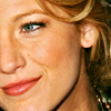
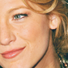
Original: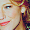
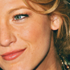
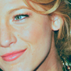
Going from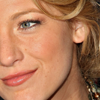
to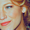
Made in Photoshop CS2 with selective colouring, so not translatable unfortunately!
1. Start with your base.
2. I duplicated mine and set it to Overlay, 56%.
3. Layer > New Adjustment Layer > Color Balance
Midtones: -13, -6, -9
Shadows: -6, 9 -7
Highlights: -8, -11, 11
4. Layer > New Adjustment Layer > Hue/ Saturation
Yellows: 0, 7, 0

5. Make a new layer. Fill it with #0B1820 and set it to Exclusion.
6. Layer > New Adjustment Layer > Curves
RGB: 66. 86
7. Duplicate the Curves layer and set it to Normal, 18%.
8. Make a new layer and fill it with #FE86A5. Set this layer to Soft Light, 11%.
9. Layer > New Adjustment Layer > Channel Mixer
Red: 128, -44, -16
Blue: 16, -24, 116
10. Layer > New Adjustment Layer > Selective Color
Reds: -51, 8, 22, 24
Yellows: -18, 14, -15, -15
Cyans: 100, 100, 0, 100
Neutrals: 0, -2, 9, 0
Blacks: 0, 100, 0 -17
11. Duplicate you base, bring it to the top and set it to Luminosity.
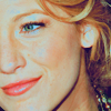
And there you go! I hope that was alright and that you make some great icons out of it. :D
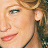
Original:
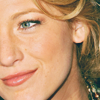
Going from
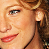
to
Made in Photoshop CS2 with selective colouring, so not translatable unfortunately!
1. Start with your base.
2. I duplicated mine and set it to Overlay, 56%.
3. Layer > New Adjustment Layer > Color Balance
Midtones: -13, -6, -9
Shadows: -6, 9 -7
Highlights: -8, -11, 11
4. Layer > New Adjustment Layer > Hue/ Saturation
Yellows: 0, 7, 0
5. Make a new layer. Fill it with #0B1820 and set it to Exclusion.
6. Layer > New Adjustment Layer > Curves
RGB: 66. 86
7. Duplicate the Curves layer and set it to Normal, 18%.
8. Make a new layer and fill it with #FE86A5. Set this layer to Soft Light, 11%.
9. Layer > New Adjustment Layer > Channel Mixer
Red: 128, -44, -16
Blue: 16, -24, 116
10. Layer > New Adjustment Layer > Selective Color
Reds: -51, 8, 22, 24
Yellows: -18, 14, -15, -15
Cyans: 100, 100, 0, 100
Neutrals: 0, -2, 9, 0
Blacks: 0, 100, 0 -17
11. Duplicate you base, bring it to the top and set it to Luminosity.
And there you go! I hope that was alright and that you make some great icons out of it. :D