(Untitled)

Jul 24, 2008 01:35

 Another Eroica pic, also copped from Seven Days in September. This one gave me trouble, since I didn't know what colours the walls were. The colour scheme is probably really whacked in tis one, and I would really appreciate thoughts on the colour of the wall.
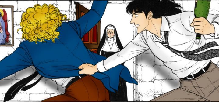

Read more... )

color art, artist-jade_glow, fan art

Leave a comment

Comments 13

napthia9 July 24 2008, 10:01:27 UTC
Dark gray, 'cos it's stone.

I like the green of the bottle!

Reply

jade_glow July 24 2008, 18:12:49 UTC
Yes, but Klaus is also wearing colours in the same spectrum. So if I make the stone dark grey, the picture will look one tone all over.

Reply

napthia9 July 24 2008, 20:30:50 UTC
Noted. Klaus is wearing lighter shades though (white shirt, light gray/khaki pants), so he'll probably still pop out. You could always try varying shades of gray on different stones too. Maybe that would give the wall more texture?

Reply


foxypope July 24 2008, 11:35:46 UTC
Yeah, the walls would be dark grey. Hehe, I love that scene. Although I was surprised that Dorian didn't like that the wine tasted of Klaus' thighs...

Reply

norwayblue_eyes July 24 2008, 13:13:17 UTC
Hi, foxypope.
Yeah, I thought the same at first.

He needed a sort of mood enhancer and wanted to enjoy the wine in a graceful mood to alter the earlier depressing feeling.
Klaus's crude way to treat the wine(bottle) ruined the mood Dorian supporsed to get into.

I think that is the author's designs.

Reply

foxypope July 24 2008, 14:29:14 UTC
I thought it was because it warmed the wine. I wouldn't know, but aren't you supposed to drink it chilled? Klaus warmed the wine by putting it in-between his legs, so it tasted gross afterwards.

Reply

norwayblue_eyes July 24 2008, 15:02:19 UTC
Ah, I think you are also right.

What I thought came from the line.

the Earl's line ---
"Ah. This is more like it. Care for a glass?"

In the Japanese original it is something like this;
"This at least could make us graceful now. Care for a glass?"

Reply


foxypope July 24 2008, 11:38:57 UTC
Oh, and I just noticed--their shadows are too big on the walls. It has the effect of looking like they're standing in front of a flat cardboard wall with a nun painted on it. XD The picture itself is in certain perspective, where Klaus and Dorian are nearest and the nun, the door and the walls are farthest, so their shadows projected on the walls should be smaller.

Reply

norwayblue_eyes July 24 2008, 15:06:40 UTC
Perhaps, painting the wall and the background around the nun would create some depth in the illustration.

Reply

foxypope July 24 2008, 15:51:21 UTC
That actually may be a part of it, eh?

Reply

jade_glow July 24 2008, 19:08:11 UTC
The nun is dressed in black and white (unless nuns dress in other colours; I'm fuzzy about religion)so I just shaded it in with grey and turned the opacity down. You're right about the shadows. XD I'll have to fix that.

Reply


anonymous July 25 2008, 02:33:36 UTC
You could go with a warm sandstone color for the walls, to add contrast. Also- you forgot to color the cork. Otherwise, gorgeous. I'm really loving these.
Oh, curses, I've lost my password.
~dorothy_notgale

Reply


Leave a comment

Up