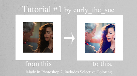
Tutorial #01 - Ziva's Recoil.

starshines asked me if I could do this tutorial. So, here we go.
It's my first tutorial, so please let me know if I made any mistakes or if something isn't working.
[x] Comments are ♥!
[x] If you use it, I'd love to see your results.
[x] Made in PS 7
[x] Uses selective coloring, so I don't know if it's translatable.
[x] keep in mind that every picture requires different settings!
Now let's get started!
Step #1.
Open your picture (mine is this picture from here.) and crop it to 100x100 px.

Step #2.
Duplicate your base 4 times and set the duplicated layers to Screen, opacity 100%. The number of screen layers depends on your image.

Step #3.
Create a new layer fill it with a dark blue (#010F2D) and set it to Exclusion, opacity 100%.

--->

Duplicate the Exclusion-layer and lower the opacity to 54%.
Step #4.
Create another layer and fill it with a light gray (#E3E3E3). Set this layer to Color Burn, opacity 100%.

--->

It's too yellowish, isn't it? We're gonna fix that now.
Step #5.
Create another layer and fill this one with a light blue. Set it to Soft Light, opacity 100%.

--->

Step #6.
The icon looks pretty washed out now. To fix this create another layer and fill it with a light pink (#F9C9E9). Set the layer to Color Burn, opacity 100%.

--->

Step #7.
Now create another layer (it's the last color fill, promise!) and fill it again with a light grey (#E3E3E3) and set this one too to Color Burn, opacity 100%. Or you can just duplicate the layer you created in Step 4.

--->

This was easy, wasn't it? But the icon still looks ugly, so we have to go on.
Step #8.
Create a selective color layer. Put in the following settings (but remember that you probably have to play around with them to achieve good results):
Reds: -100, 0, 0, -8
Yellows: -100, 0, +59, 0
Cyans: +100, 0, -100, +100
Blues: +100, 0, -17, -1
Magentas: +1, 0, +100, 0
Whites: +100, 0, -62, 0
Neutrals: +15, 0, +10, 0
Your icon should now look like this:

Step #9.
This step is optional. I just felt that the reds in the picture are a bit lost now. To fix that I created another selective color layer and lower the opacity to 80%. Put in the following settings:
Reds: -100, 0, 0, +100

Now that we have enhanced the red the whole icon far to red, so take a small brush and erase this layer wherever it is too red.
Your icon should now look like this:

And now we're almost done!
Step #10.
Blur, sharpen or do whatever you like to do. You can leave this step or start with it, but I like to do this in the end, because the coloring can alter the sharpness of your image.
Now the final step. Add text, brushes or textures to your icon. Play around and see what looks best on it. I used a light texture made by vol4itca and set it Screen, opacity 100%.

Now we're done!

I hope this was helpful, let me know what you think and please show me you're results!