#68 tutorial
Asked by monstersinyou
From:
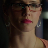
to:
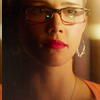
This tutorial is very simple, i guess. I decided to post it before my "blue icons" tutorial because in this one I'll show some tips you can use to make blue/cyan icon or whatever color you want. So in my next tutorial I'll just refer to it. Lazy me, I know :D
1) First of all duplicate base and use Auto Contrast. That will make image brighter and add some contrast.
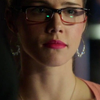
2) Create new Color Fill layer with #9f8261 and set it to Soft Light. I use this color to give icon soft yelow/brown-ish tone.
I really love light/shadows of this cap, and to make it more visible create new b&w Gradient Fill layer (Angle: 53,3 Scale: 100%). Set Opacity of this layer to 70%
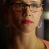
3) To make Felicity's face look brighter create new Levels layer with these settings
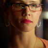
4) Now icon looks a bit too yellow. To reduce yellow create Photo Filter layer ( Color:#4c59eb, Density:30%). Reduce the Opacity to 65%

5) Now it Gradient Fill time! :D Create new Gradient Fill layer (Color: #512627, Location:25%; Color: #c5b57a, Location:25%; Angle:53,97, Scale: 100%).Set it to Hard Light (Opacity 36%)
Add another Gradient Fill layer (Color: #eac7ad, choose any light color as a second one but make Opacity Stop at 30% and Opacity 0%; Angle:-160, Scale: 135%). Lower Opacity to 70%. Create similar Gradient Fill layer using dark color (I used #300b04; Angle:57,09, Scale: 135%).
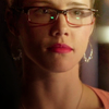
=>
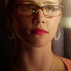
=>
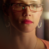
6) To make shadow even more visible and add more glow merge all layers (alt+ctrl+shift+E) go to Filter-Blur-Gaussian Blur (Radius:2-3) Set it to Soft Light (Opacity:56%). Duplicate this layer, desaturate it and lower the opacity to 34%. That will make shadows more visible. Merge all the layers again blur it an set this layer to Screen, opacity around 10 %. It will add more glow.
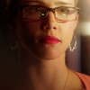
=>

=>

7) To add more contrast Create Brightness/Contrast layer(Brightness: -2, Contrast: 18). The light part around Felicity's face and neck still have different tone from her face, so create New layer pick a soft brush with #e8b061 and paint this area. Set this layer to Soft Light (opacity:70%)
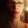
8) Add any texture similar to this (by ???) to make shadows less contrast, sharpen your icon ( I prefer to use High Pass). Then I create this small border by merging all the layers and replacing this layer. Add new Vibrance layer (Vibrance:+49, Saturation: +3). And here we done!

Thank you so much for making the request! I hope this tutorial will be useful!
And sorry again for any mistakes:)

Ask The Maker 5.0 || My Thread