Tutorial #01
Tutorial #01: Miss Piper
Requested by: xx_ella_xx
→
( In eighteen sort of weird and indecisive steps. )
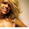
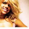
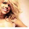
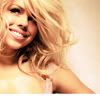
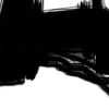
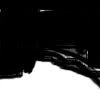
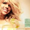
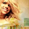
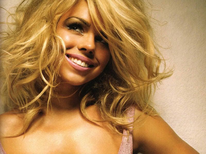
01. Using this image, crop it to your liking. Like so.
02. Add a new Curves layer (Layer → New Adjustment Layer → Curves). Play around with it until you get something you like.
These are the settings I used:
RGB: Input - 58, Output - 88 | Input - 223, Output - 244
RED: Input - 55, Output - 46 | Input - 223, Output - 235
GREEN: Input - 53, Output - 43 | Input - 235, Output - 238
BLUE: Input - 36, Output - 36 | Input - 203, Output - 225
With the added layer, it should now look like this:
03. Add a new Selective Color layer (Layer → New Adjustment Layer → Selective Color).
(R = Reds, Y = Yellows, W = Whites, N = Neutrals)
R: Cyan = -03 | Magenta = -04 | Yellow = -19 | Black = -15
Y: Cyan = -51 | Magenta = -41 | Yellow = -67 | Black = -09
W: Cyan = -26 | Magenta = +33 | Yellow = +73 | Black = -05
N: Cyan = -16 | Magenta = 0 | Yellow = +15 | Black = -06
It should now look like this:
04. Another Selective Color layer.
R: Cyan = -34 | Magenta = +03 | Yellow = +08 | Black = -08
Y: Cyan = -25 | Magenta = -08 | Yellow = -22 | Black = -05
W: Cyan = +94 | Magenta = -06 | Yellow = +04 | Black = +04
N: Cyan = -11 | Magenta = -07 | Yellow = +01 | Black = +03
It should now look like this:
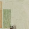
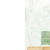
05. Add this texture by 77words, and set it to Pin Light - 100% Opacity.
Add a mask by clicking the button at the bottom of your Layer Palette that looks like a circle inside a rectangle. Your Layer Palette now shows a blank white square next to the thumbnail of your texture.
→
Using a brush, block out the unwanted parts.
Basically, the layer should look like this:
+
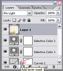
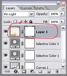
06. Duplicate Layer 1, but block out more on the mask. It should still be on Pin Light, 100%. The layer should look like so:
+
07. Add this texture, also by 77words. Use Auto Levels to correct the lighting on the texture. (Image → Adjustments → Auto Levels). Rotate the texture 90° Counter Clockwise. (Edit → Transform → Rotate 90° CCW). Set it to Darken at 100% Opacity and move it to the right so it doesn't cover her body.
→
It now looks like this:
08. Add another texture by 77words. Add a mask, and block out the unwanted bits covering her face & body. Set the texture to Linear Burn - 100%.
The layer should look like this:
+
It now looks like this:
09. Add a new Color Balance layer (Layer → New Adjustment Layer → Color Balance).
Shadows - +04, +10, +19
Midtones - +15, -01, -22
Highlights - +01, +07, -01
It now looks like this:
10. Fun trick time! You're going to create a merged image as just a layer. To do this, create a new layer (Layer → New → Layer..) and use the following shortcut: Ctrl+Alt+Shift+E
11. Duplicate this new layer, and flip it horizontally (Edit → Transform → Horizontal).
Time to go wonky with colors. Go to Image → Adjustments → Variations.
Choose: More Cyan, More Cyan, More Cyan, More Blue, More Cyan, More Cyan.
It now looks like this:
12. Create a new layer and fill it with a light blue - #DAF0FC. Set to Color Burn at 37%.

13. Add a new Selective Color layer.
(R = Reds, Y = Yellows, C = Cyans, N = Neutrals)
R: Cyan = -88 | Magenta = +100 | Yellow = +100 | Black = +35
Y: Cyan = -53 | Magenta = +63 | Yellow = +100 | Black = -81
C: Cyan = +38 | Magenta = +17 | Yellow = +15 | Black = -01
N: Cyan = -34 | Magenta = +08 | Yellow = +06 | Black = +02
14. Duplicate the merged layer, flip it horizontally, and pull it up to the top. Set it to Soft Light at 45% Opacity.
It now looks like this:
15. Almost done! Duplicate the Selective Color layer from Step 13, and pull it up to the top.
16. Create another merged image as a layer. (Layer → New → Layer, then Ctrl+Alt+Shift+E.)
Fiddle with the colors again using Variations. (Image → Adjustments → Variations)
Choose: More Yellow, More Yellow, More Red, More Red.
After Variations, the layer should look like this:
Set it to 45%, and the icon should look like this:
17. Right about now, you could add text and just be done with it. But there is a really weird step here which makes the difference between these two icons:
vs.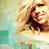
To get that sort of flowy look tapering off from Billie, do the following:
Remember that that merged image as a layer trick? Yep, Ctrl+Alt+Shift+E that sucker. Then go to Variations, and choose: More Blue, More Blue, More Cyan, More Cyan, More Cyan.
Set it to Lighten at 55% Opacity, and move it downwards.
The layer looks like this:
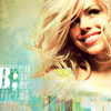
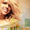
18. Final step! Add text. The font is Allegro BT, 6pt. The text queen of the superficial is set to Soft Light.
The B; is 12pt, and the anti-alias is Strong.
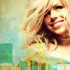
TA-DA! All finished. :)
Hopefully that wasn't too confusing, especially the last bits. I've never done a full-out huge tutorial like this, so let me know if I'm completely mad, and I'll try to explain it more in-depth.
I've decided to put the other tutorial in a new post so I don't harm anyone who hates image-heavy posts. Have fun!
Hope it helps. (:
Requested by: xx_ella_xx
→
( In eighteen sort of weird and indecisive steps. )
01. Using this image, crop it to your liking. Like so.
02. Add a new Curves layer (Layer → New Adjustment Layer → Curves). Play around with it until you get something you like.
These are the settings I used:
RGB: Input - 58, Output - 88 | Input - 223, Output - 244
RED: Input - 55, Output - 46 | Input - 223, Output - 235
GREEN: Input - 53, Output - 43 | Input - 235, Output - 238
BLUE: Input - 36, Output - 36 | Input - 203, Output - 225
With the added layer, it should now look like this:
03. Add a new Selective Color layer (Layer → New Adjustment Layer → Selective Color).
(R = Reds, Y = Yellows, W = Whites, N = Neutrals)
R: Cyan = -03 | Magenta = -04 | Yellow = -19 | Black = -15
Y: Cyan = -51 | Magenta = -41 | Yellow = -67 | Black = -09
W: Cyan = -26 | Magenta = +33 | Yellow = +73 | Black = -05
N: Cyan = -16 | Magenta = 0 | Yellow = +15 | Black = -06
It should now look like this:
04. Another Selective Color layer.
R: Cyan = -34 | Magenta = +03 | Yellow = +08 | Black = -08
Y: Cyan = -25 | Magenta = -08 | Yellow = -22 | Black = -05
W: Cyan = +94 | Magenta = -06 | Yellow = +04 | Black = +04
N: Cyan = -11 | Magenta = -07 | Yellow = +01 | Black = +03
It should now look like this:
05. Add this texture by 77words, and set it to Pin Light - 100% Opacity.
Add a mask by clicking the button at the bottom of your Layer Palette that looks like a circle inside a rectangle. Your Layer Palette now shows a blank white square next to the thumbnail of your texture.
→
Using a brush, block out the unwanted parts.
Basically, the layer should look like this:
+
06. Duplicate Layer 1, but block out more on the mask. It should still be on Pin Light, 100%. The layer should look like so:
+
07. Add this texture, also by 77words. Use Auto Levels to correct the lighting on the texture. (Image → Adjustments → Auto Levels). Rotate the texture 90° Counter Clockwise. (Edit → Transform → Rotate 90° CCW). Set it to Darken at 100% Opacity and move it to the right so it doesn't cover her body.
→
It now looks like this:
08. Add another texture by 77words. Add a mask, and block out the unwanted bits covering her face & body. Set the texture to Linear Burn - 100%.
The layer should look like this:
+
It now looks like this:
09. Add a new Color Balance layer (Layer → New Adjustment Layer → Color Balance).
Shadows - +04, +10, +19
Midtones - +15, -01, -22
Highlights - +01, +07, -01
It now looks like this:
10. Fun trick time! You're going to create a merged image as just a layer. To do this, create a new layer (Layer → New → Layer..) and use the following shortcut: Ctrl+Alt+Shift+E
11. Duplicate this new layer, and flip it horizontally (Edit → Transform → Horizontal).
Time to go wonky with colors. Go to Image → Adjustments → Variations.
Choose: More Cyan, More Cyan, More Cyan, More Blue, More Cyan, More Cyan.
It now looks like this:
12. Create a new layer and fill it with a light blue - #DAF0FC. Set to Color Burn at 37%.
13. Add a new Selective Color layer.
(R = Reds, Y = Yellows, C = Cyans, N = Neutrals)
R: Cyan = -88 | Magenta = +100 | Yellow = +100 | Black = +35
Y: Cyan = -53 | Magenta = +63 | Yellow = +100 | Black = -81
C: Cyan = +38 | Magenta = +17 | Yellow = +15 | Black = -01
N: Cyan = -34 | Magenta = +08 | Yellow = +06 | Black = +02
14. Duplicate the merged layer, flip it horizontally, and pull it up to the top. Set it to Soft Light at 45% Opacity.
It now looks like this:
15. Almost done! Duplicate the Selective Color layer from Step 13, and pull it up to the top.
16. Create another merged image as a layer. (Layer → New → Layer, then Ctrl+Alt+Shift+E.)
Fiddle with the colors again using Variations. (Image → Adjustments → Variations)
Choose: More Yellow, More Yellow, More Red, More Red.
After Variations, the layer should look like this:
Set it to 45%, and the icon should look like this:
17. Right about now, you could add text and just be done with it. But there is a really weird step here which makes the difference between these two icons:
vs.
To get that sort of flowy look tapering off from Billie, do the following:
Remember that that merged image as a layer trick? Yep, Ctrl+Alt+Shift+E that sucker. Then go to Variations, and choose: More Blue, More Blue, More Cyan, More Cyan, More Cyan.
Set it to Lighten at 55% Opacity, and move it downwards.
The layer looks like this:
18. Final step! Add text. The font is Allegro BT, 6pt. The text queen of the superficial is set to Soft Light.
The B; is 12pt, and the anti-alias is Strong.
TA-DA! All finished. :)
Hopefully that wasn't too confusing, especially the last bits. I've never done a full-out huge tutorial like this, so let me know if I'm completely mad, and I'll try to explain it more in-depth.
I've decided to put the other tutorial in a new post so I don't harm anyone who hates image-heavy posts. Have fun!
Hope it helps. (: