.046
ASK THE MAKER ANSWERS
or The Let's-Pretend-I-Know-What-I'm-Talking-About Guide to Text, Textures and Vintage Coloring (warning: image heavy and sorry in advance for my rambling XD)
raiindust asked: I'd love to know about how you use textures in your icons (for general texture, for composition elements or something completely different). Also, favourite textures &/or texture makers?
HOW DO I USE TEXTURES IN MY ICONS????
to be honest, i'm not quite as texture-happy as i used to be so i'm not sure i deserve to make a guide. in general, i've been trying to think about what i do more rather than just slapping things on for the heck of it. not that i'm not still guilty of that...


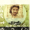
slapping textures on for the heck of it. sometimes it...works? lol you judge.
but here's what i usually use textures for anyway:


background elements | symbolism | lighting | grunge | composition
Background Elements
err quite self-explanatory, to use as background decoration or fake backgrounds. usually stock pictures or wallpaper textures but can be anything colorful/painty too. I also love using newspaper/book pages/magazine textures for this.
Symbolism/Decorative Elements
pick an animal or object (or anything connected to nature, really) that relates closely with your subject and put it in your icon. mostly used as background elements also but i sometimes put it in the foreground too. usually in white, or a white silhouette.
Lighting/Color
again, self-explanatory but i love the additional color boost that lighting textures give (presuming the light texture is colored and not black and white of course)
Grunge/Paint
I love grunge. seriously, LOVE IT. i don't know how i ever iconned without grunge textures before. you know what's even better? combining it with painty textures. you'll see some examples below.
Composition/Framing
and finally, the textures I use to help liven things up a bit. most of the time I use vintage frames but they can also be geometric shapes--circles, rectangles or squares (haven't tried triangles yet but soon...)
BUT HOW DO I USE TEXTURES IN MY ICONS????
the short answer? SCREEN ALL THE THINGS! and boom: instant profit! like literally, my textures are almost always on screen mode (also multiply and soft light.) but a lot of effects can be achieved while playing around with the other seldom used blending modes too:
difference can add interesting texture to silhouettes

+
=
>>>
texture by pandavirus
for those times when a plain white silhouette is just boring. you can read on how to achieve the effect here.
turn your icon into a painting using exclusion!

+
=
>>>
texture by vetica
dark, high contrast cap + painty texture on exclusion = icon painting! add a little bit of grunge and it's perfect to hang on walls or something.
a lighting texture on subtract can give you awesome shadows

+
=
>>>
texture by innocent_lexys
without the subtract layer it's a little blah. in my opinion at least.
divide and pin light (respectively) can have bizarre yet fun results

+
=
>>>
texture by pandavirus

+
=
>>>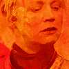
texture re-sized from this by unknown maker
I've only tried them with painty textures but who knows? the bottom line is, i wouldn't have stumbled on these effects without scrolling through all the layer modes first. and hey, if it doesn't work, there's always screen lol.
FAVORITE TEXTURES

>>>


by happy_harper13 on screen for grunge

>>>


by innocent_lexys on screen (mostly) for lighting

>>>


by pandavirus on screen and softlight for grunge/lighting

>>>


by pandavirus on normal (mostly) for background/design purposes
other favorites:


innocent_lexys x2 | sk943283 | happy_harper13
FAVORITE TEXTURE SETS
cosmic love textures by pandavirus
34 textures by pandavirus
indian woman by innocent_lexys
are we on the same page? by lookslikerain
write me a song by nokitas
if it isn't obvious, my favorite texture makers are innocent_lexys and pandavirus (even though they're not so active anymore these days T_T). Theirs are basically the first texture folders i open. if i can't find the answer there then i go hunting in my other folders. i also use a lot of textures provided in the inspiration posts at 20inspirations because i'm a lazy texture hunter.
USING ARCHIVE.ORG AS A TEXTURE RESOURCE
a trick i learned from mmorow @ tumblr (which they talk about here and here) is to go to archive.org and search through vintage books for pictures. this works especially when you're looking for something related to nature. it's a long process of clicking through old books but totally worth the time.


found using deer, zodiac, bear, rose, castle respectively as search terms
~
liesmiths asked: Is it possible to ask for a sort of general text guide? I'd just like to find out about your thought process when you use it, basically.
FINDING INSPIRATION
There are usually 2 ways I go about text in my icons. The first is being inspired by the words themselves. I love poetry and I love music and sometimes, I'll stumble on a poem or I'll be listening to a song and I'll go--oh that'll go great with [insert fandom/ship/character here]! and that basically forces me to go on a cap hunt as soon as I can. communities like greatpoets or sharingpoetry and a sea of quotes at tumblr are some of my favorite sites for poem hunting.
The second way is probably the more normal way in that I make an icon and think something's missing so I go quote hunting. google and imdb is your best friend during times like these. the lyric search function at songmeanings.net is also a great resource. just type in a general phrase and you can search through the results for variations.
as for design inspiration, I used to rely a lot on tilty and takethewords. sadly, they've stopped making icons *tears* but I go through their comms when I'm stuck without ideas. tumblr is also a great source. cesarelucrezia, jaqaciak, repeatingyourspeeches and travellersfarfromhome are my current faves. magazine spreads and book covers can be inspiring too.
EMPHASIS, EMPHASIS, EMPHASIS!


emphasis through: italicization | capitalization | different sizes | different colors | different fonts
I have a style which is well, for the lack of a better word--poetic (duh! given that most of my text is taken from poetry.) My process is simple, really. First, I take the phrase/sentence I want to put into my icon and break it into lines or words (or sometimes even syllables). Then I decide which words or lines have more weight and find a way to emphasize it. and that's it! Easy, peasy.

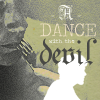


mixing 'n matching techniques
For Example:
Let's say I get inspired by this:
because that is the nature of love, because one walks alone
through the ruins of the heart, because the young must sleep
- Las Ruinas del Corazon, Eric Gamalinda
90% of the time, I'd end up with something like this:

I want to go simple yet effective so I choose one of my go-to fonts Baskerville Old Face for bulk of the text and New Baskerville for the accent. There are 4 text layers all in all--one for the regular font with a layer mask applied to hide the words I want italicized and one for each italicized word. I find that wide spacing between lines works better for something like this, especially when it comes to icons because the canvas is smaller.
(I'm doing this tumblr-sized by the way so it's easier to see. The layout might change when I resize it but the process is the same.)
A Couple More Tips that's probably been said a lot of times before but what the hell:
1. When in doubt, put each word in different layers. This makes it easier to change things/move everything around.
2. Always check your anti-alias settings. My default is on Smooth but sometimes Crisp is also a good option.
3. If the text is too thin/weak, sometimes duplicating it works better than putting it on bold.
4. Use the eyedropper to pick colors for your font that are already present in your canvas. This helps tie everything up visually.
5. Don't merge/rasterize until you're absolutely sure you're happy with your text. Better yet, keep duplicates of your text layers just in case you change your mind. but when you are happy with your text, rasterize it and add a little blur (there's always edit > fade if it's too strong). The smoother edges help blend the text to the icon better. I also sometimes lower the opacity to 90-99% for the same reason.
CHOOSING FONTS
I don't think of myself as a typography expert seeing as I have to re-google what Serif means at least once a year because I keep forgetting lol but in my head, I put fonts in 2 categories.
Basic Fonts
or the core fonts you already find installed on your computer. For most of your text needs, nothing beats a classic. works especially well when you want to put actual paragraphs of text. alternately, also works for single words when you want to create quick and effective impact.


Decorative Fonts
When you're feeling a bit fancy and playful. scripty fonts work especially great for word emphasis. handwritten scrawly fonts work when you want something bold and heavy across your icon and you don't care if your subject is obscured.


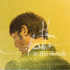

For Example:
Again, let's say I get inspired by these lines:
Very quick. Very intense, like a wolf
at a live heart, the sun breaks down.
- Wolf Canto, Simone Muench
and this is what I come up with:

to start with, of course I want to emphasize the word "wolf" so it's the first thing I type out. I choose Klinic Slab for the font because it's a gorgeous, classic Serif and put it on all caps and a big-ass font size. Next, I type out "like a" above it, with the same font on small caps and smaller size. I add hyphens on each side of the phrase to give it a little more balance. The next word I want emphasized is "heart" so again I type it out on a different layer. I want to differentiate it from "wolf" so I choose another font Frenchy which is thin with a sort of whimsy. I type out "at a" in a different layer and make it teeny tiny because who cares, it's just an article and a preposition. Finally I type out "live" and decide to go for a scripty font (again to differentiate it from "wolf" and "heart"). I choose Lavanderia which is very romantic, capitalizing the "L" again to balance it out with the loopy "e" at the end. here are all my layers. If you'll notice "wolf", "heart" and "live" are all duplicated, again, to give them more weight.
Here have some font recs because who doesn't love font recs?

INCORPORATING TEXT INTO COMPOSITION
if you find yourself stuck on a way to make text more exciting for you, I have one piece of advice: try to copy something you like.

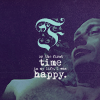


inspired by: stuff I saw on tumblr x3 | stuff I saw in magazines x2
but but but isn't that the quickest way to get yourself bashed on anon_icon or cheap_knockoffs? to that I say, eh...very few things in this world are original. and how are you supposed to learn new techniques if you don't try out what other people do? eventually, you'll learn how to tweak it into your own style but there's no shame in finding a starting point to jump off from.
in any case, here are two ways I like to incorporate text into my icon design:
Tiny Text
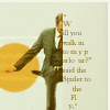
yeah, it's not trendy anymore but long live tiny text tbh! whether to make your icon look more storybook-like or to add tiny accents (or not-so tiny ones like in the ben whishaw icon below), tiny text is just awesome! of course, only actually do this if you don't need your text to be read.


Work Paths
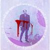
something I stumbled on recently, work paths are a great way to add shape to your text. there are two options: to force your text inside a certain shape (the first Hannibal icon) or to use text as an outline to your shape or subject (the other 4 icons). I'll go into specifics--with pictures and everything--on how to do this in my next tutorial because this is already too long (edit: as promised, here it is) but I'll talk about it a little below.


For Example:
Once again, I'm inspired by some poetry:
A woman is a carving.
A woman is a knife.
A woman.
- Spectacle: Possession, Simone Muench
and I end up with this:

Obviously, "knife" is my starting point. I want to make better use of the negative space at her right so I draw an outline over the subject using the lasso tool, right click and select "Make Work Path" from the options. I click the text tool, hover over the line of the work path and wait for the cursor to make a sort of "I" with a dash through it. click there, write the text and choose your font (for this, it's St. Marie). the weirder your outline is, the more jumbled your text will be so just play around with the settings until you find an acceptable (and readable if that's what you're going for) compromise. since i want the word "knife" to be large, it takes a fair amount of tweaking before I'm happy. (if you're trying this out in the future, don't panic--you'll get there eventually). Next, I do "woman." I want a scripty font to differentiate it and end up with Sunshine in My Soul. I transform it so it sort of aligns better with "knife." I use the eyedropper tool to pick a hue from the canvas, again to further emphasize it. Lastly I type out "A" in one layer and "in a" in another and move them around until I'm happy with size and placement. here are all my layers.
phew, this was harder to write than I expected.
~
a_cheshire_grin asked: I was wondering if you could do a guide on how you achieve the vintage colouring on your icons.
BASIC STEPS/TOOLS
Hard Light Color Fill Layers
usually of reddish/brownish tone (see below) but it can change depending on icon

try to keep within the area of the red circle. too light a color washes out the icon
The White Saturation Layer
the secret ingredient to my muted icons is a simple white color fill layer set to saturation at 20-50% opacity. read more about it here
The Grey Color Fill Layer
white is never really white in most vintage artwork I find. even if it's high contrast, the whites are always a dull. so banish those whites with a grey color fill layer set to multiply or linear burn--depending on how strong you want the effect to be. you can also use a light blue hue instead.
The Paint Brush
as popularized in icons by hauntes the paint brush is a handy tool to help with the coloring of clothes, hair, lips, skin tone, etc... see it in action with one of my icons here
HOW TO GET SIMPLE BROWN VINTAGE COLORING

>>>
ONE
So you've lightened your cap using curves or duplicated layers or whatever you use and cropped it to your icon canvas. The first thing I always do is add some shadows using a black and white gradient fill layer on softlight

>>>
TWO
Now it's time to make it brown. Add a new color fill layer and set it to hard light. Move your color picker around the red/orange area until you find the perfect shade. For this icon it's a dull pinkish hue #ae8c8c.

>>>
THREE
When I'm happy with the color, I always stamp everything on to a new layer, desaturate it, set it to hard light and lower the opacity. Why desaturate it? because a colored hard light layer can be too harsh and change your coloring. if it's black and white, mostly only the shadows and contrast are changed and if it does affect your coloring, it will only desaturate it a bit, which helps if you're going for the muted vintage style. this also works with soft light, by the way but i find that with lowered opacity, hard light gives me more room to tweak things. needless to say, the higher the opacity the stronger your blacks become so I like to keep it within 20-50% (for this icon, it's at 33%)

>>>
FOUR
Now get rid of the whites with a grey color fill layer

>>>
FIVE
for the final tweaks, I always add brightness and lessen the contrast a bit before saving the icon. here, we have my default value of 10/-10.

and if you find yourself unhappy with the whites (like I was in this case) you can add another grey color fill layer. this time, it's set to color burn, 50%

>>>
and that's it! everything you need to know about iconning theotherayn style. lol again, if you need anything clarified just ask.
profile | resources | tags | old icons | watch | request
or The Let's-Pretend-I-Know-What-I'm-Talking-About Guide to Text, Textures and Vintage Coloring (warning: image heavy and sorry in advance for my rambling XD)
raiindust asked: I'd love to know about how you use textures in your icons (for general texture, for composition elements or something completely different). Also, favourite textures &/or texture makers?
HOW DO I USE TEXTURES IN MY ICONS????
to be honest, i'm not quite as texture-happy as i used to be so i'm not sure i deserve to make a guide. in general, i've been trying to think about what i do more rather than just slapping things on for the heck of it. not that i'm not still guilty of that...
slapping textures on for the heck of it. sometimes it...works? lol you judge.
but here's what i usually use textures for anyway:


background elements | symbolism | lighting | grunge | composition
Background Elements
err quite self-explanatory, to use as background decoration or fake backgrounds. usually stock pictures or wallpaper textures but can be anything colorful/painty too. I also love using newspaper/book pages/magazine textures for this.
Symbolism/Decorative Elements
pick an animal or object (or anything connected to nature, really) that relates closely with your subject and put it in your icon. mostly used as background elements also but i sometimes put it in the foreground too. usually in white, or a white silhouette.
Lighting/Color
again, self-explanatory but i love the additional color boost that lighting textures give (presuming the light texture is colored and not black and white of course)
Grunge/Paint
I love grunge. seriously, LOVE IT. i don't know how i ever iconned without grunge textures before. you know what's even better? combining it with painty textures. you'll see some examples below.
Composition/Framing
and finally, the textures I use to help liven things up a bit. most of the time I use vintage frames but they can also be geometric shapes--circles, rectangles or squares (haven't tried triangles yet but soon...)
BUT HOW DO I USE TEXTURES IN MY ICONS????
the short answer? SCREEN ALL THE THINGS! and boom: instant profit! like literally, my textures are almost always on screen mode (also multiply and soft light.) but a lot of effects can be achieved while playing around with the other seldom used blending modes too:
difference can add interesting texture to silhouettes
+
=
>>>
texture by pandavirus
for those times when a plain white silhouette is just boring. you can read on how to achieve the effect here.
turn your icon into a painting using exclusion!
+
=
>>>
texture by vetica
dark, high contrast cap + painty texture on exclusion = icon painting! add a little bit of grunge and it's perfect to hang on walls or something.
a lighting texture on subtract can give you awesome shadows
+
=
>>>

texture by innocent_lexys
without the subtract layer it's a little blah. in my opinion at least.
divide and pin light (respectively) can have bizarre yet fun results
+
=
>>>
texture by pandavirus
+
=
>>>

texture re-sized from this by unknown maker
I've only tried them with painty textures but who knows? the bottom line is, i wouldn't have stumbled on these effects without scrolling through all the layer modes first. and hey, if it doesn't work, there's always screen lol.
FAVORITE TEXTURES
>>>
by happy_harper13 on screen for grunge
>>>


by innocent_lexys on screen (mostly) for lighting
>>>

by pandavirus on screen and softlight for grunge/lighting
>>>

by pandavirus on normal (mostly) for background/design purposes
other favorites:
innocent_lexys x2 | sk943283 | happy_harper13
FAVORITE TEXTURE SETS
cosmic love textures by pandavirus
34 textures by pandavirus
indian woman by innocent_lexys
are we on the same page? by lookslikerain
write me a song by nokitas
if it isn't obvious, my favorite texture makers are innocent_lexys and pandavirus (even though they're not so active anymore these days T_T). Theirs are basically the first texture folders i open. if i can't find the answer there then i go hunting in my other folders. i also use a lot of textures provided in the inspiration posts at 20inspirations because i'm a lazy texture hunter.
USING ARCHIVE.ORG AS A TEXTURE RESOURCE
a trick i learned from mmorow @ tumblr (which they talk about here and here) is to go to archive.org and search through vintage books for pictures. this works especially when you're looking for something related to nature. it's a long process of clicking through old books but totally worth the time.

found using deer, zodiac, bear, rose, castle respectively as search terms
~
liesmiths asked: Is it possible to ask for a sort of general text guide? I'd just like to find out about your thought process when you use it, basically.
FINDING INSPIRATION
There are usually 2 ways I go about text in my icons. The first is being inspired by the words themselves. I love poetry and I love music and sometimes, I'll stumble on a poem or I'll be listening to a song and I'll go--oh that'll go great with [insert fandom/ship/character here]! and that basically forces me to go on a cap hunt as soon as I can. communities like greatpoets or sharingpoetry and a sea of quotes at tumblr are some of my favorite sites for poem hunting.
The second way is probably the more normal way in that I make an icon and think something's missing so I go quote hunting. google and imdb is your best friend during times like these. the lyric search function at songmeanings.net is also a great resource. just type in a general phrase and you can search through the results for variations.
as for design inspiration, I used to rely a lot on tilty and takethewords. sadly, they've stopped making icons *tears* but I go through their comms when I'm stuck without ideas. tumblr is also a great source. cesarelucrezia, jaqaciak, repeatingyourspeeches and travellersfarfromhome are my current faves. magazine spreads and book covers can be inspiring too.
EMPHASIS, EMPHASIS, EMPHASIS!
emphasis through: italicization | capitalization | different sizes | different colors | different fonts
I have a style which is well, for the lack of a better word--poetic (duh! given that most of my text is taken from poetry.) My process is simple, really. First, I take the phrase/sentence I want to put into my icon and break it into lines or words (or sometimes even syllables). Then I decide which words or lines have more weight and find a way to emphasize it. and that's it! Easy, peasy.


mixing 'n matching techniques
For Example:
Let's say I get inspired by this:
because that is the nature of love, because one walks alone
through the ruins of the heart, because the young must sleep
- Las Ruinas del Corazon, Eric Gamalinda
90% of the time, I'd end up with something like this:
I want to go simple yet effective so I choose one of my go-to fonts Baskerville Old Face for bulk of the text and New Baskerville for the accent. There are 4 text layers all in all--one for the regular font with a layer mask applied to hide the words I want italicized and one for each italicized word. I find that wide spacing between lines works better for something like this, especially when it comes to icons because the canvas is smaller.
(I'm doing this tumblr-sized by the way so it's easier to see. The layout might change when I resize it but the process is the same.)
A Couple More Tips that's probably been said a lot of times before but what the hell:
1. When in doubt, put each word in different layers. This makes it easier to change things/move everything around.
2. Always check your anti-alias settings. My default is on Smooth but sometimes Crisp is also a good option.
3. If the text is too thin/weak, sometimes duplicating it works better than putting it on bold.
4. Use the eyedropper to pick colors for your font that are already present in your canvas. This helps tie everything up visually.
5. Don't merge/rasterize until you're absolutely sure you're happy with your text. Better yet, keep duplicates of your text layers just in case you change your mind. but when you are happy with your text, rasterize it and add a little blur (there's always edit > fade if it's too strong). The smoother edges help blend the text to the icon better. I also sometimes lower the opacity to 90-99% for the same reason.
CHOOSING FONTS
I don't think of myself as a typography expert seeing as I have to re-google what Serif means at least once a year because I keep forgetting lol but in my head, I put fonts in 2 categories.
Basic Fonts
or the core fonts you already find installed on your computer. For most of your text needs, nothing beats a classic. works especially well when you want to put actual paragraphs of text. alternately, also works for single words when you want to create quick and effective impact.


Decorative Fonts
When you're feeling a bit fancy and playful. scripty fonts work especially great for word emphasis. handwritten scrawly fonts work when you want something bold and heavy across your icon and you don't care if your subject is obscured.


For Example:
Again, let's say I get inspired by these lines:
Very quick. Very intense, like a wolf
at a live heart, the sun breaks down.
- Wolf Canto, Simone Muench
and this is what I come up with:
to start with, of course I want to emphasize the word "wolf" so it's the first thing I type out. I choose Klinic Slab for the font because it's a gorgeous, classic Serif and put it on all caps and a big-ass font size. Next, I type out "like a" above it, with the same font on small caps and smaller size. I add hyphens on each side of the phrase to give it a little more balance. The next word I want emphasized is "heart" so again I type it out on a different layer. I want to differentiate it from "wolf" so I choose another font Frenchy which is thin with a sort of whimsy. I type out "at a" in a different layer and make it teeny tiny because who cares, it's just an article and a preposition. Finally I type out "live" and decide to go for a scripty font (again to differentiate it from "wolf" and "heart"). I choose Lavanderia which is very romantic, capitalizing the "L" again to balance it out with the loopy "e" at the end. here are all my layers. If you'll notice "wolf", "heart" and "live" are all duplicated, again, to give them more weight.
Here have some font recs because who doesn't love font recs?
INCORPORATING TEXT INTO COMPOSITION
if you find yourself stuck on a way to make text more exciting for you, I have one piece of advice: try to copy something you like.


inspired by: stuff I saw on tumblr x3 | stuff I saw in magazines x2
but but but isn't that the quickest way to get yourself bashed on anon_icon or cheap_knockoffs? to that I say, eh...very few things in this world are original. and how are you supposed to learn new techniques if you don't try out what other people do? eventually, you'll learn how to tweak it into your own style but there's no shame in finding a starting point to jump off from.
in any case, here are two ways I like to incorporate text into my icon design:
Tiny Text
yeah, it's not trendy anymore but long live tiny text tbh! whether to make your icon look more storybook-like or to add tiny accents (or not-so tiny ones like in the ben whishaw icon below), tiny text is just awesome! of course, only actually do this if you don't need your text to be read.
Work Paths
something I stumbled on recently, work paths are a great way to add shape to your text. there are two options: to force your text inside a certain shape (the first Hannibal icon) or to use text as an outline to your shape or subject (the other 4 icons). I'll go into specifics--with pictures and everything--on how to do this in my next tutorial because this is already too long (edit: as promised, here it is) but I'll talk about it a little below.


For Example:
Once again, I'm inspired by some poetry:
A woman is a carving.
A woman is a knife.
A woman.
- Spectacle: Possession, Simone Muench
and I end up with this:
Obviously, "knife" is my starting point. I want to make better use of the negative space at her right so I draw an outline over the subject using the lasso tool, right click and select "Make Work Path" from the options. I click the text tool, hover over the line of the work path and wait for the cursor to make a sort of "I" with a dash through it. click there, write the text and choose your font (for this, it's St. Marie). the weirder your outline is, the more jumbled your text will be so just play around with the settings until you find an acceptable (and readable if that's what you're going for) compromise. since i want the word "knife" to be large, it takes a fair amount of tweaking before I'm happy. (if you're trying this out in the future, don't panic--you'll get there eventually). Next, I do "woman." I want a scripty font to differentiate it and end up with Sunshine in My Soul. I transform it so it sort of aligns better with "knife." I use the eyedropper tool to pick a hue from the canvas, again to further emphasize it. Lastly I type out "A" in one layer and "in a" in another and move them around until I'm happy with size and placement. here are all my layers.
phew, this was harder to write than I expected.
~
a_cheshire_grin asked: I was wondering if you could do a guide on how you achieve the vintage colouring on your icons.
BASIC STEPS/TOOLS
Hard Light Color Fill Layers
usually of reddish/brownish tone (see below) but it can change depending on icon
try to keep within the area of the red circle. too light a color washes out the icon
The White Saturation Layer
the secret ingredient to my muted icons is a simple white color fill layer set to saturation at 20-50% opacity. read more about it here
The Grey Color Fill Layer
white is never really white in most vintage artwork I find. even if it's high contrast, the whites are always a dull. so banish those whites with a grey color fill layer set to multiply or linear burn--depending on how strong you want the effect to be. you can also use a light blue hue instead.
The Paint Brush
as popularized in icons by hauntes the paint brush is a handy tool to help with the coloring of clothes, hair, lips, skin tone, etc... see it in action with one of my icons here
HOW TO GET SIMPLE BROWN VINTAGE COLORING
>>>
ONE
So you've lightened your cap using curves or duplicated layers or whatever you use and cropped it to your icon canvas. The first thing I always do is add some shadows using a black and white gradient fill layer on softlight
>>>
TWO
Now it's time to make it brown. Add a new color fill layer and set it to hard light. Move your color picker around the red/orange area until you find the perfect shade. For this icon it's a dull pinkish hue #ae8c8c.
>>>
THREE
When I'm happy with the color, I always stamp everything on to a new layer, desaturate it, set it to hard light and lower the opacity. Why desaturate it? because a colored hard light layer can be too harsh and change your coloring. if it's black and white, mostly only the shadows and contrast are changed and if it does affect your coloring, it will only desaturate it a bit, which helps if you're going for the muted vintage style. this also works with soft light, by the way but i find that with lowered opacity, hard light gives me more room to tweak things. needless to say, the higher the opacity the stronger your blacks become so I like to keep it within 20-50% (for this icon, it's at 33%)
>>>
FOUR
Now get rid of the whites with a grey color fill layer
>>>
FIVE
for the final tweaks, I always add brightness and lessen the contrast a bit before saving the icon. here, we have my default value of 10/-10.
and if you find yourself unhappy with the whites (like I was in this case) you can add another grey color fill layer. this time, it's set to color burn, 50%
>>>
and that's it! everything you need to know about iconning theotherayn style. lol again, if you need anything clarified just ask.
profile | resources | tags | old icons | watch | request