Tutorial/Guide
==>
==>
I had LOTS of problems making icons when i first started. I didn't know how to use textures, be creative and achieve certain looks. I was very frustrated by this. That is why I always post most of the textures I've used to make my icons, and that's why I'm making this guide. There are other useful guides out there, but I thought adding another couldn't hurt. I hope this is clear.
I have no PSD's. I couldn't get the exact coloring as the originals. Experiment and have fun!!
Using the Clone Stamp Tool
==>
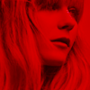
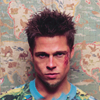
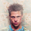
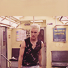
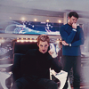
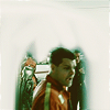
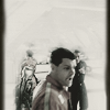
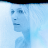
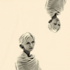
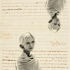
1.
this is my base which is already colored
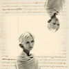
2.
+
=

i add this light texture and change it from normal to screen. i duplicate it, smudge and erase certain parts until i'm satisfied.
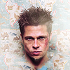
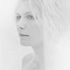
3.
i sharpen my pictures by duplicating the base and sharpening the copy

(the reason why i sharpen the copy and NOT the base is that sometimes the sharpened look is too much. if that is the case, i simply lower the opacity of the duplicate so that the sharpened copy and base blend into something i like)
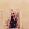
4.
this pic is a result of the above step. it is sharpened, but not TOO sharp. however, i like the completely sharpened look on this pic, so i don't change the opacity of the copy.
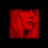
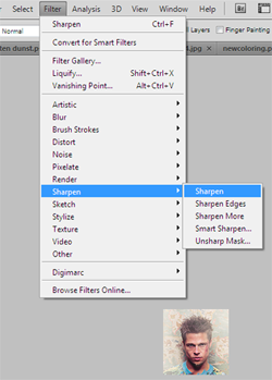
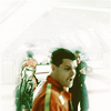
5.
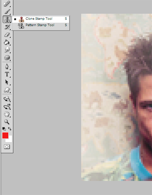
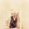
use the clone stamp tool by pressing ALT on the part of the icon you want to "clone," then brush

this was the result when i was done
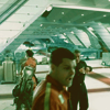
An Easy Way to Blend Any Picture
==>
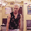
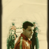
1.
this is my base which has already been colored
2.
i add a new layer and color it with something similar to the colors in the picture. then i shrink the base.
3.
i lower the opacity of my eraser and erase the edges of the base
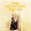
4.
then i add some light textures to it and adjust my coloring until i'm satisfied
(don't be afraid to add text to your pictures. i decided on "spike: motherfuckin bad ass")
this was the result when i was done
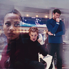
This is Another Example of Using the Above Method

==>
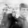
1.
i shrank the base and added a similar color layer underneath my pic
2.
then i erased the edges
3.
then i added uhura by using the eraser on a lowered opacity to remove her background. this helps it to look naturally blended
4.
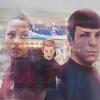
i added spock and lightened it up a bit
5.
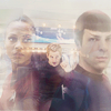
then i added some light textures and made it black and white:
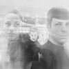
(sometime it's good to merge all your layers, duplicate your pic, then set the copy to soft light and maybe even color burn)
this was the result when i was done, the most awesome of awesome star trek trios!
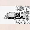
Don't be Afraid to Go Wild and Crazy With Your Textures
==>
or
1.
there are many ways to erase a background, but i usually do it with the magnetic lasso tool. once you do that, you can add any color background...
2.
3.
or you can make it black and white
4.
or you can combine the two
5.
and then add different variations
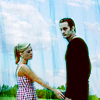
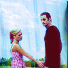
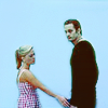
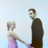
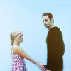
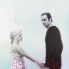
Smudging Your Backgrounds

==>

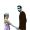
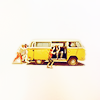
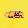
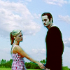
1.
this is my already colored base. i make a copy of the unsmudged base then leave it alone
2.

i smudge the base until i'm left with the focus of my icon, jack and juliet.
(i set my unsmuged base to screen. i duplicate this screen layer until i'm satisfied)
3.
+
(screen) =
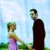
this was the result when i was done
This is Another Example of Using the Above Method
==>
1.
this is my already colored base. i duplicate it and leave the copy alone
2.
i smudge the base until i'm left with just galen and miscellaneous, lol
(i set my unsmudged copy to screen and duplicate it until i'm satisfied)
3.
+
(screen) =
(then i added one of my own tetures and set it to color burn)
4.
+
(color burn) =
(then i desaturated it 100% and then added another texture and set it to color 31%)
5.
+

(color 31 %) =
this was the result when i was done
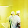
Don't Be Afraid to Set Your Textures to Saturate!
==>
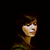
1.
this is my already colored and lightened base of eric and sookie.
2.
+
=
3.
+
(soft light 100%)=
(i erased some spots)
4.
+

(saturate 100%) =
(i erased some spots again)
this was my final result
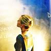
More Saturation!
==>
1.
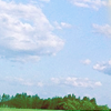
this is my already colored base set against a blue background
2.
i added some light textures
(screen 85%)
(then i set a texture to soft light 30% and another texture to saturation 100%)
3.
+
(soft light) &

(saturation 100%) =
this was my result
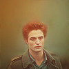
Don't Give Up On an Icon That's NOT Working!
==>
1.
a b&w pic colored red (get a red layer and set it to multiply over pic). i hated it and did this:
2.

i hated that too cause i thought it was repetitive to the icons i already had. so i lowered the opacity of my eraser and erased the edges
this was my result
More Not Giving Up, lol!
==>
1.
this is a b&w white pic lightened with this texture
2. i flipped this texture

, made it b&w

then erased the left side of it
3.
this i got by setting the above result to screen
4.
+
(duplicate this texture and set one to color and the other to saturate100%) =
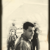
Making Your Own Thing When Nothing Works
==>
1.
this is my base. i tried alot of textures but none worked, so i fooled around until i got this:
2. from this
==>
by copying it, flipping the copy and erasing the top. i merged the two, duplicated it and set the copy to screen.
3.
+

(i erased this and turned it into a square) =
ETA Textures are by:
navras_rheya
always_muneca
elessar83
mellowmint
Helpful Tutorials


--I sincerely hope this is useful
--You can post icons of old and ppl can say what they'd change or add to make it better...anonymously!
--I'll add more examples as I go
--If you're not clear about something let me know :]
--Enjoy!!!!