I C O N T U T O R I A L #001
ICON TUTORIAL #001: Harry and Hermione as requested by silmarwen_85
This was made with Paint Shop Pro 9, though it should be easily transferable to other programs.
You'll need basic knowledge of layers.
This is a relatively simple tutorial, it's basically all about coloring and experimenting.
Please do not copy this exactly, use you own ideas.
I'd love to see what you come up with!
S T E P O N E
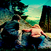
I cheated the system and didn't fight with a screen cap this time. Now as fun as making your own crop up and toying around with it is, I was being lazy and just used one of these from damnicons. Which I absolutely love and worship. (I used a different base than the one in the icon because I wanted to play around with the variety. It's just slightly different and therefore still gets the same results.)

First we start off with our base, which in this case is really blurry so I sharpened it once before deciding to add an unsharp mask to it with my settings at:
Radius: 19.00 Strength: 20 Clipping: 21 Luminance: Unchecked
S T E P T W O
We need to lighten up our base so we can add the lighting effects to it later, so we're going to duplicate the background image twice. And then set both of those duplicates to screen and keep them at 100%. The opacity really depends on your image though, if it's already light you may need to lower the opacity of one of the layers or even both of them. Your base should now look something like this:

S T E P T H R E E
Here's where we start the coloring. We add the infamous exclusion layer. I used #041746.

Then we're going to lower the opacity to around 80%. This really depends on how you want the icon to look, there should be a faint yellow to the picture now, though. Now our background should look something like this:

S T E P F O U R
This is the part where it really becomes what you want the icon to look like. When I originally played around with this icon I wanted more of a red glow to the top but later decided against it. Therefore, there are two options to this step.
We're going to add a gradient now that should be darker on the top and lower on the bottom. I recommend that you play around with a bunch of gradients for this part as they can really change your whole icon. (If you know where these gradients came from, that would be greatly appreciated!)
GRADIENT #1: GRADIENT #2:


No matter what gradient you use, set the layer to burn. Keep the opacity at 100% unless you feel that the coloring is too over powering, in which case don't lower it past 80%.
Using the first gradient, our icon will look something like this:

With the second gradient, the icon looks like this:

S T E P F I V E
Now, we're going to add a little more depth to the icon with another gradient.

Set this gradient to soft light and lower the opacity to somewhere between 50%-60%, what ever you feel looks the best.
This is what your icon will look like now:
OPTION #1:
OPTION #2:
S T E P S I X
Now we're simply going to merge our image together. You can do this by going to Layers >> Merge >> Merge All [Flatten]. Or you can do it by right clicking on your layers palette.
S T E P S E V E N
For this next part you're going to need to use your dodge tool. Mine was set at:
Size: 32 Hardness: 10 ... Opacity: 35 Limits: Highlights
Now, anywhere that would be lighter gets brushed over with the dodge tool. This is mainly just certain areas of the sky. It'll just lighten it a little, pulling more of the teals and blues out.
You're also going to want to switch over to your burn tool when you've finished with the dodge tool. Keeping the default settings, whatever they are for you, lower the opacity to about 10 and gently brush over the ground and the corners of the sky. This just adds to the depth that we want to create with the coloring.
This is what we have now:
S T E P E I G H T
I thought that the icon was still a little too dark so I duplicated it and set that layer to screen. Then I lowered the opacity to 30%.
Now we have our finished icon:

I'd love to see what you guys can come up with from this. Comments are always appreciated.
This was made with Paint Shop Pro 9, though it should be easily transferable to other programs.
You'll need basic knowledge of layers.
This is a relatively simple tutorial, it's basically all about coloring and experimenting.
Please do not copy this exactly, use you own ideas.
I'd love to see what you come up with!
S T E P O N E
I cheated the system and didn't fight with a screen cap this time. Now as fun as making your own crop up and toying around with it is, I was being lazy and just used one of these from damnicons. Which I absolutely love and worship. (I used a different base than the one in the icon because I wanted to play around with the variety. It's just slightly different and therefore still gets the same results.)
First we start off with our base, which in this case is really blurry so I sharpened it once before deciding to add an unsharp mask to it with my settings at:
Radius: 19.00 Strength: 20 Clipping: 21 Luminance: Unchecked
S T E P T W O
We need to lighten up our base so we can add the lighting effects to it later, so we're going to duplicate the background image twice. And then set both of those duplicates to screen and keep them at 100%. The opacity really depends on your image though, if it's already light you may need to lower the opacity of one of the layers or even both of them. Your base should now look something like this:
S T E P T H R E E
Here's where we start the coloring. We add the infamous exclusion layer. I used #041746.
Then we're going to lower the opacity to around 80%. This really depends on how you want the icon to look, there should be a faint yellow to the picture now, though. Now our background should look something like this:
S T E P F O U R
This is the part where it really becomes what you want the icon to look like. When I originally played around with this icon I wanted more of a red glow to the top but later decided against it. Therefore, there are two options to this step.
We're going to add a gradient now that should be darker on the top and lower on the bottom. I recommend that you play around with a bunch of gradients for this part as they can really change your whole icon. (If you know where these gradients came from, that would be greatly appreciated!)
GRADIENT #1: GRADIENT #2:
No matter what gradient you use, set the layer to burn. Keep the opacity at 100% unless you feel that the coloring is too over powering, in which case don't lower it past 80%.
Using the first gradient, our icon will look something like this:
With the second gradient, the icon looks like this:
S T E P F I V E
Now, we're going to add a little more depth to the icon with another gradient.
Set this gradient to soft light and lower the opacity to somewhere between 50%-60%, what ever you feel looks the best.
This is what your icon will look like now:
OPTION #1:
OPTION #2:
S T E P S I X
Now we're simply going to merge our image together. You can do this by going to Layers >> Merge >> Merge All [Flatten]. Or you can do it by right clicking on your layers palette.
S T E P S E V E N
For this next part you're going to need to use your dodge tool. Mine was set at:
Size: 32 Hardness: 10 ... Opacity: 35 Limits: Highlights
Now, anywhere that would be lighter gets brushed over with the dodge tool. This is mainly just certain areas of the sky. It'll just lighten it a little, pulling more of the teals and blues out.
You're also going to want to switch over to your burn tool when you've finished with the dodge tool. Keeping the default settings, whatever they are for you, lower the opacity to about 10 and gently brush over the ground and the corners of the sky. This just adds to the depth that we want to create with the coloring.
This is what we have now:
S T E P E I G H T
I thought that the icon was still a little too dark so I duplicated it and set that layer to screen. Then I lowered the opacity to 30%.
Now we have our finished icon:
I'd love to see what you guys can come up with from this. Comments are always appreciated.