guide | less than ideal caps
requested by: partitioning for icon_talk
A long-ish guide to working with caps from older fandoms and/or less than ideal caps. This is also where I talk entirely too much about making Buffy, Veronica Mars and Supernatural icons.
Buffy the Vampire Slayer
I tend to favor a more muted coloring with Buffy icons due to the overall lack of color in most of the caps. The examples below are images from season 1 and season 5 of the show. Note that the quality is just a tad on the upside of LQ to MQ (which is pretty much all you're going to get with Buffy caps) and that the overall colors tend to lean on browns, reds and yellow/oranges, even in the later seasons. Rather than spend countless hours wasting time trying to get rid of these colors, it's much easier to just go with the flow and work with what is already there. Colorings with yellows, reds, browns and oranges are your best bet. But don't go overboard. Hue/Saturation and Vibrance adjustments tend to bring out the yuckier yellows, browns and reds in the caps, so if you want to use these adjustments, I recommend MODERATION. Also: lighting is important. Most, if not all of these caps are very dark! Screen layers or Curves are going to be your friends.
Base Prep
I don't prep these caps beyond cropping. They tend to get yucky fast if you go overboard with base prep.
Original Cap -> resized to 200x200 ->

Original Cap -> resized to 200x200 ->

Basic Coloring
-- Remember, MUTED COLORING IS YOUR FRIEND. Vibrant colors, especially on the dark caps (which is like, the majority of the series, let's be real here) are going to make things ugly fast. Stick to soft lighting, minimal contrast, and neutral colors like brown, red, orange and yellow. I'll show you some basic colorings in the caps below. This will be beginner level minimalistic stuff FYI. Easier to follow along with, I think. :)


Duplicate base + Sharpen + Topaz Clean I know some people shy away from Topaz because of how intense it is, but I like it for Buffy caps. Coupled with sharpening, the result is a nicely cleaned up base.
Left: I faded the sharpening to around 45% and faded the Topaz to around 40-45%. The image is a little rough looking, but I like a grainy look to my icons, which is why I stuck to a heavier sharpening with this one. On a new layer above the duplicated base, I added a reddish/brown color fill set to Normal around 10-12% to bring out the soft browns in the image. This doesn't work all the time. I just tried it out and liked how it looked!
Right: I faded the sharpening to around 20-21% because the lines around her mouth got too defined. Same goes for the Topaz. It made her mouth look weird. I blurred the lines around her mouth a little with the blur tool to clean up the base a little.


To brighten the images up, I used Curves on the RGB channel. I just pulled the dot up the center of the graph and fiddled around until it was bright enough. You could also easily do this with Screen layers (4-5 screen layers usually looks pretty good for brightening). I like Curves because the result is cleaner and prettier IMO. After that, I added one more curves layer (adjusting just the RGB channel) for additional contrast to even things out.


Here I added a dark gray/white gradient map to each image. I like gradient maps for contrast, tamping down colors and even for some added sharpening.
Left: Dark gray/white gradient map set to Normal @ 50% opacity. I like how it faded the image slightly. The faint brown color added a nice vintage quality, which is what we're going for here.
Right: Dark gray/white gradient map set to Soft Light @ 50% opacity. The contrast is greatly improved here! I liked how it tamped down the overpowering oranges and reds too. Those can get out of control fast and the gradient map nips it nicely in the bud, while maintaining the vibrance overall. I didn't want to kill the color completely because it is quite lovely.


Left: To finish up I added two Vibrance layers set to Color. The first at 100% opacity and the second at 50% opacity. And that's where I ended because I didn't want to go overboard. If you amp up the Vibrance it gets yellow and sickly looking. This could easily be a finished product!
Right: I added a yellow color fill (using the color picker and selecting a color from the image) and a pinkish color fill (color picker again. i selected the pink color from her shirt) and set them both to Soft Light with varying opacities (the yellow was set to 20% and the pink set to 16%.) Very pretty, I think. Subtle yellows and pinks seem to work really well with later season Buffy caps. And that's where I ended.
Further Adjustments
Of course, you can always take things to the next level.

-- I resized the image down to icon size and then copy-merged everything into a new layer. I added some light blobs directly onto the layer with a large soft brush (size 60px, opacity at 30%) in white to enhance her cheek and the tear. I duplicated the light blobbed image and blurred with Gaussian Blur (radius 4px) and set the copy to Soft Light. I lowered the fill of the Soft Light copy to 60% opacity and then went back to the previous layer and lowered the fill of this one to around 5%. I stamped the layers again and added the High Pass filter (radius 0.4) and set the layer to Soft Light at around 30-32%.

-- Resized to 100x100 and stamped the layers. I added auto tone + auto color + auto contrast (fading all the adjustments to @ 20%). Added two Vibrance layers and set the first to Screen at @ 40% and the second to Color at @ 30%. I added a mask to the second Vibrance layer and masked out Buffy's hair because it was too yellow. Created a blank layer set to Soft Light @ 10-20%. With a small soft brush in white I painted over Buffy's face to brighten it a little. I repeated this step on a new blank layer, using black for the shadows in Buffy's hair and to deepen the contrast of her jacket. I created another blank layer and added light blobs. I duplicated the light blobs, gaussian blurred and set the layer to Soft Light once again lowering the opacity of the fill for both light blob layers.
Veronica Mars
It goes without saying that Veronica Mars is not a walk in the park to icon. If you are just venturing into the VM fandom (welcome btw, the more the merrier!) and want to make VM icons than you need a place to start. I now refer you to the BIBLE OF VERONICA MARS ICON-MAKING ™ ---> here by brasaremean. I wouldn't even think about iconning this show if I hadn't read her guide. The images don't show up anymore, but the tips are useful and they work. :)
Common Things You Will Encounter with Veronica Mars caps
Below, I've selected some caps to highlight the various issues you will come across when working with VM caps and some simple coloring tips to get around them.
Overly bright and overly yellow -->

The key with working with the overly yellow images is to mute them down a little. In most cases, the yellow works, but it starts to get old fast until you are at the point where you are just tired of yellow. I usually tend to go with the flow on the yellows and work with them rather than against them. I like a vibrant coloring with VM icons, but I will stay away from adding too much Vibrance to the yellow images. Curves and/or Screen layers will brighten things nicely, but don't go too crazy as things tend to get bright and over-contrasted rather quickly.
To brighten and take away some of the overpowering yellows, I go simple with the coloring.
* screen layer at 100% opacity + screen layer at 70% opacity and de-saturated
* curves (rgb only) for brightness and contrast (opacity lowered to @ 40%)
* duplicate base, drag to the top and set to soft light @ 70%
* color balance (midtones only) to take away red, add a little green and add a smidge of blue
* levels on the rgb channel only for contrast (0 | 0.76 | 1.00)
* selective color (in REDS, slightly adjust the blacks)
* resized to 100x100 and used the blur tool to clean up the icon as all the adjustments made it look a little junky.

Over-saturated colors or one color taking over the entire image -->

The flashback scenes in particular are guilty of this. Lots of heavy blues, greens, pinks and yellows tend to dominate the images. They also tend to be blurred and/or out of focus because that's the style in which the show was shot. As a note, this particular image, I have not been able to work with. Ever. I can't figure out how to get rid of all the blue in the image without totally destroying it. Anytime I think I want to tackle this image I stick with keeping the blues in the icon and just going with the flow of what's already in the image, which tends to make things purple, but eh. We're going with the flow, lol. :)
Going with the flow and working with the blues usually ends up like this:
* screen layer at 100% opacity
* black/white gradient fill set to soft light
* purple/white gradient fill set to hard light
* curves (rgb only) for brightening and enhancing color
* stamp layers and set to soft light
* selective color (adjust reds, yellows and neutrals) this gives it a soft purplish look which I like!
* solid color fill in purple set to soft light
* purple/beige gradient map set to normal at @ 35%
* stamped layers + high pass + topaz clean

And finally....
Dark images where there is color hiding in there, but you have to bring it out! -->

This is one of my favorite VM caps. I love how it's all dark, but you can see some faint yellows and pinks hiding in there just begging to be brought out. And of course, I love a good challenge when it comes to coloring.
Simple coloring for dark VM caps
* screen 100% + screen 100% + screen 50%
* two curves layers (one for brightening, one for contrast, adjust colors on all channels)
* selective coloring (adjust reds, yellows, neutrals) for those yellows and pinks I was talking about
* stamp all the layers set to soft light @ 55%
* add a blank layer set to soft light @ 10-20% and with a small soft brush in white paint over her face for slight brightening
* add a blank layer set to soft light @ 80-100% and with a small soft brush in black paint over the shadows for more contrast
* stamp layers again + high pass + topaz clean

And that pretty much covers the things you're going to most commonly run into with Veronica Mars caps. Now onto the last bit of the guide....working with Supernatural caps!
Supernatural
The biggest gripe I hear from Supernatural icon makers is how dark, grainy, muted and just plain difficult early season caps of this show are. This part of the guide will specifically deal with early season Supernatural caps (season 1 & 2 namely) and the various issues you'll run into when you icon this show. On the upside, this show used to be shot very artistically with attention paid to close up shots and scenery specifically, with the lighting leaning towards a more noir-ish and moody feel, which makes for very cool icons. On the down side, the dark, moody, grungy scenes of the early seasons can be quite a challenge to icon and in some cases can cause a maker to just give up and move on. But, if you're like me and enjoy a challenge, working with these caps can be fun. With a little patience and time you can make these caps work for you. I've been iconning SPN since 2008 and am just now really starting to feel pretty confident about working with these caps. Like I said, with time and patience it can eventually work for you! :)
Out-of-focus, Colorless Caps and How to Deal with Them
We'll start off with a cap from season 1 from the episode Skin. This episode is a perfect example of everything everyone hates about early SPN caps, lol. The cap I chose below is very dark and for the most part, lacking in color. And it's quite blurred and out of focus, which we can get around once the icon is down to 100x100 size because that won't be noticeable! As for color, I can see tons of blues and grays in there! While it's not perfectly ideal, it is still workable! So, first things first, we need to resize this to get around the blurred and out-of-focus stuff. As a note, I don't normally work at a 200x200 size, but I thought for the purpose of this tutorial it would be suitable for emphasizing detail.
Original Cap --> resized to 200x200 -->
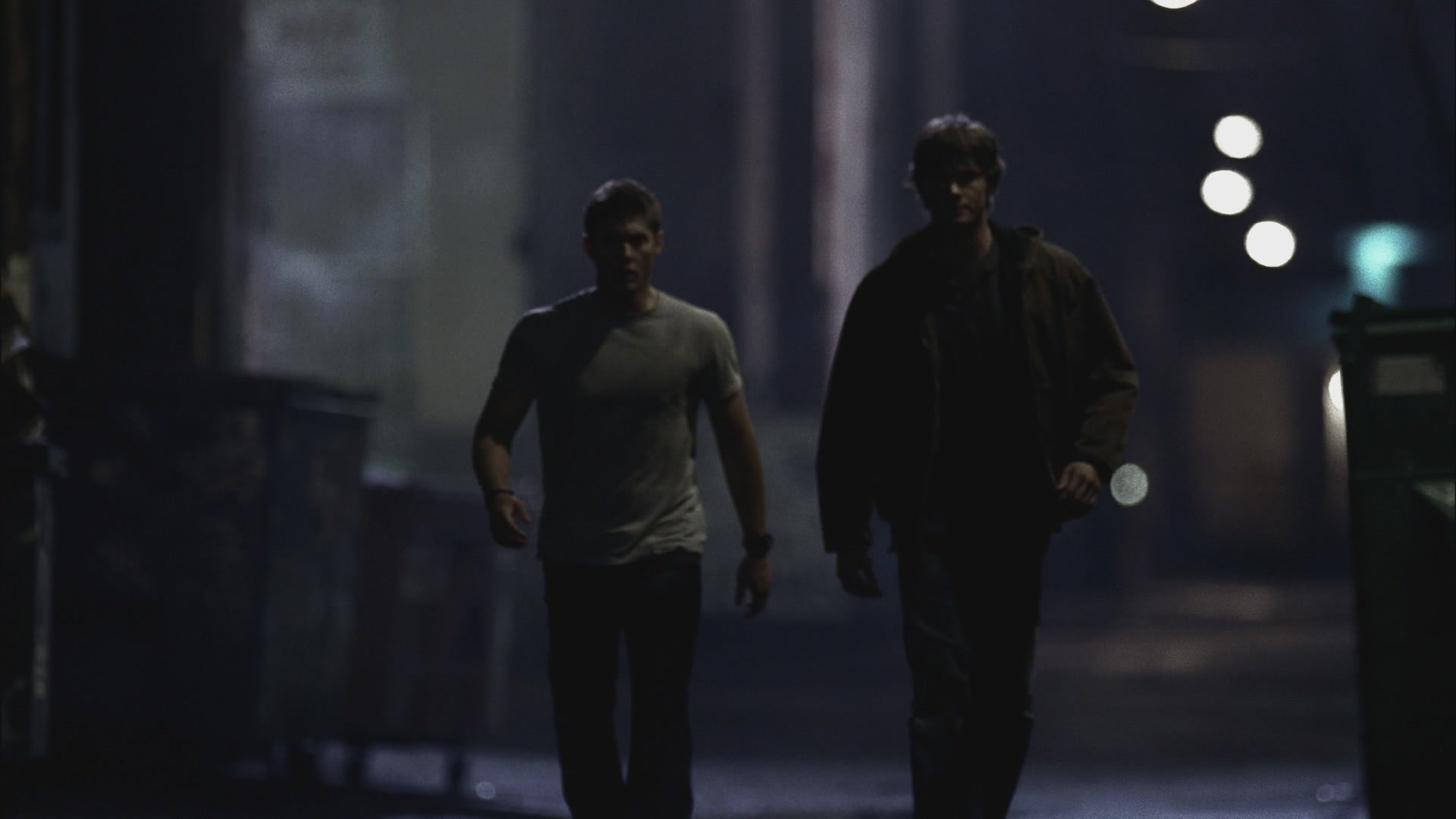

Finding the Color when there is No Color
Like I said above, there are colors in this image that you can work with! It seems all there is is blue-gray tones, so I'll focus my coloring on bringing that out while brightening things up and clarifying the boys. It can be done! :)
* duplicate base x3
* screen 100% + screen 100% (screen layers are your friends with these caps, they needs lots of love in the brightening department) + soft light 100%
* below the soft light duplicate i'll create two bluish-gray color fills, the first color fill i'll set to hard light @ 50% opacity and the second i'll set to soft light @ 50% opacity and already we have improvements!


* it ended up too washed out for my liking and definitely needs more ~atmosphere~, like lighting, shadows and more color. so, for this, i'll add a light texture and set it to soft light (this is still below the soft light duplicate of the base) and a vibrance adjustment layer (set to color) to really bring out those blues that i know are hiding in there!

* above the soft light duplicate, i'll add a levels layer for contrast (rgb: 20 | 1.00 | 2.55) and sharpen it by stamping the layers, de-saturating, setting the stamped layer to hard light and then applying the sharpen filter. i'll lower the opacity to @ 12% so it's not so intense and the colors not so affected. i'll also apply topaz clean to the sharpened layer to take away some graininess.

* more shadows, light and ~atmosphere~ needed here, i think. i stamp the layers again and apply some light blobs with a large soft brush in white, then duplicate the light blobs, blur with Gaussian blur and set the layer to soft light at @ 60% opacity. i'll go back to the light blobbed layer and lower the fill to @ 5%.
* and now it needs more attention paid to contrast so i'll stamp the layers again (2 more times to be exact) and set the first to multiply @ 20% and the second to soft light @ 20%.


* and now i'm going to resize to 100x100 and add some textures for additional layering of the shadows and to add a little grainy quality (cuz grainy looks cool!). i'll also sharpen things a couple more times.

* i'll add more adjustment layers (color balance and vibrance) to bring out the blues. i'll throw on more textures for additional ~layering~ and ~atmosphere~. this is what we finally end up with:

it's a little involved, but the result is certainly worth it!
Dark doesn't Necessarily Mean Bad
We'll move on to working with season 2 caps, because a lot of the same issues persisted into the next season. Makes for cool icons, but again frustrating and difficult! Episodes like Nightshifter and All Hell Breaks Loose Part 2 were very dark and shadowed. We'll focus on those two episodes specifically for this part of the guide. First up, Nightshifter. For some reason, I tend to be attracted to the really blurred out-focus shots with this show. But! Cool icons!
Original Cap --> resized to 200x200 -->

Yeah, that's pretty dark. My focus here is going to be brightening and sharpening. I think I want to go with a grungier look to this icon as these dark and shadowy shots look very cool in a grunge style.
* duplicate base x4 - screen 100% for all the duplicates (screen layers are your best friends!).
* i'll add a curves layer for contrast and then duplicate my base, drag it to the top and set it to soft light to deepen the blacks.


* next up, color balance, levels and selective color to bring out the skin tones in dean's face and for more contrast. and then i'll stamp the layers and sharpen to get rid of the blurriness. i'll also add some topaz clean.


* i'll resize to 100x100 now. for added grunge, i'll add a grainy texture set to screen and then for more ~pop~ to the colors i'll add a vibrance adjustment layer. one more sharpen of everything and i'm done!


Next, it's on to another fun dark episode, All Hell Breaks Loose Part 2!
Original Cap --> resized to 200x200 -->

For these darker images I find it easier to focus on the lightest parts of the image, in this case it's Dean's face and lips. So, I'll crop my image specifically with these things in mind. My mindset here is brighter (but not too bright as his face is pretty well lit) and more contrast. I also want to try to bring out the colors of Dean's shirt, his lips and eyelashes too. Color might be more difficult, but it's not impossible! I'm going to resize to 100x100 right away.
* duplicate + sharpen + fade sharpen to @ 20%.
* i'll add a blank layer set to soft light at @ 20% and take a small soft brush in white and brush around dean's face to brighten his features slightly.
* next is curves for brightening (rgb: O: 172, I: 86) and two color fills (pale yellow set to multiply and pale purple set to soft light) for more color.


* for more contrast and deepening of the shadows, i'll add a black/beige gradient map to soft light 100%. i'll add another blank layer set to soft light at @ 50% and use a small soft brush in black to fill in the shadows around dean's face.

* next, i'll stamp the layers, de-saturate, sharpen and set the layer to hard light at @ 12-20%. i'll also add some topaz clean.
* lastly, i'll add some grungy textures and a couple vibrance adjustment layers to finish things up.


And that's it! Sometimes simple works best. A little brightening, some sharpening and small color adjustments are all it takes to make these caps into decent icons. And this is where our guide ends. I hope that some of it was helpful. I'm always open to questions, so don't be afraid to ask if something is unclear.

Ask The Maker 5.0 || My Thread