Round Four:: Winners
The moment you've all been waiting for is here: it's time to reveal the winner of Round Four of the LIMS!!!
.....
First Place goes to...
zippogirl
Second Place goes to:
bringthewonder
Third Place goes to:
stolenglimpse

Votes:
Part A
#1 - 2
#2 - 3
#3 - 2
#4 - 12
#5 - 11
#6 - 6
Part B
#1 - 11
#2 - 16
#3 - 9
Part C
#1 - 6
#2 - 15
#3 - 15
Part D
#1 - 5
#2 - 15
#3 - 16
Comments/Feedback:
Part A:
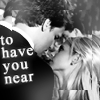
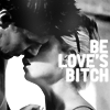
#2 - lovely text and overall composition
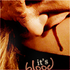
3 - Is just beautiful, I love the soft coloring.
#3 - The colouring is amazing.
4 - Nice cropping.
#4 - the coloring is really clean and kinda golden.
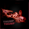
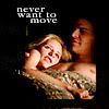
5 - The words caught my attention. It’s to true! ;)
#5 - The words touch me the most.
#5 - the font is an interesting choice- i like it when two contrasting fonts are used well.
5 - the text is eye-catching
6 - Nice cropping.
Part B:
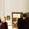
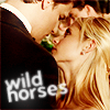
#1 - the empty space doesn't look pointless, which is rare.
#1 - really well blended and the excess black space around them really adds a lot to the icon
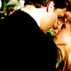
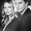
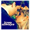
#2 - the placing of the images is very well done, Buffy's shoulder looks like it could be resting against Angel and the black and white is still nice and bright.
2 - It actually looks as though they took the picture together.
2 - Nice blending.
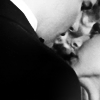
3 - This one was great too.
3 - Great blending.
#3 - the cutting out of angel's image is really clean, but i also think that they should be somehow blended in together a little- it looks a little copy-and-paste.
Part C:
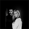
1 - Good cropping.
#2 - both icons make lovely use of text and colouring
2 - The coloring looked so warm and welcoming and the words however small. Adorable!
#2 - I like the pinkish coloring on both and the texture used on the remake.
#3 - black and white is my ultimate favorite.
3 - I preferred the colorful one in this but they were both lovely.
#3 - lovely clean colouring
3 - really fun crop
3 - Nice cropping, coloring, and use of empty space.
Part D:
1 - Because if anything spike, actually spoke sense for once (lol) and I just loved that particular episode.
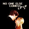
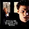
#2 - I LOVE the text and angel's vamp face doesn't look too plastic-y from up close, which is difficult to achieve.
2 - good placement of text
2 - Great cropping and use of text.
3 - The black & white effect looks really nice with icon and the text works nice as well.
#3 - again, the black and white looks really good.
3 - B.E.A.U.T.I.F.U.L.
Voting Page
Totals
zippogirl: A2 + A6 + B2 + C3 + D3 = 3 + 6 + 16 + 15 + 16 = 56 --> First Place
bringthewonder: A1 + A4 + B1 + C2 + D2 = 2 + 12 + 11 + 15 + 15 = 55 --> Second Place
stolenglimpse: A3 + A5 + B3 + C1 + D1 = 2 + 11 + 9 + 6 + 5 = 33 --> Third Place
As you can see there was only one point difference in the end, which shows just how amazing the icons were. Very big congratualtions to zippogirl for being the winner of the fourth round at balims; second time running! :D And lots of congratulations to both bringthewonder and stolenglimpse as well; all the icons we had were fantastic!
I'm making your award banners and will post them in a new entry when they're done.
Also a big thank you to everyone who took part and voted! You guys are all awesome! :D
.....
First Place goes to...
zippogirl
Second Place goes to:
bringthewonder
Third Place goes to:
stolenglimpse
Votes:
Part A
#1 - 2
#2 - 3
#3 - 2
#4 - 12
#5 - 11
#6 - 6
Part B
#1 - 11
#2 - 16
#3 - 9
Part C
#1 - 6
#2 - 15
#3 - 15
Part D
#1 - 5
#2 - 15
#3 - 16
Comments/Feedback:
Part A:
#2 - lovely text and overall composition
3 - Is just beautiful, I love the soft coloring.
#3 - The colouring is amazing.
4 - Nice cropping.
#4 - the coloring is really clean and kinda golden.
5 - The words caught my attention. It’s to true! ;)
#5 - The words touch me the most.
#5 - the font is an interesting choice- i like it when two contrasting fonts are used well.
5 - the text is eye-catching
6 - Nice cropping.
Part B:
#1 - the empty space doesn't look pointless, which is rare.
#1 - really well blended and the excess black space around them really adds a lot to the icon
#2 - the placing of the images is very well done, Buffy's shoulder looks like it could be resting against Angel and the black and white is still nice and bright.
2 - It actually looks as though they took the picture together.
2 - Nice blending.
3 - This one was great too.
3 - Great blending.
#3 - the cutting out of angel's image is really clean, but i also think that they should be somehow blended in together a little- it looks a little copy-and-paste.
Part C:
1 - Good cropping.
#2 - both icons make lovely use of text and colouring
2 - The coloring looked so warm and welcoming and the words however small. Adorable!
#2 - I like the pinkish coloring on both and the texture used on the remake.
#3 - black and white is my ultimate favorite.
3 - I preferred the colorful one in this but they were both lovely.
#3 - lovely clean colouring
3 - really fun crop
3 - Nice cropping, coloring, and use of empty space.
Part D:
1 - Because if anything spike, actually spoke sense for once (lol) and I just loved that particular episode.
#2 - I LOVE the text and angel's vamp face doesn't look too plastic-y from up close, which is difficult to achieve.
2 - good placement of text
2 - Great cropping and use of text.
3 - The black & white effect looks really nice with icon and the text works nice as well.
#3 - again, the black and white looks really good.
3 - B.E.A.U.T.I.F.U.L.
Voting Page
Totals
zippogirl: A2 + A6 + B2 + C3 + D3 = 3 + 6 + 16 + 15 + 16 = 56 --> First Place
bringthewonder: A1 + A4 + B1 + C2 + D2 = 2 + 12 + 11 + 15 + 15 = 55 --> Second Place
stolenglimpse: A3 + A5 + B3 + C1 + D1 = 2 + 11 + 9 + 6 + 5 = 33 --> Third Place
As you can see there was only one point difference in the end, which shows just how amazing the icons were. Very big congratualtions to zippogirl for being the winner of the fourth round at balims; second time running! :D And lots of congratulations to both bringthewonder and stolenglimpse as well; all the icons we had were fantastic!
I'm making your award banners and will post them in a new entry when they're done.
Also a big thank you to everyone who took part and voted! You guys are all awesome! :D