i know exactly what you mean, sometiems I can come up wit about 10 icons right after the other in no time and then pop muse gone walk about for a few hours.
that one with the shadow popping up scares me *looks behind him just to check*
Those are beautiful. I was carefully not looking at individual posts until after I'd voted, and I was much amused to realise that four of my choices were from here *g*. Your 3, 6, 9 and 10 are all lovely.
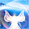
I really really like the colours and shapes of 10, it's just so gorgeous. The light border really works for me, too, and the tiny text balances so nicely. I hadn't realised it was animated until I saw your comment! but it does work, very subtle. Really nice, anyway; this was my definite favourite of all the icons.
I also loved 9, which is, again, beautifully coloured. You've really brought out the organic look of the ship; it's like a flower. And the shadowy Kosh in the background is nice, too. I like the balance of 6, the colours and the ornamentation, and again the colours and lighting on 3. They are interestingly intense, without being too dark.
Oh thank you very much! :D I really appreciate your feedbackon the icons. It helps me learn what's working, what's not, and what people see when they look at them.
It's funny, but the "Angel" type icons came together very quick. Quicker than it normally takes me to make an icon, since I'm quite slow, lol. On #10 I had the textures I wanted to use, but the effect wasn't at all what I expected. It was much better :) On #9 I thought the ship looked like a flower too ^^. I love the same ones you do and #1, but #10 is my favorite. You're quite welcome to snag any of the icons I make :)
And thank you again for your comments, I appreciate them :D
Comments 6
Reply
Reply
that one with the shadow popping up scares me
*looks behind him just to check*
Reply
(The comment has been removed)
Reply
I really really like the colours and shapes of 10, it's just so gorgeous. The light border really works for me, too, and the tiny text balances so nicely. I hadn't realised it was animated until I saw your comment! but it does work, very subtle. Really nice, anyway; this was my definite favourite of all the icons.
I also loved 9, which is, again, beautifully coloured. You've really brought out the organic look of the ship; it's like a flower. And the shadowy Kosh in the background is nice, too. I like the balance of 6, the colours and the ornamentation, and again the colours and lighting on 3. They are interestingly intense, without being too dark.
Are these available for use? I'd like to use 10.
Reply
It's funny, but the "Angel" type icons came together very quick. Quicker than it normally takes me to make an icon, since I'm quite slow, lol. On #10 I had the textures I wanted to use, but the effect wasn't at all what I expected. It was much better :) On #9 I thought the ship looked like a flower too ^^. I love the same ones you do and #1, but #10 is my favorite. You're quite welcome to snag any of the icons I make :)
And thank you again for your comments, I appreciate them :D
Reply
Leave a comment