Request a tutorial
I thought it would be a nice idea ;).
If You want a tutorial of any of my icons, ask here. Just put the link to the icon You like and tell me what's important to You (effect, colouring, text, brushes, textures etc.).
I will put a tutorial as soon as I can.
Also if You have any other questions or suggestions, here is a place for this.
FAQ
Q: May I friend you?
A: There's no need to ask for that, really! I'm very, very, very happy of every friend, it means that my work isn't pointless!
Q: Can I request a tutorial?
A: Of course, and this is a place to do it. Just put a link to icon you're interested of, and tell what's most important to you (effect, brightness, contrast, colouring).
I'll try to put the tutorial as soon as I can.
Q: From where do you get brushes?
A: It's all in my resources. Please check them!
Q: How can I credit you?
A: Check this.
Q: Why cannot I edit your icons?
A: Because I made them and that's how I want them to look like. If you have any suggestions, you can tell me, but DON'T edit.
Q: What's the hotlinking?
A: It's BAD thing. It's killing my bandwith. So really, don't post my icons anywhere straight from my server. Don't do it.
Q: Can I nominate you at icon award community?
A: Of course! It's the best way to honour me and I feel that my work is not worthless.
Q: Why are you responding for all the comments?
A: Because every single comment makes me much happier and I want to thank everyone :).
Q: How can I become your affiliate? Who can become your affiliate?
A: Just ask me for that in comments, and I'll add you. Every icon/resources/graphic/fanfiction/art journal is very welcome!
saharaam & nashirah icon-making guide.
1. Program. Have a good graphic program. Use Paint and we will hunt you down. No, seriously - Photoshop, Paint Shop Pro, Corel or even GIMP. Everything but NOT PAINT.
Icon made in PAINT: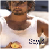
Icon made in Photoshop: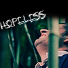
2. Balance. Using many brushes, textures and fonts on one icon makes it rather heavy. Avoid it.
Heavy and UGLY icon: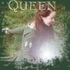
Balanced icon: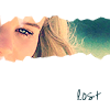
3. Cropping. The main thing in iconmaking is cropping. What's well cropped icon? It's BASE THING for every iconmaker. It makes icon interesting.
Bad cropping: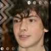
Interesting cropping:
4. Colouring. Stylish colouring is also important part in icomaking. When you just crop the picture and leave it, it will be not an icon. It will be base.
Base colouring: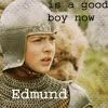
Bad colouring: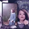
Nice, stylish colouring: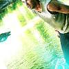
5. Exaggeration. Oversharping, overblurring and overburning is evil. Don't do it or Gollum will come and take your precious.
Overblurred icon: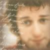
Overburned icon: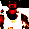
Balanced icon:
6. Style. Don't follow tutorials exactly. Really, it's pointless. Take your own picture and play around with steps that are in the tut unless you get the effect you want.
7. Fonts. Jeeeez, don't use the most common fonts, such as Times New Roman, Cooper, Arial, Courier or Verdana. There are so many beautiful (free!) fonts to get in the web!
Bad use of font: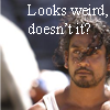
Good use of font: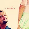
8. Inspiration. If you're inspirated by someone, it's OK. If you're not copying someone's work.
Examples of inspirated icons:
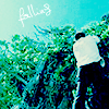
(this one was inspirated by never_frugal colouring)
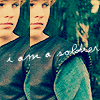
(this wasn't inspirated by one iconmaker, but follows style of "repeated image")
9. Trends. As is known, trends in iconmaking are really changeable. But if in every community we see nearly the same style of icons, it may be boring. Try to find your own style!
10. Taste. Funny icons are absolutely OK as long as they don't offend other people's feelings. As well they shouldn't be very, ekhm, kinky. Unless you warn about it. Oh, and an IDEA is nice in those, especially if they're only text icons.
Text icon: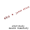
Other funny icon: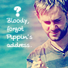
GUIDE TO FONTS
(with download links)
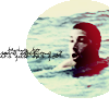
- violation download from DaFont

- crazy killer download from DaFont
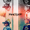
- diediedie download from DaFont
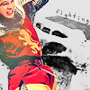
- justy download from DaFont
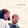
- journal download from DaFont
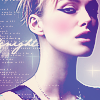
- jane austen download from DaFont
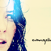
- mulder handwritting download from DaFont

- eight fifteen download here
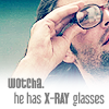
- Libel Suit download from DaFont
ashley download from DaFont
Runaway Girl download here
Yours
Nash
If You want a tutorial of any of my icons, ask here. Just put the link to the icon You like and tell me what's important to You (effect, colouring, text, brushes, textures etc.).
I will put a tutorial as soon as I can.
Also if You have any other questions or suggestions, here is a place for this.
FAQ
Q: May I friend you?
A: There's no need to ask for that, really! I'm very, very, very happy of every friend, it means that my work isn't pointless!
Q: Can I request a tutorial?
A: Of course, and this is a place to do it. Just put a link to icon you're interested of, and tell what's most important to you (effect, brightness, contrast, colouring).
I'll try to put the tutorial as soon as I can.
Q: From where do you get brushes?
A: It's all in my resources. Please check them!
Q: How can I credit you?
A: Check this.
Q: Why cannot I edit your icons?
A: Because I made them and that's how I want them to look like. If you have any suggestions, you can tell me, but DON'T edit.
Q: What's the hotlinking?
A: It's BAD thing. It's killing my bandwith. So really, don't post my icons anywhere straight from my server. Don't do it.
Q: Can I nominate you at icon award community?
A: Of course! It's the best way to honour me and I feel that my work is not worthless.
Q: Why are you responding for all the comments?
A: Because every single comment makes me much happier and I want to thank everyone :).
Q: How can I become your affiliate? Who can become your affiliate?
A: Just ask me for that in comments, and I'll add you. Every icon/resources/graphic/fanfiction/art journal is very welcome!
saharaam & nashirah icon-making guide.
1. Program. Have a good graphic program. Use Paint and we will hunt you down. No, seriously - Photoshop, Paint Shop Pro, Corel or even GIMP. Everything but NOT PAINT.
Icon made in PAINT:
Icon made in Photoshop:
2. Balance. Using many brushes, textures and fonts on one icon makes it rather heavy. Avoid it.
Heavy and UGLY icon:
Balanced icon:
3. Cropping. The main thing in iconmaking is cropping. What's well cropped icon? It's BASE THING for every iconmaker. It makes icon interesting.
Bad cropping:
Interesting cropping:
4. Colouring. Stylish colouring is also important part in icomaking. When you just crop the picture and leave it, it will be not an icon. It will be base.
Base colouring:
Bad colouring:
Nice, stylish colouring:
5. Exaggeration. Oversharping, overblurring and overburning is evil. Don't do it or Gollum will come and take your precious.
Overblurred icon:
Overburned icon:
Balanced icon:
6. Style. Don't follow tutorials exactly. Really, it's pointless. Take your own picture and play around with steps that are in the tut unless you get the effect you want.
7. Fonts. Jeeeez, don't use the most common fonts, such as Times New Roman, Cooper, Arial, Courier or Verdana. There are so many beautiful (free!) fonts to get in the web!
Bad use of font:
Good use of font:
8. Inspiration. If you're inspirated by someone, it's OK. If you're not copying someone's work.
Examples of inspirated icons:
(this one was inspirated by never_frugal colouring)
(this wasn't inspirated by one iconmaker, but follows style of "repeated image")
9. Trends. As is known, trends in iconmaking are really changeable. But if in every community we see nearly the same style of icons, it may be boring. Try to find your own style!
10. Taste. Funny icons are absolutely OK as long as they don't offend other people's feelings. As well they shouldn't be very, ekhm, kinky. Unless you warn about it. Oh, and an IDEA is nice in those, especially if they're only text icons.
Text icon:
Other funny icon:
GUIDE TO FONTS
(with download links)
- violation download from DaFont
- crazy killer download from DaFont
- diediedie download from DaFont
- justy download from DaFont
- journal download from DaFont
- jane austen download from DaFont
- mulder handwritting download from DaFont
- eight fifteen download here
- Libel Suit download from DaFont
ashley download from DaFont
Runaway Girl download here
Yours
Nash