Round 2: Challenge 3 Results

May 27, 2010 19:56

Eliminations
Sadly, we have to say goodbye to:

Read more... )

round 2: challenge 3, round 2, results

Leave a comment

Comments 9

(The comment has been removed)

coffee_nebula May 28 2010, 14:06:59 UTC
#3: I'm not quite sure what it is (whether it's a texture on the icon) but it's leaving the icon (especially on the faces) a little fuzzy.

03: The icon is way too dark and a bit too blurry

Reply


iwishiwerekerry May 28 2010, 04:26:28 UTC
Can i get comments for #2 please? Unscreened is fine :)

Reply

coffee_nebula May 28 2010, 14:07:47 UTC
002: The light blobs make it look like Amanda isn't cut out very well.

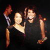
02: (the blending around the heads are rough)

#2: The icon has a lovely colouring and the texture of the background works well.

02: Nice coloring and use of negative space.

Reply


boxeddreams May 28 2010, 06:50:28 UTC
Congrats :) Can I get comments for #4 please, unscreened is fine :)

Reply

coffee_nebula May 28 2010, 14:08:21 UTC
04: (lovely coloring)

04: The white border distracts too much from the actual pic.

Reply


jasminago May 28 2010, 08:13:42 UTC
Wow thank you :) And comments for #6 please, unscreened is fine

Reply

coffee_nebula May 28 2010, 14:09:12 UTC
006: The green color is really nice, and I love the crop.

06: (the negative space is kind of cloudy and distracting from the main focus of the icon)

#6: I like the colouring of the icon and how the background has been extended.

06: Good crop and coloring.

Reply


dine7184 May 28 2010, 09:19:36 UTC
oh... thank you so much for Mod's Choice. :)

Can I have the comment for #1, please?! Unscreened is fine. :)

Reply

coffee_nebula May 28 2010, 14:09:46 UTC
001: I've seen a lot of icons with this cap, and I haven't seen a crop like this before. The coloring is great too.

Reply


Leave a comment

Up