Full icon tutorial for Photoshop CS
I use the following exclusion technique on a lot of my graphics, and it's something I just kinda made up based on expermintation with color inversion and exclusion. Let me know what you think if you try it out. :D
Going from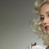
to
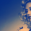
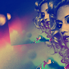
I started with this image. Cropping to a 100x100 base, I got the following:
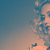
The following base preparation is what I do to most all of my works, depending on the type of coloring I'm prepping it for. First, I duplicate the base layer, and then lower the saturation of that layer by going to Image > Adjustments > Hue/Saturation (or hitting Ctrl+U). In this instance I lowered the saturation to -62, but this will depend on your image. I then merge the layers (Layers > Merge Down or Ctrl+E). You will now have this:
Next, you duplicate the base layer again and put it on soft light. This will give you more saturation than I like, so go to Image > Adjustments > Hue/Saturation (Ctrl+U) again, this time lowering the hue all the way to -180, and then raise the saturation to +25. This stage again will depend on the image you're working with. Sometimes I lower the hue all the way and then lower the saturation as well, depending on the base. Merge the layers again. You should now have this:
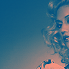
It's now looking more like I want it to, but is still a little light. Duplicate the base again, this time setting the copy to multiply. Reduce the opacity of the layer to 25%. Merge down to get this:
Duplicate the base again. Sharpen the copy by going to Filter > Sharpen > Sharpen. It was a little too sharp, so I lowered the opacity of the layer to 90%, and then used the blur tool at a strength of 9% over the ridge of her nose to smooth it out a little. This too will vary from image to image. Play with the opacity of the sharpened layer in order to achieve the look you want, and then smooth sharp edges with the blur tool. Merge down.

The base is now ready. The next couple steps are probably the most important to the coloring, and will be the basis for the color of the icon.
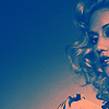
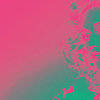
Create a new fill layer by going to Layer > New Fill Layer > Solid Color. Use the color picker to flood the layer with #005B7F. Set this layer to exclusion. Do not merge! This is the point where we will no longer be merging layers at all. You should have something like this:
Now duplicate the blue exclusion layer and set it to soft light. It will look like this:
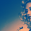
Create a new layer (Layer > New > Layer). You're now going to stamp the visible layers by pressing Ctrl+Alt+Shift+E. If you've never done this before, Stamp Visible basically has the same effect that flattening the image would, except that now you've got the merged version on one layer (the top) with all the other layers still intact beneath it. Set the stamped layer to overlay. It will look like this:
Now go back down one layer to the blue on soft light. You can mess with the opacity of both the soft light and exclusion layer until the colors are a little more subdued. I ended up lowering the opacity of the soft light layer to 10%, while leaving the exclusion at 100%. Those numbers will vary from icon to icon. It should now look like this:
Next, create another new fill layer, this time flooding it with #EC008C. Set the layer to exclusion:
It looks crazy again, I know, but we'll come through. Create a new layer, and stamp visible again (Ctrl+Alt+Shift+E). Put that layer on soft light, and the go back down to the pink exclusion layer and delete it, to look like this:
Next, open this light texture by tihana:

Drag it onto the top of your layers, and then put it on exclusion.
Then create a new layer and stamp the visible layers again (Ctrl+Alt+Shift+E), and place that layer on soft light. Lower the opacity of the layer to 70%. It will now look like this:
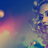
The coloring is now how I wanted, and I could stop here, but it still looks a little plain. I created a new identical document by hitting the duplicate state button, and then flattened that new image. I then went to Image > Image Size and reduced the pixels to 60x60 from 100x100. I now have a smaller duplicate of my original. Drag this small version onto the top of your original document, and then transform it so that it is tilted on it's axis slightly to the left. Move the layer to the appropriate place, to look like this:
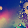
Almost done. I the used the text tool to write 'Gwen' in caps in the font 32 Pages, at size 16.5 px, with a kerning of 475, and transformed the text to tilt slightly to the left as well.
Finished!
The rest of this icon set with more of the like can be found at dissembling. I'd love to see what people come up with using this!
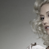
Going from
to
I started with this image. Cropping to a 100x100 base, I got the following:
The following base preparation is what I do to most all of my works, depending on the type of coloring I'm prepping it for. First, I duplicate the base layer, and then lower the saturation of that layer by going to Image > Adjustments > Hue/Saturation (or hitting Ctrl+U). In this instance I lowered the saturation to -62, but this will depend on your image. I then merge the layers (Layers > Merge Down or Ctrl+E). You will now have this:
Next, you duplicate the base layer again and put it on soft light. This will give you more saturation than I like, so go to Image > Adjustments > Hue/Saturation (Ctrl+U) again, this time lowering the hue all the way to -180, and then raise the saturation to +25. This stage again will depend on the image you're working with. Sometimes I lower the hue all the way and then lower the saturation as well, depending on the base. Merge the layers again. You should now have this:
It's now looking more like I want it to, but is still a little light. Duplicate the base again, this time setting the copy to multiply. Reduce the opacity of the layer to 25%. Merge down to get this:
Duplicate the base again. Sharpen the copy by going to Filter > Sharpen > Sharpen. It was a little too sharp, so I lowered the opacity of the layer to 90%, and then used the blur tool at a strength of 9% over the ridge of her nose to smooth it out a little. This too will vary from image to image. Play with the opacity of the sharpened layer in order to achieve the look you want, and then smooth sharp edges with the blur tool. Merge down.
The base is now ready. The next couple steps are probably the most important to the coloring, and will be the basis for the color of the icon.
Create a new fill layer by going to Layer > New Fill Layer > Solid Color. Use the color picker to flood the layer with #005B7F. Set this layer to exclusion. Do not merge! This is the point where we will no longer be merging layers at all. You should have something like this:
Now duplicate the blue exclusion layer and set it to soft light. It will look like this:
Create a new layer (Layer > New > Layer). You're now going to stamp the visible layers by pressing Ctrl+Alt+Shift+E. If you've never done this before, Stamp Visible basically has the same effect that flattening the image would, except that now you've got the merged version on one layer (the top) with all the other layers still intact beneath it. Set the stamped layer to overlay. It will look like this:
Now go back down one layer to the blue on soft light. You can mess with the opacity of both the soft light and exclusion layer until the colors are a little more subdued. I ended up lowering the opacity of the soft light layer to 10%, while leaving the exclusion at 100%. Those numbers will vary from icon to icon. It should now look like this:
Next, create another new fill layer, this time flooding it with #EC008C. Set the layer to exclusion:
It looks crazy again, I know, but we'll come through. Create a new layer, and stamp visible again (Ctrl+Alt+Shift+E). Put that layer on soft light, and the go back down to the pink exclusion layer and delete it, to look like this:
Next, open this light texture by tihana:
Drag it onto the top of your layers, and then put it on exclusion.
Then create a new layer and stamp the visible layers again (Ctrl+Alt+Shift+E), and place that layer on soft light. Lower the opacity of the layer to 70%. It will now look like this:
The coloring is now how I wanted, and I could stop here, but it still looks a little plain. I created a new identical document by hitting the duplicate state button, and then flattened that new image. I then went to Image > Image Size and reduced the pixels to 60x60 from 100x100. I now have a smaller duplicate of my original. Drag this small version onto the top of your original document, and then transform it so that it is tilted on it's axis slightly to the left. Move the layer to the appropriate place, to look like this:
Almost done. I the used the text tool to write 'Gwen' in caps in the font 32 Pages, at size 16.5 px, with a kerning of 475, and transformed the text to tilt slightly to the left as well.
Finished!
The rest of this icon set with more of the like can be found at dissembling. I'd love to see what people come up with using this!