I find this chart fascinating...
(Snurched from this article.)
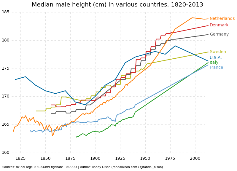
The original article was about explaining how the Dutch went from being, on average, the shortest people in Europe to being the tallest... the explanation is that height tends to reflect nutrition in that increased access to nutritious food (especially during adolescence) gives the body more and better building materials to work with and results in greater height. While the Dutch were considered a wealthy society for most of the period, its wealth was highly concentrated in the upper classes until the end of the 19th century, so only a few could afford a diet conducive to increased height. When the rest of the society finally got access to that diet, the average skyrockets.
The tend is similar across Europe; as societies became more liberal, average heights increased. When that increase starts varies with the onset of liberalisation, but the trend is upward. The one exception? Check the line for the US.
The US's height trend starts high relative to Europe but drops from the 1830s to the 1880s. Then it starts increasing along the same slope as in Europe... until the 1980s, when it drops again and continues dropping to the present day. That matches the income inequality trend rather well, doesn't it?
-- Steve should probably wait to post this until after his second cup of coffee, but it's too nifty an idea to wait.