Tutorial #6: Trio
How to go from
to

in Photoshop Elements, as requested by effulgency
I didn’t save a .psd version of this icon, so I’m doing it from scratch; hopefully I’ll come close! Anyway…
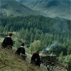
1. Start out with your base. Mine is of the trio from Harry Potter and the Prisoner of Azkaban
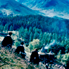
2. Duplicate your base twice. Set the layer closest to the bottom to screen, 100%. Set the top one to soft light, 100%. The number of screen layers you’ll need depends on how dark your starting image is. It should look something like this:

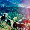
3. Fill a new layer with a turquoisey color (#99DDF6) and set it on color burn, 100%. Not very pretty, but should look something like this:

>>

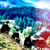
4. Fill a new layer with a light pink (#FFAEE2) and set it on color burn, 25%. Not a huge difference and still not so pretty, but should look something like this:

>>

5. Fill another new layer with the same pink color (#FFAEE2) and set it on soft light, 100%. Now it should look something like this:
>>
6. Take this light texture thing and move it to the right side of the icon. Set it on screen, 100% This gives the nice pink on the side of the icon, so it should now look something like this:

>>

7. Next, I add a gradient to brighten the icon back up a bit. Flip it horizontally and erase the gradient where the red is. Set it on soft light, 100%. You should get something like this:

>>
8. It looks decent like that, but I always like some extra brightness and contrast in my icons, so I go to Layer>>New Adjustment Layer>>Brightness/Contrast, and set the brightness to +10 and the contrast to +25. The settings on each will depend on your icon. So now, the final product should look like this:

>>
And that’s it! Let’s compare…
This one:
Original:
Well, I didn’t get it exactly right, but it’s pretty close, I guess. If you have any questions, don’t hesitate to ask; I’m not familiar with any other programs, but I’ll do my best to help. I’d love to see what you come up with if this tutorial helped you :)
other icons made using a similar technique:


Resources