Tutorials #34 - Lucy Pevensie Coloring
Requested by someheartsxx & xxjaybabyxx.
Going from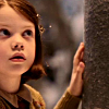
to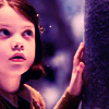
.
*USING PSP8*
PLEASE DON'T COPY THIS ICON, USE THE STEPS TO CREATE SOMETHING THAT IS YOUR OWN; THAT'S MAKES IT MORE FUN, ANYWAY :)
- First I took this screencap from dj_capslock and cropped it down to a 100x100 base and did an unsharp mask.

*NOTE: I suggest that you try to be creative with your cropping, but not to the point that the subject you're iconizing is undistinguishable xD
- Then I created a new Curves layer (Layers>New Adjustment Layer>Curves) and entered the following settings:
RBG: I-0 O-0
Red: 1st click: I-45 O-108
2nd click: I-130 O-130
Green: I-0 O-0
Blue: 1st click: I-47 O-102
2nd click: I-136 O-130
Duplicated that layer. Set the one closest to the base to Normal 70 and the one above that one to Soft Light 100.
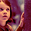
Yes, I'm fully aware that it looks really icky right now...just keep going, it'll look better in a minute.
- Duplicate the base layer and bring it to the top. Desaturate it using -60 (Shift+H). Then do a Gaussion Blur at 4. Set that layer to screen.
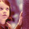
*NOTE: Depending on your image, the opacity varies. Mine is set to 100, but I later went back and duplicated it again. I suggest doing whatever works for your particular icon.
- Next, create a new layer and flood fill (the paint bucket) it with a light pink color (#FFAEE2). Set that layer to Soft Light 44.

>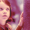
Yes, I know it still looks funny xP
- Create another new layer and flood fill it with a dark purplish color (#001464). Set that layer to Soft Light 100.

>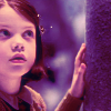
Told you it'd start to look not-so icky xD
- This step really depends on how dark your image is, but I took a light blue color (#85DEFF), flood filled a new layer with it and set it to Dodge 10.

>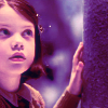
*NOTE: As stated, this step depends on the image you're using; if it doesn't need brightening, then you do not need this layer. (unless you think it looks nice there, of course xD)
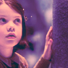
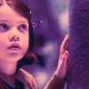
- Create ANOTHER new layer and fill it with a dark green color (#002B30); set that layer to Exclusion 80.

>
- Duplicate that exclusion layer, BUT change the layer opacity and blend mode to Burn 10.

>
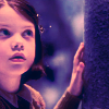
- Create ONE MORE new layer (xD) and fill it with a light blue (#002B30); I used the same color for this layer that I used for my Dodge layer a couple steps back, FYI. Set that layer to Burn, 30.

>
- Now Duplicate the base layer and bring it all the way to the top; set it to Soft Light 100.

*NOTE: My icon was too dark when I finished so I went back to my screen layer at the bottom, duplicate it and played wit the opacity until it looked light enough. If you have this same issue, I suggest you do that same :)
** Usually when I make icons involving this coloring, I use those red light spots that so many people hate. xD BUT I use them because I think they compliment the coloring nicely, this is merely my opinion, of course, but I thought I'd throw that out there. xD
***Opacities for layers may vary depending upon your image; don't be afraid to experiment!***
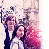
ICONS MADE USING THIS METHOD:
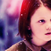
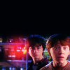
FRIEND ME | RESOURCES | OTHER TUTORIALS
Going from
to
.
*USING PSP8*
PLEASE DON'T COPY THIS ICON, USE THE STEPS TO CREATE SOMETHING THAT IS YOUR OWN; THAT'S MAKES IT MORE FUN, ANYWAY :)
- First I took this screencap from dj_capslock and cropped it down to a 100x100 base and did an unsharp mask.
*NOTE: I suggest that you try to be creative with your cropping, but not to the point that the subject you're iconizing is undistinguishable xD
- Then I created a new Curves layer (Layers>New Adjustment Layer>Curves) and entered the following settings:
RBG: I-0 O-0
Red: 1st click: I-45 O-108
2nd click: I-130 O-130
Green: I-0 O-0
Blue: 1st click: I-47 O-102
2nd click: I-136 O-130
Duplicated that layer. Set the one closest to the base to Normal 70 and the one above that one to Soft Light 100.
Yes, I'm fully aware that it looks really icky right now...just keep going, it'll look better in a minute.
- Duplicate the base layer and bring it to the top. Desaturate it using -60 (Shift+H). Then do a Gaussion Blur at 4. Set that layer to screen.
*NOTE: Depending on your image, the opacity varies. Mine is set to 100, but I later went back and duplicated it again. I suggest doing whatever works for your particular icon.
- Next, create a new layer and flood fill (the paint bucket) it with a light pink color (#FFAEE2). Set that layer to Soft Light 44.
>
Yes, I know it still looks funny xP
- Create another new layer and flood fill it with a dark purplish color (#001464). Set that layer to Soft Light 100.
>
Told you it'd start to look not-so icky xD
- This step really depends on how dark your image is, but I took a light blue color (#85DEFF), flood filled a new layer with it and set it to Dodge 10.
>
*NOTE: As stated, this step depends on the image you're using; if it doesn't need brightening, then you do not need this layer. (unless you think it looks nice there, of course xD)
- Create ANOTHER new layer and fill it with a dark green color (#002B30); set that layer to Exclusion 80.
>
- Duplicate that exclusion layer, BUT change the layer opacity and blend mode to Burn 10.
>
- Create ONE MORE new layer (xD) and fill it with a light blue (#002B30); I used the same color for this layer that I used for my Dodge layer a couple steps back, FYI. Set that layer to Burn, 30.
>
- Now Duplicate the base layer and bring it all the way to the top; set it to Soft Light 100.
*NOTE: My icon was too dark when I finished so I went back to my screen layer at the bottom, duplicate it and played wit the opacity until it looked light enough. If you have this same issue, I suggest you do that same :)
** Usually when I make icons involving this coloring, I use those red light spots that so many people hate. xD BUT I use them because I think they compliment the coloring nicely, this is merely my opinion, of course, but I thought I'd throw that out there. xD
***Opacities for layers may vary depending upon your image; don't be afraid to experiment!***
ICONS MADE USING THIS METHOD:
FRIEND ME | RESOURCES | OTHER TUTORIALS