Erik/Christine icon - Tutorial #3
hehe. now whenever i'm bored i make icons and do tutorials -_-' lol. this one's massively easy, ya'll.
okay we're going from this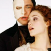
to this
.
PLEASE DON'T COPY THIS ICON, USE THE STEPS TO CREATE SOMETHING THAT IS YOUR OWN; THAT'S MAKES IT MORE FUN, ANYWAY :)
i first started with this picture from Andrew Lloyd Webber's The Phantom of the Opera and cropped it down to make a 100x100 base:

i then duplicated the base layer once, set it to Multiply and then duplicated that layer three more times. Then I duplicated it one more time and set that layer to Screen. Then i duplicated one more time (LOL) and set that layer to Soft Light; i also desaturated that layer. Then i created a new raster layer, set it for Soft Light. Opacity 100. and flood filled it with reguler ol' black (#000000). now i've got this:
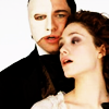
Next, i created a new adjustment layer (layers > new adjustment layer > hue/saturation/lightness. saturation = -45) then i merged the layers.
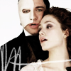
i then took this scribble brush made by teh_indy, made the size 198 and set the color to white. (#FFFFFF) now i have this:
i then took this gradient made by crumblingwalls.

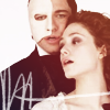
i took the flood fill tool and set the Opacity to 34. then i set the raster layer to Screen. Opacity 100 and wound up with this:
then i selected the text tool and did a little typing. i used Book Antiqua. size 6. and typed "your touch" with spaces in between each letter. Once i'd finished my typing and had my text placed where i wanted it, i right clicked on the vector layer and converted it to a raster layer. i now have this:

then i merged the layers again.
then i created another new raster layer and used this brush:

i'm not sure who it was made by :/ if anyone knows, please tell me so that i can credit accordingly.
i set the color to white (#FFFFFF) and created the white border around the icon.
now i have this:

hehe. and at that point i was sort of at a loss at what else to do so i just decided to save it...lol. obviously, you can do whatever else you feel is necessary :)
**Opacities for layers may vary depending upon your image; don't be afraid to experiment!**
okay! I hope this helped someone :/
Feedback is always appreciated :D
bye!
FRIEND ME | RESOURCES | OTHER TUTORIALS
okay we're going from this
to this
.
PLEASE DON'T COPY THIS ICON, USE THE STEPS TO CREATE SOMETHING THAT IS YOUR OWN; THAT'S MAKES IT MORE FUN, ANYWAY :)
i first started with this picture from Andrew Lloyd Webber's The Phantom of the Opera and cropped it down to make a 100x100 base:
i then duplicated the base layer once, set it to Multiply and then duplicated that layer three more times. Then I duplicated it one more time and set that layer to Screen. Then i duplicated one more time (LOL) and set that layer to Soft Light; i also desaturated that layer. Then i created a new raster layer, set it for Soft Light. Opacity 100. and flood filled it with reguler ol' black (#000000). now i've got this:
Next, i created a new adjustment layer (layers > new adjustment layer > hue/saturation/lightness. saturation = -45) then i merged the layers.
i then took this scribble brush made by teh_indy, made the size 198 and set the color to white. (#FFFFFF) now i have this:
i then took this gradient made by crumblingwalls.
i took the flood fill tool and set the Opacity to 34. then i set the raster layer to Screen. Opacity 100 and wound up with this:
then i selected the text tool and did a little typing. i used Book Antiqua. size 6. and typed "your touch" with spaces in between each letter. Once i'd finished my typing and had my text placed where i wanted it, i right clicked on the vector layer and converted it to a raster layer. i now have this:
then i merged the layers again.
then i created another new raster layer and used this brush:
i'm not sure who it was made by :/ if anyone knows, please tell me so that i can credit accordingly.
i set the color to white (#FFFFFF) and created the white border around the icon.
now i have this:
hehe. and at that point i was sort of at a loss at what else to do so i just decided to save it...lol. obviously, you can do whatever else you feel is necessary :)
**Opacities for layers may vary depending upon your image; don't be afraid to experiment!**
okay! I hope this helped someone :/
Feedback is always appreciated :D
bye!
FRIEND ME | RESOURCES | OTHER TUTORIALS