Tutorial #1
This is really just for my own memory, as I always forget the techniques I come up with.
Maybe someone else will find it useful?
We'll be going from..
THIS to THIS
Notes
I know that this isnt in icon "form" but I find it to easier to walk through a coloring technique with a larger picture.
You, of course, will go ahead and crop/resize/lighten/etc until you are satisfied.
This doesnt work for all icons.
Be sure to play around with opacities and such to fit your own icon needs.
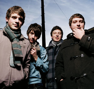
Step 1.
Take your base and duplicate it once.
Desaturate it, and set it to softlight at 100%
Step 2.
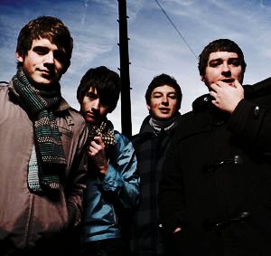
Duplicate your softlight layer.
Set it to color burn at 71%
Step 3.
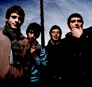
Create a new layer and fill it with (#e5dddc)
Set this layer to color burn at 100%.
Step 4.
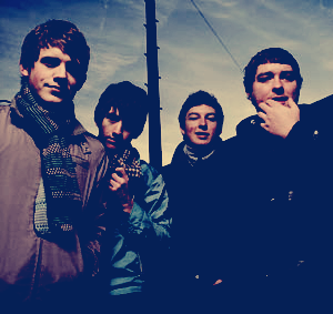
Create a new layer and fill it with (#072d7b)
Set this layer to exclusion at 70%
Step 5.
Duplicate your base and drag it to the top.
Set this layer to softlight at 100%.
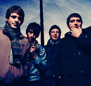
Step 6. (If needed)
Duplicate your base and drag it to the top.
Set this layer to screen at 20%.

Flatten image and your finished =]
Keep in mind the note earlier, that all images wont work well if you follow it exactly.
Play around with it and make it your own.
Maybe someone else will find it useful?
We'll be going from..
THIS to THIS
Notes
I know that this isnt in icon "form" but I find it to easier to walk through a coloring technique with a larger picture.
You, of course, will go ahead and crop/resize/lighten/etc until you are satisfied.
This doesnt work for all icons.
Be sure to play around with opacities and such to fit your own icon needs.
Step 1.
Take your base and duplicate it once.
Desaturate it, and set it to softlight at 100%
Step 2.
Duplicate your softlight layer.
Set it to color burn at 71%
Step 3.
Create a new layer and fill it with (#e5dddc)
Set this layer to color burn at 100%.
Step 4.
Create a new layer and fill it with (#072d7b)
Set this layer to exclusion at 70%
Step 5.
Duplicate your base and drag it to the top.
Set this layer to softlight at 100%.
Step 6. (If needed)
Duplicate your base and drag it to the top.
Set this layer to screen at 20%.
Flatten image and your finished =]
Keep in mind the note earlier, that all images wont work well if you follow it exactly.
Play around with it and make it your own.