(no subject)
See how to go from 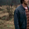
to
in 6 easy steps!
IN PS7. Not translatable.
JUST A NOTE
Typically for my icons, I do all the coloring before cropping, simply because the coloring in the background can sometimes make the icon more interesting, and that way I have my options open. However, for space purposes, I did crop this before I colored it, since I already knew how it looked.
Step One: Grab a screencap. Mine is here, and its from Screencap Paradise. Crop it however you wish.

Step Two: Duplicate the base twice, and set both layers to SCREEN, 100% opacity.

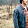
Step Three: In between the two SCREEN layers, create a SELECTIVE COLOR adjustment layer. (If you make SPN icons, GET TO KNOW selective coloring. It helps so much with the coloring of this show!)
Here's your settings:
REDS:
C: -100
Y: +100
YELLOWS:
C: -100
Y: +100
GREENS:
C: +100
M: +100
Y: +100
B: +100

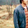
Step Four: On top of all the layers, create another SELECTIVE COLOR adjustment layer.
Here's the settings:
REDS:
C: -80
Y: +90
YELLOWS:
C: +56
M: -43
Y: -100
B: +34
NEUTRALS:
C: +20
Y: -23
B: -11


Pretty good, but I wanna bring out the oranges in his shirt and his face a LITTLE more...
Step Five: So I create one more SELECTIVE COLOR adjustment layer.
Settings:
REDS:
C:-50
M:+2


its a subtle difference, but I can see it.
Step Six: Just add some text or textures, and you're done! (I used 28 Days Later, size 12)

Pretty easy huh? Let me know if theres any questions, and I'd love to see what you guys come up with.

to

in 6 easy steps!
IN PS7. Not translatable.
JUST A NOTE
Typically for my icons, I do all the coloring before cropping, simply because the coloring in the background can sometimes make the icon more interesting, and that way I have my options open. However, for space purposes, I did crop this before I colored it, since I already knew how it looked.
Step One: Grab a screencap. Mine is here, and its from Screencap Paradise. Crop it however you wish.

Step Two: Duplicate the base twice, and set both layers to SCREEN, 100% opacity.


Step Three: In between the two SCREEN layers, create a SELECTIVE COLOR adjustment layer. (If you make SPN icons, GET TO KNOW selective coloring. It helps so much with the coloring of this show!)
Here's your settings:
REDS:
C: -100
Y: +100
YELLOWS:
C: -100
Y: +100
GREENS:
C: +100
M: +100
Y: +100
B: +100


Step Four: On top of all the layers, create another SELECTIVE COLOR adjustment layer.
Here's the settings:
REDS:
C: -80
Y: +90
YELLOWS:
C: +56
M: -43
Y: -100
B: +34
NEUTRALS:
C: +20
Y: -23
B: -11


Pretty good, but I wanna bring out the oranges in his shirt and his face a LITTLE more...
Step Five: So I create one more SELECTIVE COLOR adjustment layer.
Settings:
REDS:
C:-50
M:+2


its a subtle difference, but I can see it.
Step Six: Just add some text or textures, and you're done! (I used 28 Days Later, size 12)

Pretty easy huh? Let me know if theres any questions, and I'd love to see what you guys come up with.