Tutorial #1: Orangey coloured.
scout27 asked me about a tutorial a while back and I said yes. So, here it is! There's nothing special in my way of making icons. And this one is proof. HAHA!
NOTE: Okay, so you all should know this by now, but this tutorial will not work on all pictures. You can try this same tutorial with 3 different pics and you'll get either good results, or bad ones. Who knows. Anyway, just remember, that once you've remembered how this tutorial goes, you should try and change the numbers, colours and add new things to make it completely different. In fact, it'll make your icons even better! ;)
NOTE 2: Oops! Forgot to mention that this tutorial was done in PSP. So, some things might work with PS and some might not.
Step 01. The original picture is from _jems_' awesome Firefly pilot cap, which can be found here. Crop and resize it to 100x100 . Then, do whatever you like to make it a good base. I did nothing at all because... I'm lazy. :P
Step 02. Duplicate the base layer and set it to "Screen". Then, duplicate that 2 more times and you should have 3 layers that are all screened above your base. This makes the layer much lighter than it was before. I'm sure there's another way of doing this, but I like using "Screen" these days.


Step 03. Duplicate the base and move it to under the top most screened layer (meaning, your layers should be listed from top to bottom as:screen, normal, screen, screen, base normal). Fill that layer with #011537 and set to "Exclusion". Then, duplicate this layer and change the opacity to 44% (you should have two "Exclusion" layers). This gives it a blue-ish tinge. I'm not exactly sure why most people do this but I learnt it from a tutorial before and it definitely makes it easier to colour icons.


Step 04. Merge all the layers. Duplicate what has now become your base and set it to "Soft Light". This makes it contrast (??) and a bit shinier so you can see the image better. Does it look better? lol.

Step 05. Duplicate the base (the bottom most layer) and fill it with #F7E555. Then, set this layer to "Multiply" (don't worry about your top layer that has "Soft Light" selected). This gives it a orangey or golden touch, depends on the picture at hand.


Step 06. Duplicate the "Multiply" layer twice and set both to "Soft Light". This ligthens it up a bit. But it's done it a bit too much that the dark bits are well... not dark anymore! So, select the top "Soft Light" layer that you've just duplicated and change its opacity to 33%. There! Now we can see the dark bits clearer. :)


Step 07. Duplicate the base layer and fill it with #86BDE8. Set this layer to "Burn" (or "Color Burn" for PS users) and change the opacity to 42%. This makes it really blue and dark, but by changing the opacity, you can see that it won't be as extreme. Of course, it might be good on other pictures if you left it alone. It all depends on the picture you begin with and how you coloured it the step before.


NOTE: This next bit might get a bit complicated if you don't know how to use curves. So, pay attention or you'll have to start again!!
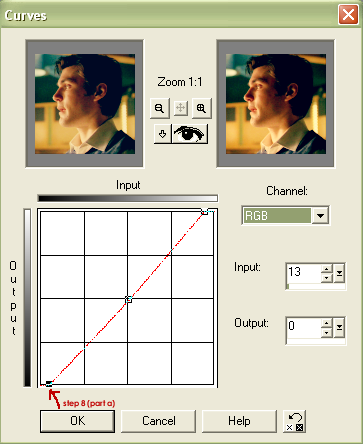
Step 08. Merge all the layers... Part A: Go to "Cuvres" (colors > adjust > curves). Select the dot on the bottom left hand corner and move it right till the number in the "Input" changes to 13, but the "Output" stays 0. (This concept is taken from wooed's tutorial on cleaning up bases. Read it, because she probably explains it better than me.)
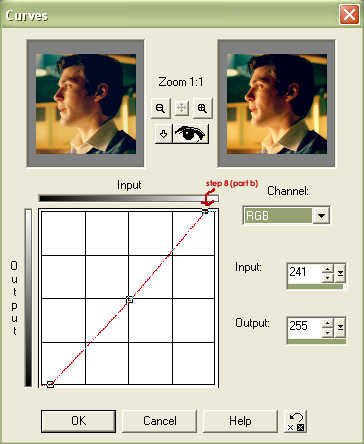
Part B: Do the same to the dot on the top right hand corner till you get 241 for "Input", but "Output" stays at 255.
Part C: Now, select the dot in the middle and then enter 136 for "Input" and 120 for "Output". If you would like the icon to be darker, move the dot in the middle towards where "HELP" is written at the bottom of the Curves page. Go in the opposite direction if you would like to make it lighter. Here, I've gone just a bit darker but only slightly because the effect was pretty big when I did go a bit further.

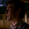
Step 09. When done, click "OK" and your icon should look like this:

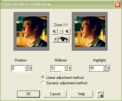
Step 10. Go to "Highlight/Midtone/Shadow" (colors > adjust > h/m/s). Select 0 for Shadow, 52 for Midtone and 95 for Highlight. Oh, make sure you have "Linear Adjustment Method" selected before clicking "OK". I thought that once using this technique wasn't enough so I did it again and it made it more contrasty, so that the blurry and light coloured bits aren't so dull to look at.

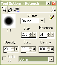
Step 11. Select the "Retouch Brush". Then select the "Soften" mode, have it on opacity = 20, hardness = 51 and step = 33. Now, click on the icon twice. This will soften the icon up (DUH).

Step 12. Then, go to effects > sharpen > sharpen. And... YOU ARE DONE! I like to soften icons before I sharpen them because on PS, there's this "Fade" tool you can use, but since PSP doesn't have that... Besides, it's such a reflex now. I'm sure there's even a better way of doing that. HAHA!

I hope that was helpful to some people. Hee! If you have any questions, just leave a comment here and I'll try to answer as best as I can. :D
NOTE: Okay, so you all should know this by now, but this tutorial will not work on all pictures. You can try this same tutorial with 3 different pics and you'll get either good results, or bad ones. Who knows. Anyway, just remember, that once you've remembered how this tutorial goes, you should try and change the numbers, colours and add new things to make it completely different. In fact, it'll make your icons even better! ;)
NOTE 2: Oops! Forgot to mention that this tutorial was done in PSP. So, some things might work with PS and some might not.
Step 01. The original picture is from _jems_' awesome Firefly pilot cap, which can be found here. Crop and resize it to 100x100 . Then, do whatever you like to make it a good base. I did nothing at all because... I'm lazy. :P
Step 02. Duplicate the base layer and set it to "Screen". Then, duplicate that 2 more times and you should have 3 layers that are all screened above your base. This makes the layer much lighter than it was before. I'm sure there's another way of doing this, but I like using "Screen" these days.
Step 03. Duplicate the base and move it to under the top most screened layer (meaning, your layers should be listed from top to bottom as:screen, normal, screen, screen, base normal). Fill that layer with #011537 and set to "Exclusion". Then, duplicate this layer and change the opacity to 44% (you should have two "Exclusion" layers). This gives it a blue-ish tinge. I'm not exactly sure why most people do this but I learnt it from a tutorial before and it definitely makes it easier to colour icons.
Step 04. Merge all the layers. Duplicate what has now become your base and set it to "Soft Light". This makes it contrast (??) and a bit shinier so you can see the image better. Does it look better? lol.
Step 05. Duplicate the base (the bottom most layer) and fill it with #F7E555. Then, set this layer to "Multiply" (don't worry about your top layer that has "Soft Light" selected). This gives it a orangey or golden touch, depends on the picture at hand.
Step 06. Duplicate the "Multiply" layer twice and set both to "Soft Light". This ligthens it up a bit. But it's done it a bit too much that the dark bits are well... not dark anymore! So, select the top "Soft Light" layer that you've just duplicated and change its opacity to 33%. There! Now we can see the dark bits clearer. :)
Step 07. Duplicate the base layer and fill it with #86BDE8. Set this layer to "Burn" (or "Color Burn" for PS users) and change the opacity to 42%. This makes it really blue and dark, but by changing the opacity, you can see that it won't be as extreme. Of course, it might be good on other pictures if you left it alone. It all depends on the picture you begin with and how you coloured it the step before.
NOTE: This next bit might get a bit complicated if you don't know how to use curves. So, pay attention or you'll have to start again!!
Step 08. Merge all the layers... Part A: Go to "Cuvres" (colors > adjust > curves). Select the dot on the bottom left hand corner and move it right till the number in the "Input" changes to 13, but the "Output" stays 0. (This concept is taken from wooed's tutorial on cleaning up bases. Read it, because she probably explains it better than me.)
Part B: Do the same to the dot on the top right hand corner till you get 241 for "Input", but "Output" stays at 255.
Part C: Now, select the dot in the middle and then enter 136 for "Input" and 120 for "Output". If you would like the icon to be darker, move the dot in the middle towards where "HELP" is written at the bottom of the Curves page. Go in the opposite direction if you would like to make it lighter. Here, I've gone just a bit darker but only slightly because the effect was pretty big when I did go a bit further.
Step 09. When done, click "OK" and your icon should look like this:
Step 10. Go to "Highlight/Midtone/Shadow" (colors > adjust > h/m/s). Select 0 for Shadow, 52 for Midtone and 95 for Highlight. Oh, make sure you have "Linear Adjustment Method" selected before clicking "OK". I thought that once using this technique wasn't enough so I did it again and it made it more contrasty, so that the blurry and light coloured bits aren't so dull to look at.
Step 11. Select the "Retouch Brush". Then select the "Soften" mode, have it on opacity = 20, hardness = 51 and step = 33. Now, click on the icon twice. This will soften the icon up (DUH).
Step 12. Then, go to effects > sharpen > sharpen. And... YOU ARE DONE! I like to soften icons before I sharpen them because on PS, there's this "Fade" tool you can use, but since PSP doesn't have that... Besides, it's such a reflex now. I'm sure there's even a better way of doing that. HAHA!
I hope that was helpful to some people. Hee! If you have any questions, just leave a comment here and I'll try to answer as best as I can. :D