Tutorial #2: Simple, simple.
Many people have been asking for a tutorial and I had been meaning to do one, and since I have some time on my hands now (and also cuz I'm bored), here's a pretty simple for ya! But like most tutorials, this is just a base for which you can change the settings to how your liking the more you mess around with it.
NOTE: This tutorial is made for PS users. If you are a PSP user, you can still use this tutorial. The results might just be a little different is all.
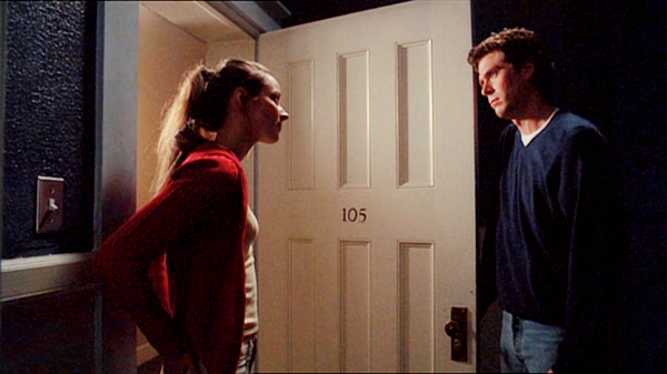
The image I'm starting with is a cap from Angel (of which I capped myself). It's a little dark, so if you are going to use this tutorial, it's best used on darker caps/pictures. But like I said before, you can mess around with the curves or selective colouring to get it to work to your particular cap/picture. :) I also like to start off with the image at 600 x whatever pixels (especially if it's a cap). I find that having it large, but not too large, helps with better icon-making. Dunno, just my opinion.
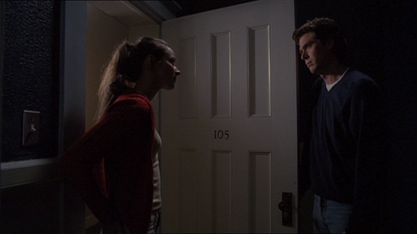
Frist step is to duplicate the image 3 times. Set the bottom layer (the first layer on top of your original image) to Soft Light at 80% opacity. Then the other two should be set to Screen at 100% opacity for both.
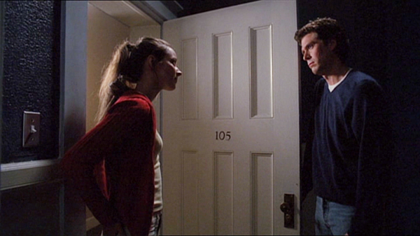
Go to Layer >> New Adjustment Layer >> Selective Colour. (I'm not sure if PSP has this or not. When I had the program, I never used this tool so I don't really know.) These are the following changes that you should make, and everything else that I do not mention here stays the same:
RED
Cyan: -39
BLUES
Cyan: +33
Magenta: -11
BLACK
Black: +5
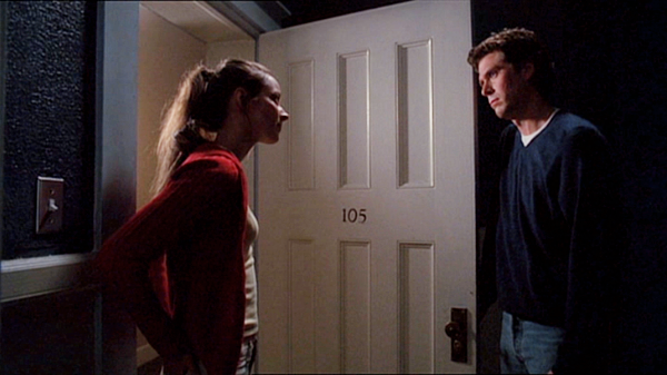
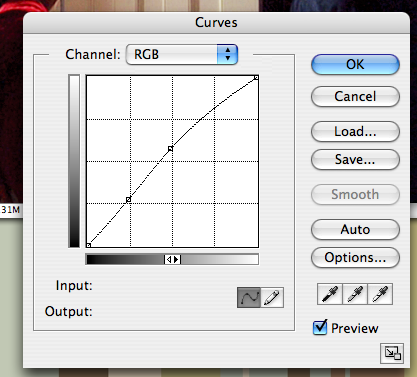
Download this curves preset, then go to Layers >> New Adjustment Layer >> Curves. Click on "Load" and find where you have downloaded the preset, select that and click "OK".

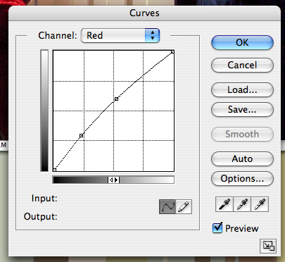
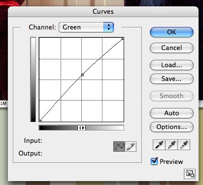
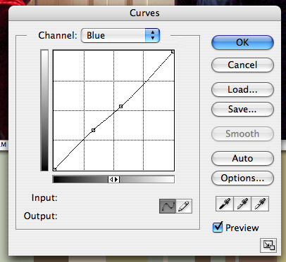
Because PSP users don't have the ability to use presets, I thought I'd make screencaps of the curves option on the different channels. I don't know what the numbers are because I've had this preset for a while, so I hope this is helps a bit anyway. Remember, you can change it to however you like okay!
Next you go to Layers >> New Adjustment Layer >> Hue/Saturation. This brings out the colour of your image more depending on how high you set the "Saturation" section to. In this case, I put it to +10. on the scale.
Then, I went to Layers >> New Adjustment Layer >> Brightness/Contrast, which makes it much brighter in the white-r areas and darker in the black-er areas. lol. Anyway, I set this to +6 for "Brightness" and +10 for "Contrast".
NOTE TO PS USERS: Since we're lucky enough to use .psd files, I created one which you can use if all of my explaining above sucks. ;)
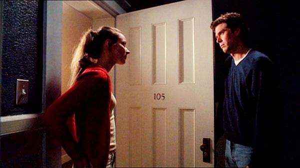
Now, you are done with all the colouring and stuff! So, you go to Layers >> Merge Visible (or you can use Flatten Image, it's pretty much the same) to merge all them layers together. Then, I like to sharpen the image (Filter >> Sharpen >> Sharpen) before I go about resizing it. I don't know why I do this, I just find that the Sharpen option on PS can be a bit strong sometimes. *shrugs* Anyway, after that, I crop the image to how I like it (using the Crop Tool).
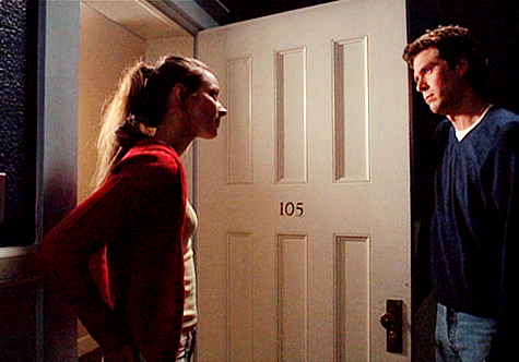
After that, I resize the image to 100 x 70.

For some reason, whenever I get to this stage, I always like to do something else more to it. So, I Sharpened it again, but this was TOO much. So I go to Edit >> Fade Sharpen and changed the opacity to +25. Now, it looks a bit clearer. But it's a little bit too dark for me. So I go to Image >> Adjustments >> Curves >> Inputs: 109, Outputs: 146 for the "RBG" channel. And voila, the icon is complete!

Well, I hope that was useful to you guys. I might think about doing another one some time soon. We'll see. ;) Anyway, if you've got any questions, feedback or if you'd like to show me an example of your work using this tutorial that'd be great. Bring it on, I say! :D
NOTE: This tutorial is made for PS users. If you are a PSP user, you can still use this tutorial. The results might just be a little different is all.
The image I'm starting with is a cap from Angel (of which I capped myself). It's a little dark, so if you are going to use this tutorial, it's best used on darker caps/pictures. But like I said before, you can mess around with the curves or selective colouring to get it to work to your particular cap/picture. :) I also like to start off with the image at 600 x whatever pixels (especially if it's a cap). I find that having it large, but not too large, helps with better icon-making. Dunno, just my opinion.

Frist step is to duplicate the image 3 times. Set the bottom layer (the first layer on top of your original image) to Soft Light at 80% opacity. Then the other two should be set to Screen at 100% opacity for both.

Go to Layer >> New Adjustment Layer >> Selective Colour. (I'm not sure if PSP has this or not. When I had the program, I never used this tool so I don't really know.) These are the following changes that you should make, and everything else that I do not mention here stays the same:
RED
Cyan: -39
BLUES
Cyan: +33
Magenta: -11
BLACK
Black: +5

Download this curves preset, then go to Layers >> New Adjustment Layer >> Curves. Click on "Load" and find where you have downloaded the preset, select that and click "OK".

Because PSP users don't have the ability to use presets, I thought I'd make screencaps of the curves option on the different channels. I don't know what the numbers are because I've had this preset for a while, so I hope this is helps a bit anyway. Remember, you can change it to however you like okay!


Next you go to Layers >> New Adjustment Layer >> Hue/Saturation. This brings out the colour of your image more depending on how high you set the "Saturation" section to. In this case, I put it to +10. on the scale.

Then, I went to Layers >> New Adjustment Layer >> Brightness/Contrast, which makes it much brighter in the white-r areas and darker in the black-er areas. lol. Anyway, I set this to +6 for "Brightness" and +10 for "Contrast".
NOTE TO PS USERS: Since we're lucky enough to use .psd files, I created one which you can use if all of my explaining above sucks. ;)

Now, you are done with all the colouring and stuff! So, you go to Layers >> Merge Visible (or you can use Flatten Image, it's pretty much the same) to merge all them layers together. Then, I like to sharpen the image (Filter >> Sharpen >> Sharpen) before I go about resizing it. I don't know why I do this, I just find that the Sharpen option on PS can be a bit strong sometimes. *shrugs* Anyway, after that, I crop the image to how I like it (using the Crop Tool).

After that, I resize the image to 100 x 70.

For some reason, whenever I get to this stage, I always like to do something else more to it. So, I Sharpened it again, but this was TOO much. So I go to Edit >> Fade Sharpen and changed the opacity to +25. Now, it looks a bit clearer. But it's a little bit too dark for me. So I go to Image >> Adjustments >> Curves >> Inputs: 109, Outputs: 146 for the "RBG" channel. And voila, the icon is complete!
Well, I hope that was useful to you guys. I might think about doing another one some time soon. We'll see. ;) Anyway, if you've got any questions, feedback or if you'd like to show me an example of your work using this tutorial that'd be great. Bring it on, I say! :D