(no subject)
Icon Tutorial 6?
Kiera Knightley Icon Tutorial
Today, we'll be making this lovely icon of Kiera Knightley as Elizabeth Swan of Pirates of the Caribbean. Right, for the last 4 tutorials I've explained coloring techniques; for this tutorial I'll be explaining how to use masks, brushes, textures to make your icon look pretty!
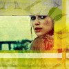
Go from this:

to
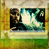
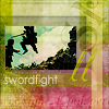
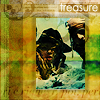
Using textures and brushes by fangirls_inc or

sanami276's icon journal! This was originally posted in her journal, I was showing her my results in using her resources, someone nudged me to make a tut for it. So it wil also make the following because I used almost the same techniques:
and
and
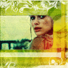
1. I am going to use this lovely picture of Keira Knightley: Since this icon is mostly covered with the texture, we don't need too much coloring and base prep.
My base:
I simply duplicated the base twice, set the first duplicate to Screen 100% and the other Soft Light 100%. Adjust the opacities according to your image but just enough to fix the basic colors of the pic.
2. Okay, we're now going to apply the brush and texture. So first, create a new layer and fill it with white. Then pick up one of
sanami276's uber useful Textured Polaroids brush and brush it squarely over the canvas. If you stamped it over and it came out unaligned (not in the right position), hit undo and try again. So here's the brush over a white layer. Keep the layer at Normal.
This is the Textured Polaroid Brush I used:
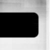
Next, select the black area for the mask using the Magic Wand Tool. My Tolerance was 50 because 0 just didn't cut it. Then hit Delete to erase the black areas. There may be little left-over spots but it will be less noticable after we apply the texture.
Since, we could see through the Brush layer now, we could see that the image is unproperly aligned. So I moved it to a point where we could see Kiera's face and bits of the background behind her. I moved it like so:

- the black represents transparent areas after moving it.
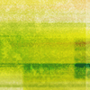
3. Now, open up the
sanami276 texture you're going to use. This is mine, coming from her Set 26. I set it to Darken. Now, we can barely see the picture. I wanted the pic a bit less affected by the texture, so I CTRL+Click the layer containing the polaroid brush and clicked Shift+CTRL+I to invert the selection. Then I clicked the texture layer and hit CTRL+J to duplicate ONLY the selected area. Then, with the selection still active, I went back to the complete texture layer and hit delete.
The texture:
I just used a complicated method to extract that certain part. If you can't follow that, follow this other methos:
1. CTRL+Click the layer containing the polaroid brush and clicked Shift+CTRL+I to invert the selection.
2. Go to the texture layer and hit CTRL+X to cut and then CTRL+V to paste.
3. Reposition the cut part of the texture to it's original place.
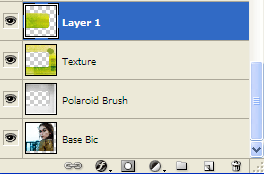
Well, yeah, set that extracted piece to Darken 44%. If you don't get it, take a look at this Layers Palette screen shot I took.
After this step, your layers palette should look somewhat like this:
4. Pretty, pretty! Now we're going to add some design stuff! First thing I did was add some Color Bars, horizontal and vertical in white and yellow. I set it to Normal 64% so it blends with the image.
The Color Bars:

The effect:
Then I decide that it was too bright green and I needed to mix in some colors. I added a red blobby thingy on the corner and set it to screen.
The Blob:

The effect:

Then I went a little brush crazy and brushed "Paris Petal" brushes by
iconistas in black. Then set it to Soft Light 69% to intensify the colors on the texture.
The brush layer:

(I added a white background so you can see the black brushes) The effect:
Then I corrected a bit of the texture because it looked a bit dull on top. I filled a bar of a greenish-yellowish coloe on a new layer and set it to Softlight 100% to add a bit more color.
After correcting the upper bit:

Then I added a combination of two mask brushes by
ewanism then set it to Normal 76% to blend it in.
The Mask brushes:

The effect:

And finally some grungelines by
quebelly to act as a subtle border. Set to Soft Light. These are must haves for texture-based icons:
The grungelines:
The final effect:
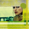
And Voila! The lovely Keria Knightley icon!
Please show me what you get and remember to comment when you find it useful Feel free to Mem this and Friend me too! =)