the one with the tutorial
I have been wanting to do this FOREVER, but I never got around to it. I'm lazy, what can I say? Anyway, this is my second tutorial that I've ever done (and trust me, you do NOT want to see the first one--radioactive colouring FTL). Shall we?
Go from this to
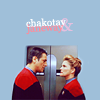
First, I should say that I am such a random idiot when I icon. I jump in between layers, tweak colouring after I think I'm long done with it, and occassionally do things backwards. I've tried to straighten everything out, but I may throw in a step or two that you won't use.
Today, we're going to use this cap by TrekCore.
Part One:
Step...Zero. IDK. I don't think this is a step. ANYWAY.
I usually just toggle the size percentage down to 50% when I work, but for the purpose of this tutorial, I went ahead and actually re-sized it to half of its original size.
Step One
Image>Adjustments>Auto Contrast. I ALWAYS do this. It is my kung-fu.
Duplicate your base. Set it to screen, 20%. Your base should now look brighter! Or, like this:
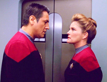
I'm on a computer that I know has a substantially darker monitor than most, so this may look a liiiittle bit dark to a few people. But not really. I don't know. Moving on.
Step Two
Decrease your Hue/Saturation by -10%. Yes, I said decrease. Voyager is such a vibrant, bright show that, if you anywhere near the Selective Colouring option, you will wind up with something radioactive. I tend do this for a whole host of caps, if I know I'm going to be using Selective Colouring. You should now have something a little bit quieter:

Okay? Okay.
Step Three A)
Selective Colouring. In Reds, decrease Cyan by -100% and increase Yellow to +100%. In Yellows, decrease Cyan by -100% and increase Yellow to +100%. Now, from here, what you do in the Neutrals depends heavily on the cap. For this one, I increased Cyan to +15%, decreased Yellow to -5%, and decreased Magenta to -5% (see? backwards). I usually work with the Yellows first, to see what the Magenta pops out as, and then decrease as I see fit. You should now have something that looks like this:

I know. It's really yellow. Just hold up a sec!
Step Three B)
Add another Selective Colouring layer. We're working a bit backwards again. Start with Yellows, and decrease to -40%. In Reds, decrease Magenta to -10% and increase Black to +15%. This adds a bit of definition to Janeway and Chakotay without turning it funky colours. I hope. Now, they look like this:
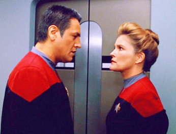
It doesn't look much different from the original, but it is, dammit. Anyway, it's still a bit too yellow for my taste.
Step Three C)
We're doing Selective Colouring again. In Yellows, decrease Yellow to -25%. Observe:

Now, that's better!
Step Four
Merge those layers, my pretties. Duplicate your base, and set it to Soft Light, 50%. Again, the percentage depends greatly on your cap, and your own instincts on how you want everything to look. Now, they look like this:
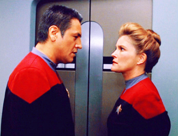
I know. Just wait.
Step Five
New layer. Fill it with #360000, and set to Exclusion, 60%. This takes the crazy, over-contrasted, saturated-looking aspect away from the cap. The amount that you set the Exclusion layer to depends entirely on you, and your cap. Each one reacts differently to the Soft Light layer, so play around with different settings for both the Fourth and Fifth step. You should have something that looks like this:
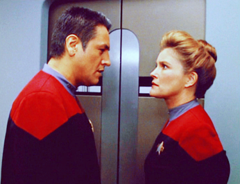
And it's a bit yellow, isn't it?
Step Five A)
In Selective Colouring, in Yellows, decrease Yellow to -35.In Blacks, increase Black to +5%. I usually play with the Black a touch, just because I tend to lose that wonderful, crisp black of their Starfleet uniforms without it. Now, we're done with colouring, and your cap should look like this:
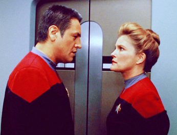
And you're done! With the colouring, anyway. Feel free to stop here if you're in it for the colouring. Crop away and sharpen at will.
Part Two:
Step Zero. Again.
Merge Visible. Duplicate your layer, and delete your locked background. This way, we're working with a transparent background, and not a white, inflexible one.
Step One:
Image>Canvas Size. I usually increase whatever I'm working with to 200px more than its usual dimensions. For this cap, we'll increase the Height from 265px to 465px. Grab your cap and drag it down to the bottom of the canvas, so that it looks like this:
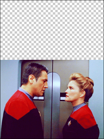
Wow. LJ didn't re-size it. Imagine that.
Step Two
This part's a bit tricky, purely because it's all up to you. Create a new layer, pull it underneath your background, and fill it with a blue from the cap. I grabbed #9FBFD9 from some shadows near Janeway's back. Your canvas:
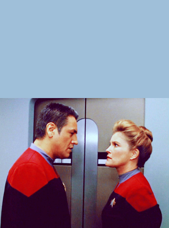
Step Three
Now, things get more and more up to you. I created a New Layer, and pulled up a 35px brush to start blending the two areas together. Using a combination of that, and the Polygonal Lasso Tool (my new best friend), I filled in the areas around Chakotay, the 'lift, and Janeway. I cleaned up some of the edges, too, with the Lasso Tool. Now, everything looks like this:
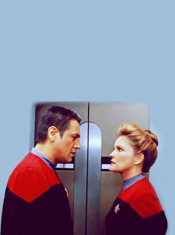
There's a tiny little bit around The Janeway Bun that I didn't fill in, because it kind of makes me giggle to have it silhouetted like that. Anyway.
Step Four
I sort of wanted to have more room around their bodies, so I increased the Canvas width 100px from 346px to 446px. I could have done this earlier, but I'm an idiot. Don't mind me.
Step Five
Merge and Crop! I cropped from the top down, this time. You'll get this:
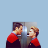
Step Six
Duplicate your layer, and sharpen it. Play around with the opacity until you get something that looks satisfactory. I hate sharpening, so feel free to do your own thing with this step. This is the only thing that works for me. I usually end up with an opacity of anywhere from 30%-40%. I got this:

Step Seven
Add some text! I never use this font, but I had a strange need to abuse it just this once. I used Georgia, free transformed it (Edit>Free Transform) and used two different shades of pink for 'Janeway' and '&'. And now we're done! Here's the finished product:

Other examples of this colouring or spacial use:

Voila!