LIMS 07 Results
Great turnout for Lims Challenge 07! Unfortunately two people will be leaving us tonight.
CHALLENGE 07 ELIMINATIONS!
VOTED OFF

by sweethermione21 (-8)
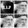
by _covergirl_ (-6)
CHALLENGE 07 CONGRATULATIONS!
FAVORITE ICON
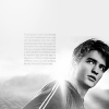
by alfiri (+3)
NO-VOTES (eligible for a skip)

by alfiri (3)
EARNED A SKIP!

and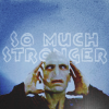
by alfiri
MOVING ON TO NEXT ROUND
alfiri ♥
gamma_wow
i_we_you
lauradumb ♥
li_potter
roxybaby2414
teapartea ♥
xmwuahharry ♥
CHALLENGE 07 VOTING TALLIES!
Here's the tally... Remember we're picking 3 least favorites and 1 favorite. Therefore, a negative (-) denotes how many people voted against your icon and a plus (+) denotes how many people voted your icon their favorit, zero (0) means you got neither or that they anuled each other out. So if you have a + point, pat yourself on the back!
Lims Challenge 07:
01
02
03
04
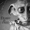

05
06
07
08


01: -1 +1 = 0
02: -0 +0 = 0
03: -0 +4 = 4
04: -2 +1 = -1
05: -2 +1 = -1
06: -8 +0 = -8
07: -1 +2 = 1
08: -4 +0 = -4
CHALLENGE 07 POSITIVE VOTING COMMENTS!
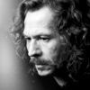
#01 -- Maybe crop isn't perfect (I think it will be better if you cut all right eye), but I love this icon! Text, texture use and b/w balance - all is good.
#03 -- I really liked this icon because it was very good as a whole. Good use of the grey scale. Good choice of image and the maker managed to keep the image quality. Good crop, keeps things centered but gives it a special soemthing. The only thing I don't like that much is the text since I think it might have looked better plain but I really like it.
#03 -- The choice of brightness/contrast is good, cropping well done and tiny text brush simple but in a way that benefits the icon and complements the light present.
#003 -- I love the contrast, the texture and the icon as a whole.
#03 -- Beautiful clarity and contrast
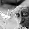
#04 -- This icon really brings out the emotions connected with Dobby. Perfect choice of picture, fantastically cropped and brought out beautifully through the b/w coloring that isn't easy to handle. Thanks for such a great icon.
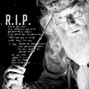
#05 -- The choice of the picture is a great idea, he's taking one of his memory while making us think that he will be remembered. I like the crop and how you did the text.
#07 -- The text works really well even though it's a little bit hard to read and the picture choice and the negative space have given the icon a nice overall look.
#07 -- The darkness and the text really add to the theme. (It was so hard to pick a favorite, so many were really fantastic!)
CHALLENGE 07 NEGATIVE VOTING COMMENTS!
#01 -- The text is a bit pixelated and doesn't really blend in with the rest of th icon making it lose some of it's impact.
#04 -- It seem uncreative, it would have been better with a texture, text or anything else.
#04 -- A little too bright, making it hard to see correctly. And for some reason, the sparks where he's snapping his fingers distracts me from dobby's face a bit too much.
#05 -- The tiny text is distracting from the rest of the image.
#05 -- Although I like the composition of the icon, I have to say that Dumbledore's face looks over-lightened, there should be more contrast. Also the tiny text looks blurry and unstructured.
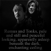
#06 -- The blending was done nicely, although the image ended up being a bit sharp. My main objection tho is the pixelated text and the texture underneath that doesn't add nor substract from the icon. I think in the end the text calls too much attetion and it's the icon's weakest point.
#06 -- I think the text takes away from an otherwise well made icon. The brush in the corner detracts from the icon and unbalances it.
#06 -- Oversharpened and text it's too rude, also font doesn't fit.
#06 -- The font is distracting from the image.
#06 -- Remus and Tonks have very different contrast, so the icon is not well-composed.
#006 -- The texture at the bottom is really distracting and the outlined text is really quite bad.
#06 -- The text stands out too much, it's distracting.
#06 -- The pictures looks a little bit over-sharpened, the cropping could have been more interesting. Additionally the chosen font doesn't look good on this picture and it's placement is unfortunate because it creates a second focus. The eyes can't decide where to look. At the faces or the text.
#007 -- Both the photos and the text are really hard to see/read. It there was a bit more contrast on both it could've been done better.
#08 -- The font choice does not match the tone of the icon - the light texture in the top left attracts attention away from the subject.
#08 -- Crop isn't good. Blocks don't fit with image.
#08 -- The many images would have worked better if there had been different images, but now the icon looks to busy and the white border doesn't really fit the overall look.
#08 -- The repetition of the same shot of Dumbledore is a little too repetitive.. It would look better w/ three different shots of him, perhaps from 3 different movies?
Don't take these comments as mean pointless critics, they could help you make a better icon for the next challenge!
It's alfiri's turn to do the banner and nomination for the winning icon.
CHALLENGE 07 ELIMINATIONS!
VOTED OFF
by sweethermione21 (-8)
by _covergirl_ (-6)
CHALLENGE 07 CONGRATULATIONS!
FAVORITE ICON
by alfiri (+3)
NO-VOTES (eligible for a skip)
by alfiri (3)
EARNED A SKIP!
and
by alfiri
MOVING ON TO NEXT ROUND
alfiri ♥
gamma_wow
i_we_you
lauradumb ♥
li_potter
roxybaby2414
teapartea ♥
xmwuahharry ♥
CHALLENGE 07 VOTING TALLIES!
Here's the tally... Remember we're picking 3 least favorites and 1 favorite. Therefore, a negative (-) denotes how many people voted against your icon and a plus (+) denotes how many people voted your icon their favorit, zero (0) means you got neither or that they anuled each other out. So if you have a + point, pat yourself on the back!
Lims Challenge 07:
01
02
03
04
05
06
07
08
01: -1 +1 = 0
02: -0 +0 = 0
03: -0 +4 = 4
04: -2 +1 = -1
05: -2 +1 = -1
06: -8 +0 = -8
07: -1 +2 = 1
08: -4 +0 = -4
CHALLENGE 07 POSITIVE VOTING COMMENTS!
#01 -- Maybe crop isn't perfect (I think it will be better if you cut all right eye), but I love this icon! Text, texture use and b/w balance - all is good.
#03 -- I really liked this icon because it was very good as a whole. Good use of the grey scale. Good choice of image and the maker managed to keep the image quality. Good crop, keeps things centered but gives it a special soemthing. The only thing I don't like that much is the text since I think it might have looked better plain but I really like it.
#03 -- The choice of brightness/contrast is good, cropping well done and tiny text brush simple but in a way that benefits the icon and complements the light present.
#003 -- I love the contrast, the texture and the icon as a whole.
#03 -- Beautiful clarity and contrast
#04 -- This icon really brings out the emotions connected with Dobby. Perfect choice of picture, fantastically cropped and brought out beautifully through the b/w coloring that isn't easy to handle. Thanks for such a great icon.
#05 -- The choice of the picture is a great idea, he's taking one of his memory while making us think that he will be remembered. I like the crop and how you did the text.
#07 -- The text works really well even though it's a little bit hard to read and the picture choice and the negative space have given the icon a nice overall look.
#07 -- The darkness and the text really add to the theme. (It was so hard to pick a favorite, so many were really fantastic!)
CHALLENGE 07 NEGATIVE VOTING COMMENTS!
#01 -- The text is a bit pixelated and doesn't really blend in with the rest of th icon making it lose some of it's impact.
#04 -- It seem uncreative, it would have been better with a texture, text or anything else.
#04 -- A little too bright, making it hard to see correctly. And for some reason, the sparks where he's snapping his fingers distracts me from dobby's face a bit too much.
#05 -- The tiny text is distracting from the rest of the image.
#05 -- Although I like the composition of the icon, I have to say that Dumbledore's face looks over-lightened, there should be more contrast. Also the tiny text looks blurry and unstructured.
#06 -- The blending was done nicely, although the image ended up being a bit sharp. My main objection tho is the pixelated text and the texture underneath that doesn't add nor substract from the icon. I think in the end the text calls too much attetion and it's the icon's weakest point.
#06 -- I think the text takes away from an otherwise well made icon. The brush in the corner detracts from the icon and unbalances it.
#06 -- Oversharpened and text it's too rude, also font doesn't fit.
#06 -- The font is distracting from the image.
#06 -- Remus and Tonks have very different contrast, so the icon is not well-composed.
#006 -- The texture at the bottom is really distracting and the outlined text is really quite bad.
#06 -- The text stands out too much, it's distracting.
#06 -- The pictures looks a little bit over-sharpened, the cropping could have been more interesting. Additionally the chosen font doesn't look good on this picture and it's placement is unfortunate because it creates a second focus. The eyes can't decide where to look. At the faces or the text.
#007 -- Both the photos and the text are really hard to see/read. It there was a bit more contrast on both it could've been done better.
#08 -- The font choice does not match the tone of the icon - the light texture in the top left attracts attention away from the subject.
#08 -- Crop isn't good. Blocks don't fit with image.
#08 -- The many images would have worked better if there had been different images, but now the icon looks to busy and the white border doesn't really fit the overall look.
#08 -- The repetition of the same shot of Dumbledore is a little too repetitive.. It would look better w/ three different shots of him, perhaps from 3 different movies?
Don't take these comments as mean pointless critics, they could help you make a better icon for the next challenge!
It's alfiri's turn to do the banner and nomination for the winning icon.