LIMS 06 Results
Great turnout for Lims Challenge 06! Unfortunately two people will be leaving us tonight.
CHALLENGE 06 ELIMINATIONS!
VOTED OFF
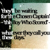
by noromancethere (-6)
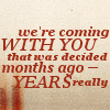
by stillxmyxheart (-5)
CHALLENGE 06 CONGRATULATIONS!
FAVORITE ICON
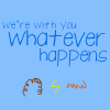
by gamma_wow (+3)
NO-VOTES (eligible for a skip)
NONE
EARNED A SKIP!
NONE
MOVING ON TO NEXT ROUND
_covergirl_
alfiri ♥
gamma_wow ♥
i_we_you
lauradumb ♥ ♥
li_potter
roxybaby2414
sweethermione21
teapartea ♥
xmwuahharry ♥
CHALLENGE 06 VOTING TALLIES!
Here's the tally... Remember we're picking 3 least favorites and 1 favorite. Therefore, a negative (-) denotes how many people voted against your icon and a plus (+) denotes how many people voted your icon their favorit, zero (0) means you got neither or that they anuled each other out. So if you have a + point, pat yourself on the back!
Lims Challenge 06:
01
02
03
04


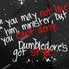
05
06
07
08
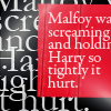
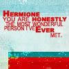
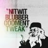
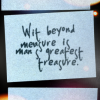
09
-
-
-

01: -0 +2 = 2
02: -6 +0 = -6
03: -0 +3 = 3
04: -3 +0 = -3
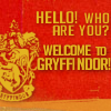
05: -1 +2 = 1
06: -1 +0 = -1
07: -1 +2 = 1
08: -3 +1 = -2
09: -5 +0 = -5
CHALLENGE 06 POSITIVE VOTING COMMENTS!
#01 -- I love the colouring here and the use of the house emblem. I actually feel that the font choice could be improved, but everything else about the composition, quote choice etc is pretty much spot on.
#01 -- The background fits with the Quote and I like that some of the words are bigger/smaller than the others.
#03 -- The creativity is extraordinary. I love the simplicity and how much it works with the text.
#03 -- Great font, thats works perfectly on the simple background. I adore the little symbols. Really nice icon, that captures the message of the quote!
#03 -- I love its simplicity. The quote isn't extense and it doesn't make use of any complex technique, yet the drawings help carry the message perfectly, while always keeping that kid's feeling about it.
#05 -- The main text works well here, even though it's all in one size and font. I like the placement and also is the text repeat in the background looking good there.
#05 -- Fantastic use of text. Stunning icon.
#07 -- it's very clean, easy to read, and I like the little touch of color with the texture, and the Dumbledore dingbat (I think that's what it is) is very cute.
#07 -- Reason. Coloring is nice, like the quote which goes well with the image. (like how it's outlined black and white)
#08 -- I like to composition of the icon. The textures are cute and the quote is great!
CHALLENGE 06 NEGATIVE VOTING COMMENTS!
#02 -- Contrast with text is distracting, as is the texture.
#02 -- The chosen font doesn't work on this icon, it looks too blurry (exp.:"waiting") in some parts and over-sharpened on others (exp.:they). Additionally the black and white makes it look unbalanced.
#02 -- The two-toned text is really distracting and it doesn't flow well with the icon. If the maker had chosen a different background/base it could've been good.
#02 -- The quote is too long IMO, and it's all in one font and one size. You should emphasize words to take out the monotony. Also is the black-white too distracting, it almost hurts to read the text.
#02 -- the texture is too much with the text and it makes it a little hard to read, with the differing text colors over the background; font choice isn't so great either
#02 -- The font is hard to read (especially with the colors changing mid-word for no apparent reason), which would be okay as a design element, but in a text icon, it does not work.
#04 -- There's too much going on in this icon. The texture calls more attention than the text and the red is hard to read against the black background.
#04 -- The colors and the font chosen make this hard to read, which would be fine in a graphic icon, but is frustrating in a text icon.
#04 -- The words looks too sharpened, mostly the red ones.
#05 -- Reason. The text in the background, makes the person looking at the icon lose focus of the actual quote. The text is cut off.
#06 -- The font choice is a little unfortunate. The red is too over-powering.
#07 -- The image of Dumbledore seems out of place. I think the text alignment could have been made more interesting instead of just being centrally aligned. The light texture covers over the text and distracts from it.
#08 -- I like the quote, but feel that the font is a bit unclear and has a strange mixture of being squashed together and having large spaces between lines. The text seems blurry and the colour on the icon is too muted.
#08 -- if I didn't already know the quote so well, I don't think I'd be able to read the text; all I can really make out well is "Wit beyond" and then the rest is too small and a little blurry
#08 -- Some of the words are hard to read, because of the Font, but if it has been one or two size bigger, it would have looked more clear. The text also looks at bit blurry.
#09 -- Bland texture, unimaginative font - ineffective and not engaging.
#09 -- Overall the icon is a bit bland and doesn't stand out that much. It's too plain.
#09 -- The background is too plain and except the one corner monotonous also is the text placed so accurate in the middle, it looks really boring.
#09 -- It's a rather plain icon and even the words in capslock have a hard time calling one's attention. I think it needs something to make contrast with the letters.
#009 -- Reason. Text overlaps red color on bottom. The text seems like it was "squished" into the box, making a bit hard to read.
Don't take these comments as mean pointless critics, they could help you make a better icon for the next challenge!
It's hpnarnia's turn to do the banner and nomination for the winning icon.
CHALLENGE 06 ELIMINATIONS!
VOTED OFF
by noromancethere (-6)
by stillxmyxheart (-5)
CHALLENGE 06 CONGRATULATIONS!
FAVORITE ICON
by gamma_wow (+3)
NO-VOTES (eligible for a skip)
NONE
EARNED A SKIP!
NONE
MOVING ON TO NEXT ROUND
_covergirl_
alfiri ♥
gamma_wow ♥
i_we_you
lauradumb ♥ ♥
li_potter
roxybaby2414
sweethermione21
teapartea ♥
xmwuahharry ♥
CHALLENGE 06 VOTING TALLIES!
Here's the tally... Remember we're picking 3 least favorites and 1 favorite. Therefore, a negative (-) denotes how many people voted against your icon and a plus (+) denotes how many people voted your icon their favorit, zero (0) means you got neither or that they anuled each other out. So if you have a + point, pat yourself on the back!
Lims Challenge 06:
01
02
03
04
05
06
07
08
09
-
-
-
01: -0 +2 = 2
02: -6 +0 = -6
03: -0 +3 = 3
04: -3 +0 = -3
05: -1 +2 = 1
06: -1 +0 = -1
07: -1 +2 = 1
08: -3 +1 = -2
09: -5 +0 = -5
CHALLENGE 06 POSITIVE VOTING COMMENTS!
#01 -- I love the colouring here and the use of the house emblem. I actually feel that the font choice could be improved, but everything else about the composition, quote choice etc is pretty much spot on.
#01 -- The background fits with the Quote and I like that some of the words are bigger/smaller than the others.
#03 -- The creativity is extraordinary. I love the simplicity and how much it works with the text.
#03 -- Great font, thats works perfectly on the simple background. I adore the little symbols. Really nice icon, that captures the message of the quote!
#03 -- I love its simplicity. The quote isn't extense and it doesn't make use of any complex technique, yet the drawings help carry the message perfectly, while always keeping that kid's feeling about it.
#05 -- The main text works well here, even though it's all in one size and font. I like the placement and also is the text repeat in the background looking good there.
#05 -- Fantastic use of text. Stunning icon.
#07 -- it's very clean, easy to read, and I like the little touch of color with the texture, and the Dumbledore dingbat (I think that's what it is) is very cute.
#07 -- Reason. Coloring is nice, like the quote which goes well with the image. (like how it's outlined black and white)
#08 -- I like to composition of the icon. The textures are cute and the quote is great!
CHALLENGE 06 NEGATIVE VOTING COMMENTS!
#02 -- Contrast with text is distracting, as is the texture.
#02 -- The chosen font doesn't work on this icon, it looks too blurry (exp.:"waiting") in some parts and over-sharpened on others (exp.:they). Additionally the black and white makes it look unbalanced.
#02 -- The two-toned text is really distracting and it doesn't flow well with the icon. If the maker had chosen a different background/base it could've been good.
#02 -- The quote is too long IMO, and it's all in one font and one size. You should emphasize words to take out the monotony. Also is the black-white too distracting, it almost hurts to read the text.
#02 -- the texture is too much with the text and it makes it a little hard to read, with the differing text colors over the background; font choice isn't so great either
#02 -- The font is hard to read (especially with the colors changing mid-word for no apparent reason), which would be okay as a design element, but in a text icon, it does not work.
#04 -- There's too much going on in this icon. The texture calls more attention than the text and the red is hard to read against the black background.
#04 -- The colors and the font chosen make this hard to read, which would be fine in a graphic icon, but is frustrating in a text icon.
#04 -- The words looks too sharpened, mostly the red ones.
#05 -- Reason. The text in the background, makes the person looking at the icon lose focus of the actual quote. The text is cut off.
#06 -- The font choice is a little unfortunate. The red is too over-powering.
#07 -- The image of Dumbledore seems out of place. I think the text alignment could have been made more interesting instead of just being centrally aligned. The light texture covers over the text and distracts from it.
#08 -- I like the quote, but feel that the font is a bit unclear and has a strange mixture of being squashed together and having large spaces between lines. The text seems blurry and the colour on the icon is too muted.
#08 -- if I didn't already know the quote so well, I don't think I'd be able to read the text; all I can really make out well is "Wit beyond" and then the rest is too small and a little blurry
#08 -- Some of the words are hard to read, because of the Font, but if it has been one or two size bigger, it would have looked more clear. The text also looks at bit blurry.
#09 -- Bland texture, unimaginative font - ineffective and not engaging.
#09 -- Overall the icon is a bit bland and doesn't stand out that much. It's too plain.
#09 -- The background is too plain and except the one corner monotonous also is the text placed so accurate in the middle, it looks really boring.
#09 -- It's a rather plain icon and even the words in capslock have a hard time calling one's attention. I think it needs something to make contrast with the letters.
#009 -- Reason. Text overlaps red color on bottom. The text seems like it was "squished" into the box, making a bit hard to read.
Don't take these comments as mean pointless critics, they could help you make a better icon for the next challenge!
It's hpnarnia's turn to do the banner and nomination for the winning icon.