Prep Tutorial No. 1: Basic Skills
Tutorial requested by
f_ireworks and granted, of course. This tutorial is meant as a basic prep for all manga pictures and scans. Though all my icon tutorials will have a ready prep tutorial already available, this tutorial is much more in depth, and lists many ways to get your bases good and ready before you do anything else.
Level: Easy
Program: Adobe Photoshop 7.0

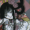
>>
and
>>
... and MORE BASIC SKILLS!
Prep No. 1 (Sharpening Bases):
No matter how you crop and resize, your new picture will always be a little blurry. When plain "sharpen" makes your icon way too pixelly, you can either use the Unsharpen Mask (FILTER>>SHARPEN>>UNSHARPEN MASK) or you can duplicate the layer (CTRL A (Select Canvas)>>CTRL C (Copy Selection)>>CTRL V (Paste Selection) and go to FILTER>>SHARPEN>>SHARPEN and then change the opacity of the layer until you think it looks good. Unsharpen Mask will give you more concise results but I find that regular ol' Sharpen is faster.
Watch out for bangs: often they turn out too pixelly while the rest of the picture is just right. In that case I usually take the blurred 5 pt eraser and set it on 20% opacity, 100% flow, and erase until they're perfect.
Example:

>> Opacity 60% >>
Prep No. 2 (Darkening Bases):
Sometimes a picture is simply too light to work with. The pastel colors drive you crazy when you're trying to add in light textures and the features almost blend into the background. When I'm working with pictures that I know will be too light for the effect I have in mind, I duplicate the layer (CTRL A>>CTRL C>>CTRL V) and then I set that layer to MULTIPLY. Change the opacity of this second layer depending on how dark you want your picture to be.
Example:
>> MULTIPLY 100% >>
I also like this darkening effect when working with lineart, because it makes the lines darker. I usually LAYER>>MERGE VISIBLE afterwards so I don't have to mess with it.
Prep No. 3 (Brightening Bases):
I love color. I love BRIGHT colors. So what do I do when I get a base that's too dull? I use Gaussian Blur, the effect from Photoshop God. Simply crop, duplicate the layer, and go to FILTER>>BLUR>>GAUSSIAN BLUR (Radius: 5-7.5). Set that layer to OVERLAY at whatever opacity you think is right and the icon is instantly brightened up. However, this effect isn't for every picture (though it does look fantastic on most!)--it tends to look too shiny on light icons and too heavy on dark ones. When I find that happens I usually take my trusty eraser tool, set it to a low opacity, and fix up the trouble areas.
Examples:

>> OVERLAY Gaussian Blur 100% >>
>> OVERLAY Gaussian Blur 100% >>
Prep No. 4 (Clearing Up Grey-Toned Bases):
Badly scanned pictures sometimes have that greyish tone in the skin that's ugly and hard to bear. So to rid yourself of it, use OVERLAY. Pick a skin-toned color like #FFE6D8 and set the layer to OVERLAY. Adjust the opacity so the doesn't look so washed out--I tend to go around 50%. If the skin of the character is still too grey, create a new layer, color in the section with the same color you used for the overlay, and set the layer to color. When you're all done, merge the layers together (LAYER>>MERGE VISIBLE). Use Prep No. 3 and brighten up your picture!
Step By Step:
>> OVERLAY 50% >>
>> COLORED SECTIONS 100% (opt) >>
>> GAUSSIAN BLUR >>
----
The main point of these tutorials is to help you gain insight on how to better your photoshop skills. Experiment. Play around with the options. Of course, if you're stuck with something, feel free to ask! This tutorial is constantly open to questions and new bits could easily be added. Until then, happy photoshoping!
_________
Was this tutorial helpful? Confusing? Too hard? Feedback would be wonderful!
[x] Like what you see? FRIEND
wicked_avis to stay updated on fresh tutorials, textures, brushes, and icons!
f_ireworks and granted, of course. This tutorial is meant as a basic prep for all manga pictures and scans. Though all my icon tutorials will have a ready prep tutorial already available, this tutorial is much more in depth, and lists many ways to get your bases good and ready before you do anything else.
Level: Easy
Program: Adobe Photoshop 7.0
>>
and
>>
... and MORE BASIC SKILLS!
Prep No. 1 (Sharpening Bases):
No matter how you crop and resize, your new picture will always be a little blurry. When plain "sharpen" makes your icon way too pixelly, you can either use the Unsharpen Mask (FILTER>>SHARPEN>>UNSHARPEN MASK) or you can duplicate the layer (CTRL A (Select Canvas)>>CTRL C (Copy Selection)>>CTRL V (Paste Selection) and go to FILTER>>SHARPEN>>SHARPEN and then change the opacity of the layer until you think it looks good. Unsharpen Mask will give you more concise results but I find that regular ol' Sharpen is faster.
Watch out for bangs: often they turn out too pixelly while the rest of the picture is just right. In that case I usually take the blurred 5 pt eraser and set it on 20% opacity, 100% flow, and erase until they're perfect.
Example:
>> Opacity 60% >>
Prep No. 2 (Darkening Bases):
Sometimes a picture is simply too light to work with. The pastel colors drive you crazy when you're trying to add in light textures and the features almost blend into the background. When I'm working with pictures that I know will be too light for the effect I have in mind, I duplicate the layer (CTRL A>>CTRL C>>CTRL V) and then I set that layer to MULTIPLY. Change the opacity of this second layer depending on how dark you want your picture to be.
Example:
>> MULTIPLY 100% >>
I also like this darkening effect when working with lineart, because it makes the lines darker. I usually LAYER>>MERGE VISIBLE afterwards so I don't have to mess with it.
Prep No. 3 (Brightening Bases):
I love color. I love BRIGHT colors. So what do I do when I get a base that's too dull? I use Gaussian Blur, the effect from Photoshop God. Simply crop, duplicate the layer, and go to FILTER>>BLUR>>GAUSSIAN BLUR (Radius: 5-7.5). Set that layer to OVERLAY at whatever opacity you think is right and the icon is instantly brightened up. However, this effect isn't for every picture (though it does look fantastic on most!)--it tends to look too shiny on light icons and too heavy on dark ones. When I find that happens I usually take my trusty eraser tool, set it to a low opacity, and fix up the trouble areas.
Examples:
>> OVERLAY Gaussian Blur 100% >>
>> OVERLAY Gaussian Blur 100% >>
Prep No. 4 (Clearing Up Grey-Toned Bases):
Badly scanned pictures sometimes have that greyish tone in the skin that's ugly and hard to bear. So to rid yourself of it, use OVERLAY. Pick a skin-toned color like #FFE6D8 and set the layer to OVERLAY. Adjust the opacity so the doesn't look so washed out--I tend to go around 50%. If the skin of the character is still too grey, create a new layer, color in the section with the same color you used for the overlay, and set the layer to color. When you're all done, merge the layers together (LAYER>>MERGE VISIBLE). Use Prep No. 3 and brighten up your picture!
Step By Step:
>> OVERLAY 50% >>
>> COLORED SECTIONS 100% (opt) >>
>> GAUSSIAN BLUR >>
----
The main point of these tutorials is to help you gain insight on how to better your photoshop skills. Experiment. Play around with the options. Of course, if you're stuck with something, feel free to ask! This tutorial is constantly open to questions and new bits could easily be added. Until then, happy photoshoping!
_________
Was this tutorial helpful? Confusing? Too hard? Feedback would be wonderful!
[x] Like what you see? FRIEND
wicked_avis to stay updated on fresh tutorials, textures, brushes, and icons!