Series 1: [CRITS]
Critiques by numbers, idea once again snagged from tartankilts. Anyway, here's a basic overlook - +2 means you were first on a person's list, +1 means you were second, - means you were least favourite, G is a general comment, and ★ means mod's choice (and anything in [M] is something I specifically want to point out I said to an iconmaker, mostly those that were close for mods.)
1
2
3
4
5
6
7
8
9
10
11
12
13
14
15
16
17
18
19
1
BATTLE 1
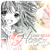
[G] Ah I love this icon, the colored parts of the icon are lovely! What I didn't like was how faded the b&w part is, if it's a bit darker, it'll be perfect.
[+2] no comments
BATTLE 2
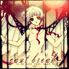
[-] Kudos for the creative idea. That red/orange dot in the corner just really bothers me. I'm not too sure what it has to do with the icon's theme.
[G] I love the theme, but it seems a bit too faded out on her face, and the dot in the corner seems out of place.
BATTLE 3
[+2] no comments
[+2] no comments
[+2] no comments
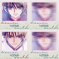
[G] I really like it, but I have no idea what the cursive text says.
[+2] no comments
[+1] I love the crops used on the two images and how it fits in with the animation.
[+3] One of the nicest animations, and I really like the composition of this icon above the others.
BATTLE 4
[+1] no comments
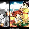
[+3] I like the vibrant colors used in the icon. Granted, it didn't stick with the specifications, but the icon as it is now is still beautiful.
[+3] I love the crisp colors of this icon, and how everything pulls together with your black borders. The simple use of orange lights is very eye-catching as well.
[+2] no comments
[+1] I like the colors and cropping and the composition.
[+1] It's a really cute icon, and I like the way that the black frames it.
[+1] I like the black/white fade away. Very nice.
[+2] Very cute image choice! The colors are eye-catching and contrast is just right. I love the b&w repetition as well, and the black border adds a nice touch, as well as the light textures. A very pretty, very well done icon.
[+3] You guys make it so hard to vote! This icon has wonderful colors. I really like the sparkly fireflies and I've never seen this stock.
[+1] no comments
2
BATTLE 1
[+2] Composition and coloring are good, but I would suggest a less thick font or the words to be in caps.
BATTLE 2
[-] The quality of the smaller image is quite poor and it's oversaturated. The random blocks don't make much sense and their colors don't match very well with the picture. You could have used more space for the picture and not for the texture thing.
[+2] A wonderfully creative icon! Great use of colors, placement, and brushes.
BATTLE 3
[+3] no comments
[+1] no comments
[G] it's a cute icon, but there is a really weird splotch of color over Tomoyo.
BATTLE 4
[+1] no comments
[+3] no comments
[+3] This is too gorgeous. I just happen to really love this kind of coloring and the crop & composition is lovely as well. <3 The red bits are a little too bright though.
[+3] GOD I just love everything about this icon! The coloring is so bold yet not overpowering in the least, and it is very clean.
[+2] no comments
[+2] Coloring and cropping...all good. Stuck out, in a good way.
[+3] Beautiful coloring! The image got really bright, but I love the effect it gives. My only nitpick is the lines are a bit too sharp as a result, but it's so eye-catching that it doesn't matter. The repetition was also pulled off flawlessly, and I love how they actually shifted the placement of the images around to make it fit that space. I absolutely love this icon.
[+3] no comments
[+3] no comments
3
BATTLE 1
[G] I like the cropping and the idea for it, but the colours are too much of a washed out, dull red.
[+1] I love the colours in the icon and how the brush nicely blends into the icon. I'm not sure if the word is necessary though, granted it fits the expression on Sakura's face but I prefer the icon textless.
[G] The use of flowery gradients/textures overwhelm your icon. They also don't really fit your icon theme.
[+1] The mood of this icon is VERY Sakura. I also like the flowers on the side.
BATTLE 2
[+2] no comments
[+2] I love the subtle colors and the composition of the icon; the text is done very crisply and nicely too ^^
[+2] I really love the muted, almost grey-scale coloring on this picture. The set-up is really original (great cropping).
[+2] no comments
BATTLE 3
[+1] Very sharp and clear, though it would have been better if there was some text.
[+2] no comments
[+3] no comments
[+2] no comments
BATTLE 4
[+3] no comments
[+3] no comments
[+2] no comments
[G] The icon needs further sharpening and the bottom half of the icon also seems poorly executed. The text is a bit too small for my liking.
[G] The composition is nice, but I think some sharpening could be used and the colors needs to be brought out more as well.
4
BATTLE 1
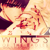
[+1] no comments
[+2] A really clean icon. I really like the colors and how smooth it looks (my only problem would be that the rectangles of color don't quite match with ones found on the icon)
[+2] no comments
[+2] Gorgeous composition, excellent use of textures, nice typography. A very nice icon overall and my favorite of the batch!
[+1] This one has wonderful colors and I love the little strip separating the text from the image. It's very creative.
[+2] The coloring is gorgeous, as are the crop and layout.
[+2] It's pretty. And it works with the text and there are wings and it's just awesome.
[G] Cool icon! I love the font placement and use as well. but I'm not too fond of the different coloured bars.
[+1] The composition is very well done, but the coloring is a bit overwhelming. I particularly like your text positioning and border.
[+2] I think it's the color palette that draws me to this one. I also love the effect of the top-cropped text.
[+1] no comments
[+2] no comments
BATTLE 2
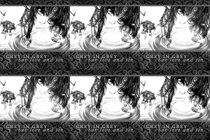
[+2] no comments
[+1] no comments
[+2] no comments
[+1] no comments
[G] The texture chosen as the border is too dark and 'heavy' in contrast with the overly faded image.
BATTLE 3
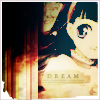
[+1] no comments
[+3] no comments
[+1] no comments
[+2] I like how dark this icon is in contrast with the others. I feel it's perhaps a bit too washed out and could use more detail (which was lost in the coloring), but it's still a favorite of mine.
[G] nice coloring, but the black in the corner could have been less. It looks like it's going to crawl over the rest of the icon.
BATTLE 4
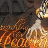
[-] The subject is really hard to see here, because the coloring is much to dark and the text too big. Maybe if the original image was smaller and we could see that the entire subject, the icon would look better.
[-] It's kind of a shame, because I really like the typography, but the icon itself is far too dark. I can't even make out what it is, or even tell if it's a doubled image.
x2 [-] It's waaaay too dark. I can't even see most of the images in the icon to even tell that it's a double image. And the text is too big - it stands out too much.
[-] I love how you just decided to show the hands, but it took me a long time to figure out what was on your icon. Also, the way the image was duplicated in the background looks too dull. While I understand that it was supposed to be faded, the way it was done looks too dull and dark. The text is too large and makes the focus of the icon even more confusing.
[-] I can't even make out the subject of this icon, and all the curls in the font choice seem a bit too much.
[-] I just really don't understand this image. And the colors are dull and the font is too overpowering.
[-] The crop and text placement cause the image to be difficult to discern. The text overpowers the icon.
[-] It's very hard to see the background image, and the random light splotch by the arm doesn't make much sense.
[-] I think the background on this one turned out a bit too dark - I had to squint to be able to tell where the image repetition was. The crop is interesting, but the text obscures it and I had a very hard time telling just what was in the image besides a hand... I think the text placement could have been a little better, it's obscuring some seemingly important parts while leaving what looks like a big negative space on top (since the background is so dark). A very creative idea, though.
[-] The text is too um, big and is more noticable than the image itself. Also, I had to look closely as to see what the image presented. The coloring, IMHO, is quite dull.
[-] It's nice to see an icon among the batch that has a completely different crop (no faces on the icon) but I think the icon would look better if it wasn't so dark. Also, I think the text stands out a lot, maybe you could try implementing it more into the image, like on a different blending mode, and perhaps make the text smaller, because my attention goes out to the text immediately, while I don't think that's the point of the icon?
[G] The text is too distracting and the image isn't very well blended.
[G] The font is way too large and part of the icon is so dark I can't even make out who's in it.
5
BATTLE 1
[G] good picture, but the second half of the icon is just boring and the golden-brown colors don't match too well with the icon. If the section was smaller, it would have looked better.
BATTLE 2
[-] The b&w isn't executed well, since it seems dim and plainly desaturated when there are ways to make the b&w colors pop. The texture used on the top is also distracting.
[-] The icon is too blured out, so the quality decreases. You should've shapened it a little bit.
[G] The font is too sharp, and the image looks too stretched as well as in need of sharpening.
BATTLE 3
[+1] while a little boring, I think it's cute how you used a bunch of different parts from the image and made them work well together. Could have done a little more on the actual appearance of the images, but it's really cute and clever.
[+1] I'm not very fond of the saturated colors (though the image was admittedly difficult to work with), but the composition as a whole is really nice and makes this icon stand out.
BATTLE 4
[+2] This one is beautiful as well. The butterfly is what attracted me to this icon overall. It's a very unique idea and I like how the "B" is different.
6
BATTLE 1
[-] Although it is quite cute, the biggest problem is the text. I can't read it and that really takes away from the icon when you're straining to see what on earth they're saying. Except for tiny text, it's just there for the sake of being there for some reason. But it's really important to have legible text, especially when the contest is about lyrics.
[+1] The text phrase (although too small for my liking) and colors give the icon a soft look and matches the mood of the image.
[G] I love this icon, and I love the text you used with this image, but I think the text either needs to be darker or larger, because I had to strain to read it. Still, it's absolutely adorable.
BATTLE 2
[G] I like the composition of this icon, the colours are fitting and it definately fits the theme. The text seems a little out of place, though - perhaps changing the font would help the icon out a lot.
BATTLE 3
[+1] no comments
[+1] no comments
[+3] no comments
[+1] no comments
[+1] I didn't notice the animation on this one either. But I love the transition from sorta gray to brown in Kobato's hair.
[+3] The use of textures is really fitting and pretty, as well as the image placement and typography. The animation though is hardly even noticeable (I can't even tell what the animation is doing XD; ) and is also a bit choppy, so I feel maybe you should've picked a better animation or done a different icon where animation could fit better. Otherwise, this is a very aesthetically pleasing icon!
[+2] The warm coloring flatters the image nicely and the textures/use of text fits in nicely with the composition of the icon.
[+3] no comments
[+3] no comments
[-] Well, it was a toss up between this and another icon, but in the end this was chosen because of the lousy animation. The gradual desaturation of the pic is barely noticeable and the brightening of the flower seems redundant. The flowery textures at the bottom only serves as a distraction; half the time I was looking at it rather than the image in the icon. The words, sandwiched in between the textures and the image is also hard to see.
[-] This icon is nice, but the reason I'm voting it off is that it took me quite a while to even figure out it was animated - the animation seems to just be "there", and when you can hardly even tell it seems quite pointless. Also, upon actually paying attention to the animation, it seemed more hypnotic/disturbing than I would like. :/
[G] it would have been a really good icon if you hadn't had to animate it. The quality was taken away from the image, and the animation is really clunky. If you had found some other way to add animation, it would have been better than just the partial grey-scale and back.
[G] This was a really difficult choice. I love this icon so, so much--the flower patterns on the bottom are fantastic, and especially in conjunction with the text and color palette and image. I also like how subtle the animation is, but its also choppy, which is ultimately the reason why I cut it out.
BATTLE 4

[+2] no comments
[+2] no comments
[+3] no comments
[+2] no comments
[+2] Love the originality and the colors. A really neat and beautiful icon.
[+1] no comments
[+3] The effect is just...stunning. Took my breath away.
[+2] no comments
[+3] I really like the icon's colors and the use of textures here, how both of the images are placed in light textures.
[+2] no comments
7
BATTLE 1
[G] Great coloring!
[★] I feel so cruel picking out a mods choice, all the icons are gorgeous... but this one takes mods choice. I love the colouring, the background on it... and even though my first instinct was not to be fond of the text font, it actually adds to the icon's effect. Overall, really good job here.
BATTLE 2
[-] the colors seem a bit oversaturated, and the text is blurry.
[G] I like the dark feel, but the icon just seems to be a little too dark overall, so as the subject and text can't be seem clearly.
BATTLE 3
[-] While the coloring is lovely, the border leaves a bad impression. If that border wasn't there, or maybe just a plain white 1x1 border, the icon would look much better.
[-] It's a little plain when compared to the other icons. It doesn't really stand out or give any sort of impression. I almost didn't even see it until I did another thorough look at the voting table. The faded borders at the top and bottom don't add much to it either.
BATTLE 4
[+3] no comments
[+1] no comments
[-] The icon itself would be alright if there wasn't that doubling requirement. Although you did it in a rather unique way, it looks randomly placed and more like an afterthought rather than part of the big picture. Desaturation was nice to make it different though.
8
BATTLE 1
[-] The monochrome colors stand out too much and overtake the image itself. The text is too dark and a little hard to read. The white glow in the corner is a nice touch, however. Maybe if the orange was toned down a bit, the icon would look better.
[G] I'm not too fond of this coloring and it seems too strong for the image, considering the close up crop. The font is also too jarring along with the 3 lines below it.
BATTLE 2
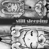
[+1] It took me a while to realize what this was, but when I did I fell in love with it. The cropping is nicely chosen and the text is wonderfully placed. I dunno if it's a texture or part of the image or what but the Cloud Card really looks cool.
[G] Composition wise, the icon is excellent. I like the flipped and minimized look. Only thing is, the minimized duplicate seems blurry in comparism to the bigger version in the same icon.
BATTLE 3
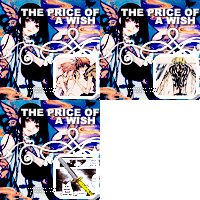
[+3] no comments
[+3] no comments
[-] Between the animation and the icon in general, it's just too busy looking.
[-] The variety of things going on in the icon (brushwork, text, and animation) overpower the icon.
[-] Even though the coloring is very nice, the icon is too crowded and busy.
[M] Despite what everyone else said about the icon being too busy, this was another strong candidate for mods. I really love the colouring, and it's a rather creative idea. Normally, I wouldn't like text like that but I loved the text for this one. Good job!
BATTLE 4
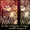
[+1] no comments
[G] The images are oversharpened and the colors you chosed makes the images look harsher. The text isn't all that fitting either.
9
BATTLE 1
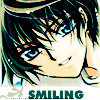
[G] I think the font is way too big for the image and since he has such a peaceful expression on his face, the huge font really doesn't fit the whole mood.
[G] This icon is HAWT. XD
BATTLE 2
[+2] The cropping's was very well done, and I like the flowery textures on top. The desaturation makes the icon come together perfectly. Only thing is, the words might be too light to read, particularly towards the upper left corner.
[+1] no comments
[+2] no comments
[+1] Although the text is pretty much obliterated by a random blob of light, I really like the softness of the monochromatic scheme here :) The crop is nice and emphasizes her flowing/falling. :)
[+1] A little too faint in the upper-left corner, but I like the composition of the icon and how smooth it is.
BATTLE 3
[+2] I like the gold coloring of this icon, and it's a very cute and original idea.
[+1] no comments
[+3] The colors here are really what wins it for me. I don't know what it is or how you did it, but I like it. ^^ It really conveys a regal mood that matches your text. The text itself is also well placed and easy to read.
[+1] Haha, so adorable. <3
BATTLE 4
[+1] A unique way of duplication, and the light filters are reminiscent of spotlights that draw my attention to the text.
[+2] Your cropping and image placement is fantastic, and I really love how the text mirrors itself.
[G] Waaay too much blank space. I know that's how the orignal image is, but my eyes are just drawn to that blank space and have to contentrate on one half of the icon at a time.
[★] This is definately my favourite icon this week. I love the colour scheme, and I love the creative way you've split the image, and the way the text is mirrored. It's very eye catching and I noticed it straight away. Good job!
10
BATTLE 1

[+1] the colouring is amazing, and it fits the theme very well!
[-] Well... it matches the theme and it has nice shading but it's a little too simple. Some text, patterns, or even textures could have helped. I really do love this icon and normally it would be one of my favorites, but the competition is really intense. Keep it up though!
BATTLE 2
[+1] I like the coloring and the light texture was well chosen to compliment the image.
[-] I don't know if you intended to do this or not, but it looks like Chii has red eyes. And that's kind of scary. D: There's also something a little off about the black space and the colour of the text. It doesn't seem to exactly match the rest of the image.
[-] The starkness of the black clashes with the rest of the image. Also, Chi's eyes being that saturated of a red makes her look...I dunno, evil?; they look out of place.
BATTLE 3
[+2] no comments
[+1] no comments
[+2] no comments
[-] the colors in Tomoyo's face are way oversaturated, and the text is too difficult to read.
[-] The coloring is very washed out, and the add-ons like the bulky texture on the side and the border don't really help to enhance it's overall look, instead it clutters it and makes it hard to find a certain focus on the icon.
BATTLE 4
[+1] This icon has a wonderful, creative layout! I love how the little circles match the colors in the image perfectly, it shows you have a very good sense of balancing your colors.
[+1] Unique and eye-catching style. The textures were well-chosen for the background and compliment it nicely, overall a very elegant icon. I'm not sure I'm very fond of the dots above the images, I think perhaps they could have been a more muted shade, but otherwise this icon is very pleasing. Great job.
[-] The image is way too small and it's mirrored in the same square to get a strange squished up effect. The text doesn't make any sense as well.
[G] I like what you did, although because the icon is mostly border, your images are too small.
[G] I can hardly see that image. While your eyes are drawn towards it because it's the only colored thing, the white is way to overpowering and takes up too much of the icon.
11
BATTLE 1
[+1] Nice cropping and I love the bright colors.
[+1] no comments
[G] Excellent colors! They all fit together very nicely.
[+2] I love the colors of this icon. The brightness well-matches the mood of happiness and I love how it fades out to white.
[+2] I absolutely love the colouring, the cropping and icon composition is lovely as well.
[+1] no comments
[+1] no comments
BATTLE 2
[+2] Grayscale really compliments your style. The shadows in the icon are really gorgeous. The white that's place behind the text looks just like clouds and the texting is really wonderful. Great job!
BATTLE 3
[-] The text looks out of place here. And the coloring is a little...um, weird.
[G] Despite the creative ideas with the colouring, it's not too pleasing for the eye. The text really looks out of place - I think adding a layer to make the icon a slightly lighter colour would have helped lodes.
BATTLE 4
[G] I love the colouring on this icon, though the split off colour strip seems a little weird.
12
BATTLE 1
[G] It doens't look like much was done with the icon. It's kind of washed out; if some color adjustment had been made, as well as a border and textures, it would have looked much better.
[-] The cut-out of the picture seems a bit odd, which might be because of the purple texture in the background, which I feel doesn't blend well with the colors of the icon.
[-] I think the image is a little washed out, and I'm not crazy about that empty space on the bottom right corner. Perhaps some text, or a brush?
BATTLE 2
[+2] no comments
[G] I like the use of the image and font on this icon. However, the left hand side seems a little bare in contrast, so perhaps adding something else in would make some difference. It looks nice as it is, though, so I don't know if that's just preferance.
BATTLE 3
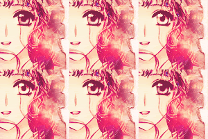
[+3] I love the animation for this icon, it's so original! The cropping is lovely, and the pink color tones fit beautifully with the image used. Great job!
[+2] AMAZING ANIMATION. I didn't even notice that the eye was moving.
[+1] This animation is masterful. It cought my eye the minute I opened the page. The transistions are subtle and smooth, which draws your eye but still isn't necessarily distracting. The colors and crop of the icon are also very well done; thank you for not concentrating so hard on the animation that you forget the rest of the icon!
[+2] no comments
[+1] no comments
BATTLE 4
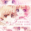
[+3] no comments
[+1] no comments
[+1] no comments
[G] I really like the composition of this icon but the icon is too faded for my liking. But it's a great icon nevertheless.
13
BATTLE 1
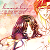
[G] The use of flowery gradients/textures overwhelm your icon. They also don't really fit your icon theme.
BATTLE 2
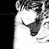
[+2] This icon is B&W but catches a lot of attention. The technic was very well executed and it makes the icon very appealing. Excellent work! ^^
[+1] no comments
[+2] no comments
[+1] no comments
[-] the icon is pretty but its hard to focus on it
[G] The black space doesn't work well here, and the image's contrast is too high, giving the icon a jarring feel.
[M] I really, really, really wanted two mods this week.. but I had to choose, and unfortunately, it wasn't yours *huggles* but I still want to give out my opinions~ for a b&w icon, it really stands out admid the ones of the same style. Unlike others, I really like the use of the black strip. Good job here!
BATTLE 3
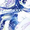
[+2] The color palette is great here. Normally, I don't like textless icons, but the glow spots and litte 'x'es are very effective, and really help to give the icon some visual interest that it would lack otherwise.
[-] Coloring is boring, and the crop is a bit odd.
[-] The icon is a little too bright, so much that it's blinding and the icon needs more color.
[-] The blue is too harsh and I think the light filters are unneccessary. The cropping could have been better.
[-] I really didn't like this icon. The blue coloring is overwhelming the icon and grates on the eyes. The light filters seem to be added on as an afterthought and serves no purpose. As for the text, I think almost anything would be more meaningful than a mere 'XXX'.
[-] It's an interesting crop, but the icon looks a little bland because there's not much color compared to the other icons.
[G] it's very blue, and the shade is rather unattractive over her skin. Less blue and more of other colors would have been better.
BATTLE 4
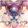
[-] The text totally sticks out and the coloring lacks a focus--kinda randomly colored.
[G] It looks a little too messy. I can't even tell where the second person is. And the text clashes with the image.
[G] The icon is so bright such that I can only make out one person from the icon and the font could be improved.
14
BATTLE 1
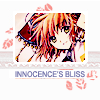
[+2] no comments
[+2] no comments
[+2] Really cute/neat looking in terms of layout.
[G] The most interesting composition out of all the icons in this batch. Really unique, I love it.
[+1] I really like the layout, although I think the text could've been improved (something about either the color or the font choice or the text itself, I think).
[+1] It's so cute. I love everything about it. The cropping is great, the text is clear and it just goes together really well. I give you an A+. And an invisible gold star.
[G] What a lovely and pleasant icon. I love the texture and brush use and the whole composition is lovely! The image looks a tad bit oversharpened to me though, compared to the font in the same icon.
[+2] It has a really nice use of textures, and because of the chosen colors, the white doesn't make the icon look empty.
[+1] no comments
[+2] no comments
BATTLE 2
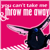
[+1] Your icon is insanely awesome. XD Not only were you the only one that picked a cutesy theme from serious lyrics of the song, your placement of text and imagery is wonderfully done. The icon is simple, but stands out amongst the rest as a very creative icon regardless.
[+1] no comments
[+1] no comments
[+1] no comments
[★] You my dear, steal this weeks mod's choice by a fair way. It was between two icons mostly, and this one is so unique that it really probably is my favourite of the bunch. The colouring is great, and the unique aspect on the lyrics makes it even better. Really good job!
BATTLE 3

[+3] Tomoyo looks very clear and sharp is this icon unlike the others, and the falling petals are a nice touch.
[+3] The coloring is gorgeous! The image quality is good, as is the animation (which in nicely with the icon).
[★] This has to be my favourite icon out of this week. As soon as I look at the table filled with Tomoyo, this one catches my eye straight off. She's crisp, clear, and not faded, making her easy to see, and the animation is a lovely touch. Good job!
BATTLE 4
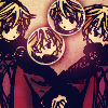
[+2] The coloring was wonderfully executed as are the bubble like duplication, though I think some tiny text would have made it look better.
[+1] no comments
[+2] While I'm not a fan of repetition by bubbles, I really like the colors of this icon.
[+2] The icon has a nice coloring and I like how the double image was places in what otherwise would just be a white space.
15
BATTLE 1
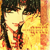
[+2] the colouring is gorgeous; and the text done very nicely
[+2] This icon has amazing coloring! I love the antique-esque look and the usage of text. The image is cropped well and matches with both the texture and text. A graphic well done!
[G] the image is blurry and grainy at the same time (blurry grains? does that make sense?) I think part of it might be the brush you used in the corner. I like this icon, but just make sure you look out for the quality of the image.
[+1] no comments
[+1] Love the colours and use of text.
[+1] no comments
[+1] The use of text is really nice on this one, and I really love the composition as a whole. The yellow could be a bit less bright, in my opinion, but it doesn't take away too much from the icon!
[+2] no comments
BATTLE 2
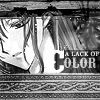
[G] The icon as a whole is too sharp. The font choice, color ('C') and text could have been done much better.
BATTLE 3
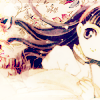
[+3] I just LOVE the coloring and the way it was cropped/rotated. It's very soft, but immediately caught my eye.
[+2] no comments
[+3] I love the soft pastel coloring and the cropping looks good too.
[+2] The coloring and use of textures is awesome, it's almost looks like some type of soft quilt material or something. Very nice!
[+3] no comments
[+1] no comments
[+2] The flowery texture behind Tomoyo makes the icon look 'soft', and I like the coloring to match the texture.
[-] the contrast is really high, its hard to make out anything but her hair.
BATTLE 4
[G] I think that the image quality could have been better. While I really like the format you had in mind while making the icon, the images are blury and the lines on them are ill defined with overpowering dark of the image (as in, you could have adjusted them a little better before desaturating them)
16
BATTLE 1
[-] It looks like a lot of quality was lost when saving the icon; which makes the text very hard to read and reduces the quality of the images.
[-] the animation is terribly glitchy (you can really notice it down in the 'save us' section of the font). Also, the quality of the images are really poor, very pale, and the skin blends in with the border.
(x3) [-] Images are terribly oversharpened, and the text is almost illegible.
[G] I like the animation, but it is oversharpened. The text is somewhat unclear as well.
[-] Making it an animated gif just killed the image quality. It's too grainy and washed out in terms of colour.
[-] The composition and coloring are pretty nice, but the oversharpening kills the icon for me. It's probably only so sharp because the animation needs to fit the 40kb limit, but still, I'd have traded the animated-ness of the icon for smoother lines.
[-] While the concept behind the image is interesting, the animation could've been made smoother. Also, in compressing it as a gif, the quality of the image suffered a lot. The text is far too blurry and is unappealing.
[-] The colors give the icon a very bad quality feeling.
BATTLE 2
[+2] no comments
[+2] no comments
[+1] no comments
[+1] no comments
[+2] no comments
[G] I like the use of the font, but I'm not really sure about the image in general. Overall it's a good icon, but it seems slightly oversharpened. It's good overall, though!
BATTLE 3
[-] it's very plain to look at; looks like nothing was done with the orignal image.
[-] Snow is good but the colors don't really match. The blue is way too blue and the text don't go with the colors as well.
BATTLE 4
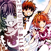
[+1] no comments
[-] The coloring on the desaturated duplicate of Sakura is awful. The purple and green makes her look sickly and doesn't bring out the joy in her expression. The text is also badly positioned.
[G] The coloring over sakura's face on the side is really odd and distracting.
17
BATTLE 1
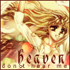
[-] The tan coloring is dull and it could use some sharpening. It simply does not stand out next to the other multi-colored icons (not your fault, but maybe you should try something eye-catching). Also, the text while suitably placed, the choice of font for 'don't hear me' does not fit the icon.
[-] The coloring is very beautiful, but the text and border don't seem to go with the picture very well and give it a somewhat sloppy look. The dark border, especially, gives the icon a different feeling...
[-] The font used for the word "heaven" doesn't fit the icon, nor the one below it. And the brownish border is way too dark, and it's too contrasted with the general color of the icon.
BATTLE 2
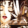
[-] The text is a bit hard to read, and I'm none too fond of the drop-shadow effect on it. The icon also looks a tad too plain outside of the text, and doesn't stand out very much.
[-] I can't read the text; the color and dropshadow on it are really distracting. Plus, the crop puts focus on different parts of the picture and makes it difficult to figure out what your focal point was.
[G] I like this icon! The colour scheme works well for it and really compliments the image.
18
BATTLE 1
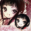
[G] I like the double image and the texture use here, cute icon!
BATTLE 2
[-] The font is way too sharp, the image looks flat and bland, and the white border in the middle is just out of place.
[-] While the cropping is original, it looks awkward. Cutting off Chii's eye makes her look weird here, and the second smaller crop just looks like a bunch of random lines. The text is over-sharpened and looks out of place. Since this was a lyrical icon, maybe some color should have been added to spruce up the icon, because overall, it's bland.
[-] It's just kind of plain, too plain really. And the left side of the icon I can't explain but it just looks some-what out of place.
19
BATTLE 2
[+1] no comments
[-] Though the concept of the icon is a good one, the image itself appears pixilated and unclear.
[-] Not too fond of the text used here and the bright white spot makes it hard to identify the character
[-] Looks rather plain in comparison to the other icons, and the font choices don't really compliment each other.
1
BATTLE 1

[G] Ah I love this icon, the colored parts of the icon are lovely! What I didn't like was how faded the b&w part is, if it's a bit darker, it'll be perfect.
[+2] no comments
BATTLE 2

[-] Kudos for the creative idea. That red/orange dot in the corner just really bothers me. I'm not too sure what it has to do with the icon's theme.
[G] I love the theme, but it seems a bit too faded out on her face, and the dot in the corner seems out of place.
BATTLE 3

[+2] no comments
[+2] no comments
[+2] no comments
[G] I really like it, but I have no idea what the cursive text says.
[+2] no comments
[+1] I love the crops used on the two images and how it fits in with the animation.
[+3] One of the nicest animations, and I really like the composition of this icon above the others.
BATTLE 4

[+1] no comments
[+3] I like the vibrant colors used in the icon. Granted, it didn't stick with the specifications, but the icon as it is now is still beautiful.
[+3] I love the crisp colors of this icon, and how everything pulls together with your black borders. The simple use of orange lights is very eye-catching as well.
[+2] no comments
[+1] I like the colors and cropping and the composition.
[+1] It's a really cute icon, and I like the way that the black frames it.
[+1] I like the black/white fade away. Very nice.
[+2] Very cute image choice! The colors are eye-catching and contrast is just right. I love the b&w repetition as well, and the black border adds a nice touch, as well as the light textures. A very pretty, very well done icon.
[+3] You guys make it so hard to vote! This icon has wonderful colors. I really like the sparkly fireflies and I've never seen this stock.
[+1] no comments
2
BATTLE 1

[+2] Composition and coloring are good, but I would suggest a less thick font or the words to be in caps.
BATTLE 2

[-] The quality of the smaller image is quite poor and it's oversaturated. The random blocks don't make much sense and their colors don't match very well with the picture. You could have used more space for the picture and not for the texture thing.
[+2] A wonderfully creative icon! Great use of colors, placement, and brushes.
BATTLE 3

[+3] no comments
[+1] no comments
[G] it's a cute icon, but there is a really weird splotch of color over Tomoyo.
BATTLE 4

[+1] no comments
[+3] no comments
[+3] This is too gorgeous. I just happen to really love this kind of coloring and the crop & composition is lovely as well. <3 The red bits are a little too bright though.
[+3] GOD I just love everything about this icon! The coloring is so bold yet not overpowering in the least, and it is very clean.
[+2] no comments
[+2] Coloring and cropping...all good. Stuck out, in a good way.
[+3] Beautiful coloring! The image got really bright, but I love the effect it gives. My only nitpick is the lines are a bit too sharp as a result, but it's so eye-catching that it doesn't matter. The repetition was also pulled off flawlessly, and I love how they actually shifted the placement of the images around to make it fit that space. I absolutely love this icon.
[+3] no comments
[+3] no comments
3
BATTLE 1

[G] I like the cropping and the idea for it, but the colours are too much of a washed out, dull red.
[+1] I love the colours in the icon and how the brush nicely blends into the icon. I'm not sure if the word is necessary though, granted it fits the expression on Sakura's face but I prefer the icon textless.
[G] The use of flowery gradients/textures overwhelm your icon. They also don't really fit your icon theme.
[+1] The mood of this icon is VERY Sakura. I also like the flowers on the side.
BATTLE 2

[+2] no comments
[+2] I love the subtle colors and the composition of the icon; the text is done very crisply and nicely too ^^
[+2] I really love the muted, almost grey-scale coloring on this picture. The set-up is really original (great cropping).
[+2] no comments
BATTLE 3

[+1] Very sharp and clear, though it would have been better if there was some text.
[+2] no comments
[+3] no comments
[+2] no comments
BATTLE 4

[+3] no comments
[+3] no comments
[+2] no comments
[G] The icon needs further sharpening and the bottom half of the icon also seems poorly executed. The text is a bit too small for my liking.
[G] The composition is nice, but I think some sharpening could be used and the colors needs to be brought out more as well.
4
BATTLE 1

[+1] no comments
[+2] A really clean icon. I really like the colors and how smooth it looks (my only problem would be that the rectangles of color don't quite match with ones found on the icon)
[+2] no comments
[+2] Gorgeous composition, excellent use of textures, nice typography. A very nice icon overall and my favorite of the batch!
[+1] This one has wonderful colors and I love the little strip separating the text from the image. It's very creative.
[+2] The coloring is gorgeous, as are the crop and layout.
[+2] It's pretty. And it works with the text and there are wings and it's just awesome.
[G] Cool icon! I love the font placement and use as well. but I'm not too fond of the different coloured bars.
[+1] The composition is very well done, but the coloring is a bit overwhelming. I particularly like your text positioning and border.
[+2] I think it's the color palette that draws me to this one. I also love the effect of the top-cropped text.
[+1] no comments
[+2] no comments
BATTLE 2

[+2] no comments
[+1] no comments
[+2] no comments
[+1] no comments
[G] The texture chosen as the border is too dark and 'heavy' in contrast with the overly faded image.
BATTLE 3

[+1] no comments
[+3] no comments
[+1] no comments
[+2] I like how dark this icon is in contrast with the others. I feel it's perhaps a bit too washed out and could use more detail (which was lost in the coloring), but it's still a favorite of mine.
[G] nice coloring, but the black in the corner could have been less. It looks like it's going to crawl over the rest of the icon.
BATTLE 4

[-] The subject is really hard to see here, because the coloring is much to dark and the text too big. Maybe if the original image was smaller and we could see that the entire subject, the icon would look better.
[-] It's kind of a shame, because I really like the typography, but the icon itself is far too dark. I can't even make out what it is, or even tell if it's a doubled image.
x2 [-] It's waaaay too dark. I can't even see most of the images in the icon to even tell that it's a double image. And the text is too big - it stands out too much.
[-] I love how you just decided to show the hands, but it took me a long time to figure out what was on your icon. Also, the way the image was duplicated in the background looks too dull. While I understand that it was supposed to be faded, the way it was done looks too dull and dark. The text is too large and makes the focus of the icon even more confusing.
[-] I can't even make out the subject of this icon, and all the curls in the font choice seem a bit too much.
[-] I just really don't understand this image. And the colors are dull and the font is too overpowering.
[-] The crop and text placement cause the image to be difficult to discern. The text overpowers the icon.
[-] It's very hard to see the background image, and the random light splotch by the arm doesn't make much sense.
[-] I think the background on this one turned out a bit too dark - I had to squint to be able to tell where the image repetition was. The crop is interesting, but the text obscures it and I had a very hard time telling just what was in the image besides a hand... I think the text placement could have been a little better, it's obscuring some seemingly important parts while leaving what looks like a big negative space on top (since the background is so dark). A very creative idea, though.
[-] The text is too um, big and is more noticable than the image itself. Also, I had to look closely as to see what the image presented. The coloring, IMHO, is quite dull.
[-] It's nice to see an icon among the batch that has a completely different crop (no faces on the icon) but I think the icon would look better if it wasn't so dark. Also, I think the text stands out a lot, maybe you could try implementing it more into the image, like on a different blending mode, and perhaps make the text smaller, because my attention goes out to the text immediately, while I don't think that's the point of the icon?
[G] The text is too distracting and the image isn't very well blended.
[G] The font is way too large and part of the icon is so dark I can't even make out who's in it.
5
BATTLE 1

[G] good picture, but the second half of the icon is just boring and the golden-brown colors don't match too well with the icon. If the section was smaller, it would have looked better.
BATTLE 2

[-] The b&w isn't executed well, since it seems dim and plainly desaturated when there are ways to make the b&w colors pop. The texture used on the top is also distracting.
[-] The icon is too blured out, so the quality decreases. You should've shapened it a little bit.
[G] The font is too sharp, and the image looks too stretched as well as in need of sharpening.
BATTLE 3

[+1] while a little boring, I think it's cute how you used a bunch of different parts from the image and made them work well together. Could have done a little more on the actual appearance of the images, but it's really cute and clever.
[+1] I'm not very fond of the saturated colors (though the image was admittedly difficult to work with), but the composition as a whole is really nice and makes this icon stand out.
BATTLE 4

[+2] This one is beautiful as well. The butterfly is what attracted me to this icon overall. It's a very unique idea and I like how the "B" is different.
6
BATTLE 1

[-] Although it is quite cute, the biggest problem is the text. I can't read it and that really takes away from the icon when you're straining to see what on earth they're saying. Except for tiny text, it's just there for the sake of being there for some reason. But it's really important to have legible text, especially when the contest is about lyrics.
[+1] The text phrase (although too small for my liking) and colors give the icon a soft look and matches the mood of the image.
[G] I love this icon, and I love the text you used with this image, but I think the text either needs to be darker or larger, because I had to strain to read it. Still, it's absolutely adorable.
BATTLE 2

[G] I like the composition of this icon, the colours are fitting and it definately fits the theme. The text seems a little out of place, though - perhaps changing the font would help the icon out a lot.
BATTLE 3

[+1] no comments
[+1] no comments
[+3] no comments
[+1] no comments
[+1] I didn't notice the animation on this one either. But I love the transition from sorta gray to brown in Kobato's hair.
[+3] The use of textures is really fitting and pretty, as well as the image placement and typography. The animation though is hardly even noticeable (I can't even tell what the animation is doing XD; ) and is also a bit choppy, so I feel maybe you should've picked a better animation or done a different icon where animation could fit better. Otherwise, this is a very aesthetically pleasing icon!
[+2] The warm coloring flatters the image nicely and the textures/use of text fits in nicely with the composition of the icon.
[+3] no comments
[+3] no comments
[-] Well, it was a toss up between this and another icon, but in the end this was chosen because of the lousy animation. The gradual desaturation of the pic is barely noticeable and the brightening of the flower seems redundant. The flowery textures at the bottom only serves as a distraction; half the time I was looking at it rather than the image in the icon. The words, sandwiched in between the textures and the image is also hard to see.
[-] This icon is nice, but the reason I'm voting it off is that it took me quite a while to even figure out it was animated - the animation seems to just be "there", and when you can hardly even tell it seems quite pointless. Also, upon actually paying attention to the animation, it seemed more hypnotic/disturbing than I would like. :/
[G] it would have been a really good icon if you hadn't had to animate it. The quality was taken away from the image, and the animation is really clunky. If you had found some other way to add animation, it would have been better than just the partial grey-scale and back.
[G] This was a really difficult choice. I love this icon so, so much--the flower patterns on the bottom are fantastic, and especially in conjunction with the text and color palette and image. I also like how subtle the animation is, but its also choppy, which is ultimately the reason why I cut it out.
BATTLE 4

[+2] no comments
[+2] no comments
[+3] no comments
[+2] no comments
[+2] Love the originality and the colors. A really neat and beautiful icon.
[+1] no comments
[+3] The effect is just...stunning. Took my breath away.
[+2] no comments
[+3] I really like the icon's colors and the use of textures here, how both of the images are placed in light textures.
[+2] no comments
7
BATTLE 1

[G] Great coloring!
[★] I feel so cruel picking out a mods choice, all the icons are gorgeous... but this one takes mods choice. I love the colouring, the background on it... and even though my first instinct was not to be fond of the text font, it actually adds to the icon's effect. Overall, really good job here.
BATTLE 2

[-] the colors seem a bit oversaturated, and the text is blurry.
[G] I like the dark feel, but the icon just seems to be a little too dark overall, so as the subject and text can't be seem clearly.
BATTLE 3

[-] While the coloring is lovely, the border leaves a bad impression. If that border wasn't there, or maybe just a plain white 1x1 border, the icon would look much better.
[-] It's a little plain when compared to the other icons. It doesn't really stand out or give any sort of impression. I almost didn't even see it until I did another thorough look at the voting table. The faded borders at the top and bottom don't add much to it either.
BATTLE 4

[+3] no comments
[+1] no comments
[-] The icon itself would be alright if there wasn't that doubling requirement. Although you did it in a rather unique way, it looks randomly placed and more like an afterthought rather than part of the big picture. Desaturation was nice to make it different though.
8
BATTLE 1

[-] The monochrome colors stand out too much and overtake the image itself. The text is too dark and a little hard to read. The white glow in the corner is a nice touch, however. Maybe if the orange was toned down a bit, the icon would look better.
[G] I'm not too fond of this coloring and it seems too strong for the image, considering the close up crop. The font is also too jarring along with the 3 lines below it.
BATTLE 2

[+1] It took me a while to realize what this was, but when I did I fell in love with it. The cropping is nicely chosen and the text is wonderfully placed. I dunno if it's a texture or part of the image or what but the Cloud Card really looks cool.
[G] Composition wise, the icon is excellent. I like the flipped and minimized look. Only thing is, the minimized duplicate seems blurry in comparism to the bigger version in the same icon.
BATTLE 3

[+3] no comments
[+3] no comments
[-] Between the animation and the icon in general, it's just too busy looking.
[-] The variety of things going on in the icon (brushwork, text, and animation) overpower the icon.
[-] Even though the coloring is very nice, the icon is too crowded and busy.
[M] Despite what everyone else said about the icon being too busy, this was another strong candidate for mods. I really love the colouring, and it's a rather creative idea. Normally, I wouldn't like text like that but I loved the text for this one. Good job!
BATTLE 4

[+1] no comments
[G] The images are oversharpened and the colors you chosed makes the images look harsher. The text isn't all that fitting either.
9
BATTLE 1

[G] I think the font is way too big for the image and since he has such a peaceful expression on his face, the huge font really doesn't fit the whole mood.
[G] This icon is HAWT. XD
BATTLE 2

[+2] The cropping's was very well done, and I like the flowery textures on top. The desaturation makes the icon come together perfectly. Only thing is, the words might be too light to read, particularly towards the upper left corner.
[+1] no comments
[+2] no comments
[+1] Although the text is pretty much obliterated by a random blob of light, I really like the softness of the monochromatic scheme here :) The crop is nice and emphasizes her flowing/falling. :)
[+1] A little too faint in the upper-left corner, but I like the composition of the icon and how smooth it is.
BATTLE 3

[+2] I like the gold coloring of this icon, and it's a very cute and original idea.
[+1] no comments
[+3] The colors here are really what wins it for me. I don't know what it is or how you did it, but I like it. ^^ It really conveys a regal mood that matches your text. The text itself is also well placed and easy to read.
[+1] Haha, so adorable. <3
BATTLE 4

[+1] A unique way of duplication, and the light filters are reminiscent of spotlights that draw my attention to the text.
[+2] Your cropping and image placement is fantastic, and I really love how the text mirrors itself.
[G] Waaay too much blank space. I know that's how the orignal image is, but my eyes are just drawn to that blank space and have to contentrate on one half of the icon at a time.
[★] This is definately my favourite icon this week. I love the colour scheme, and I love the creative way you've split the image, and the way the text is mirrored. It's very eye catching and I noticed it straight away. Good job!
10
BATTLE 1

[+1] the colouring is amazing, and it fits the theme very well!
[-] Well... it matches the theme and it has nice shading but it's a little too simple. Some text, patterns, or even textures could have helped. I really do love this icon and normally it would be one of my favorites, but the competition is really intense. Keep it up though!
BATTLE 2

[+1] I like the coloring and the light texture was well chosen to compliment the image.
[-] I don't know if you intended to do this or not, but it looks like Chii has red eyes. And that's kind of scary. D: There's also something a little off about the black space and the colour of the text. It doesn't seem to exactly match the rest of the image.
[-] The starkness of the black clashes with the rest of the image. Also, Chi's eyes being that saturated of a red makes her look...I dunno, evil?; they look out of place.
BATTLE 3

[+2] no comments
[+1] no comments
[+2] no comments
[-] the colors in Tomoyo's face are way oversaturated, and the text is too difficult to read.
[-] The coloring is very washed out, and the add-ons like the bulky texture on the side and the border don't really help to enhance it's overall look, instead it clutters it and makes it hard to find a certain focus on the icon.
BATTLE 4

[+1] This icon has a wonderful, creative layout! I love how the little circles match the colors in the image perfectly, it shows you have a very good sense of balancing your colors.
[+1] Unique and eye-catching style. The textures were well-chosen for the background and compliment it nicely, overall a very elegant icon. I'm not sure I'm very fond of the dots above the images, I think perhaps they could have been a more muted shade, but otherwise this icon is very pleasing. Great job.
[-] The image is way too small and it's mirrored in the same square to get a strange squished up effect. The text doesn't make any sense as well.
[G] I like what you did, although because the icon is mostly border, your images are too small.
[G] I can hardly see that image. While your eyes are drawn towards it because it's the only colored thing, the white is way to overpowering and takes up too much of the icon.
11
BATTLE 1

[+1] Nice cropping and I love the bright colors.
[+1] no comments
[G] Excellent colors! They all fit together very nicely.
[+2] I love the colors of this icon. The brightness well-matches the mood of happiness and I love how it fades out to white.
[+2] I absolutely love the colouring, the cropping and icon composition is lovely as well.
[+1] no comments
[+1] no comments
BATTLE 2

[+2] Grayscale really compliments your style. The shadows in the icon are really gorgeous. The white that's place behind the text looks just like clouds and the texting is really wonderful. Great job!
BATTLE 3

[-] The text looks out of place here. And the coloring is a little...um, weird.
[G] Despite the creative ideas with the colouring, it's not too pleasing for the eye. The text really looks out of place - I think adding a layer to make the icon a slightly lighter colour would have helped lodes.
BATTLE 4

[G] I love the colouring on this icon, though the split off colour strip seems a little weird.
12
BATTLE 1

[G] It doens't look like much was done with the icon. It's kind of washed out; if some color adjustment had been made, as well as a border and textures, it would have looked much better.
[-] The cut-out of the picture seems a bit odd, which might be because of the purple texture in the background, which I feel doesn't blend well with the colors of the icon.
[-] I think the image is a little washed out, and I'm not crazy about that empty space on the bottom right corner. Perhaps some text, or a brush?
BATTLE 2

[+2] no comments
[G] I like the use of the image and font on this icon. However, the left hand side seems a little bare in contrast, so perhaps adding something else in would make some difference. It looks nice as it is, though, so I don't know if that's just preferance.
BATTLE 3

[+3] I love the animation for this icon, it's so original! The cropping is lovely, and the pink color tones fit beautifully with the image used. Great job!
[+2] AMAZING ANIMATION. I didn't even notice that the eye was moving.
[+1] This animation is masterful. It cought my eye the minute I opened the page. The transistions are subtle and smooth, which draws your eye but still isn't necessarily distracting. The colors and crop of the icon are also very well done; thank you for not concentrating so hard on the animation that you forget the rest of the icon!
[+2] no comments
[+1] no comments
BATTLE 4

[+3] no comments
[+1] no comments
[+1] no comments
[G] I really like the composition of this icon but the icon is too faded for my liking. But it's a great icon nevertheless.
13
BATTLE 1

[G] The use of flowery gradients/textures overwhelm your icon. They also don't really fit your icon theme.
BATTLE 2

[+2] This icon is B&W but catches a lot of attention. The technic was very well executed and it makes the icon very appealing. Excellent work! ^^
[+1] no comments
[+2] no comments
[+1] no comments
[-] the icon is pretty but its hard to focus on it
[G] The black space doesn't work well here, and the image's contrast is too high, giving the icon a jarring feel.
[M] I really, really, really wanted two mods this week.. but I had to choose, and unfortunately, it wasn't yours *huggles* but I still want to give out my opinions~ for a b&w icon, it really stands out admid the ones of the same style. Unlike others, I really like the use of the black strip. Good job here!
BATTLE 3

[+2] The color palette is great here. Normally, I don't like textless icons, but the glow spots and litte 'x'es are very effective, and really help to give the icon some visual interest that it would lack otherwise.
[-] Coloring is boring, and the crop is a bit odd.
[-] The icon is a little too bright, so much that it's blinding and the icon needs more color.
[-] The blue is too harsh and I think the light filters are unneccessary. The cropping could have been better.
[-] I really didn't like this icon. The blue coloring is overwhelming the icon and grates on the eyes. The light filters seem to be added on as an afterthought and serves no purpose. As for the text, I think almost anything would be more meaningful than a mere 'XXX'.
[-] It's an interesting crop, but the icon looks a little bland because there's not much color compared to the other icons.
[G] it's very blue, and the shade is rather unattractive over her skin. Less blue and more of other colors would have been better.
BATTLE 4

[-] The text totally sticks out and the coloring lacks a focus--kinda randomly colored.
[G] It looks a little too messy. I can't even tell where the second person is. And the text clashes with the image.
[G] The icon is so bright such that I can only make out one person from the icon and the font could be improved.
14
BATTLE 1

[+2] no comments
[+2] no comments
[+2] Really cute/neat looking in terms of layout.
[G] The most interesting composition out of all the icons in this batch. Really unique, I love it.
[+1] I really like the layout, although I think the text could've been improved (something about either the color or the font choice or the text itself, I think).
[+1] It's so cute. I love everything about it. The cropping is great, the text is clear and it just goes together really well. I give you an A+. And an invisible gold star.
[G] What a lovely and pleasant icon. I love the texture and brush use and the whole composition is lovely! The image looks a tad bit oversharpened to me though, compared to the font in the same icon.
[+2] It has a really nice use of textures, and because of the chosen colors, the white doesn't make the icon look empty.
[+1] no comments
[+2] no comments
BATTLE 2

[+1] Your icon is insanely awesome. XD Not only were you the only one that picked a cutesy theme from serious lyrics of the song, your placement of text and imagery is wonderfully done. The icon is simple, but stands out amongst the rest as a very creative icon regardless.
[+1] no comments
[+1] no comments
[+1] no comments
[★] You my dear, steal this weeks mod's choice by a fair way. It was between two icons mostly, and this one is so unique that it really probably is my favourite of the bunch. The colouring is great, and the unique aspect on the lyrics makes it even better. Really good job!
BATTLE 3

[+3] Tomoyo looks very clear and sharp is this icon unlike the others, and the falling petals are a nice touch.
[+3] The coloring is gorgeous! The image quality is good, as is the animation (which in nicely with the icon).
[★] This has to be my favourite icon out of this week. As soon as I look at the table filled with Tomoyo, this one catches my eye straight off. She's crisp, clear, and not faded, making her easy to see, and the animation is a lovely touch. Good job!
BATTLE 4

[+2] The coloring was wonderfully executed as are the bubble like duplication, though I think some tiny text would have made it look better.
[+1] no comments
[+2] While I'm not a fan of repetition by bubbles, I really like the colors of this icon.
[+2] The icon has a nice coloring and I like how the double image was places in what otherwise would just be a white space.
15
BATTLE 1

[+2] the colouring is gorgeous; and the text done very nicely
[+2] This icon has amazing coloring! I love the antique-esque look and the usage of text. The image is cropped well and matches with both the texture and text. A graphic well done!
[G] the image is blurry and grainy at the same time (blurry grains? does that make sense?) I think part of it might be the brush you used in the corner. I like this icon, but just make sure you look out for the quality of the image.
[+1] no comments
[+1] Love the colours and use of text.
[+1] no comments
[+1] The use of text is really nice on this one, and I really love the composition as a whole. The yellow could be a bit less bright, in my opinion, but it doesn't take away too much from the icon!
[+2] no comments
BATTLE 2

[G] The icon as a whole is too sharp. The font choice, color ('C') and text could have been done much better.
BATTLE 3

[+3] I just LOVE the coloring and the way it was cropped/rotated. It's very soft, but immediately caught my eye.
[+2] no comments
[+3] I love the soft pastel coloring and the cropping looks good too.
[+2] The coloring and use of textures is awesome, it's almost looks like some type of soft quilt material or something. Very nice!
[+3] no comments
[+1] no comments
[+2] The flowery texture behind Tomoyo makes the icon look 'soft', and I like the coloring to match the texture.
[-] the contrast is really high, its hard to make out anything but her hair.
BATTLE 4

[G] I think that the image quality could have been better. While I really like the format you had in mind while making the icon, the images are blury and the lines on them are ill defined with overpowering dark of the image (as in, you could have adjusted them a little better before desaturating them)
16
BATTLE 1

[-] It looks like a lot of quality was lost when saving the icon; which makes the text very hard to read and reduces the quality of the images.
[-] the animation is terribly glitchy (you can really notice it down in the 'save us' section of the font). Also, the quality of the images are really poor, very pale, and the skin blends in with the border.
(x3) [-] Images are terribly oversharpened, and the text is almost illegible.
[G] I like the animation, but it is oversharpened. The text is somewhat unclear as well.
[-] Making it an animated gif just killed the image quality. It's too grainy and washed out in terms of colour.
[-] The composition and coloring are pretty nice, but the oversharpening kills the icon for me. It's probably only so sharp because the animation needs to fit the 40kb limit, but still, I'd have traded the animated-ness of the icon for smoother lines.
[-] While the concept behind the image is interesting, the animation could've been made smoother. Also, in compressing it as a gif, the quality of the image suffered a lot. The text is far too blurry and is unappealing.
[-] The colors give the icon a very bad quality feeling.
BATTLE 2

[+2] no comments
[+2] no comments
[+1] no comments
[+1] no comments
[+2] no comments
[G] I like the use of the font, but I'm not really sure about the image in general. Overall it's a good icon, but it seems slightly oversharpened. It's good overall, though!
BATTLE 3

[-] it's very plain to look at; looks like nothing was done with the orignal image.
[-] Snow is good but the colors don't really match. The blue is way too blue and the text don't go with the colors as well.
BATTLE 4

[+1] no comments
[-] The coloring on the desaturated duplicate of Sakura is awful. The purple and green makes her look sickly and doesn't bring out the joy in her expression. The text is also badly positioned.
[G] The coloring over sakura's face on the side is really odd and distracting.
17
BATTLE 1

[-] The tan coloring is dull and it could use some sharpening. It simply does not stand out next to the other multi-colored icons (not your fault, but maybe you should try something eye-catching). Also, the text while suitably placed, the choice of font for 'don't hear me' does not fit the icon.
[-] The coloring is very beautiful, but the text and border don't seem to go with the picture very well and give it a somewhat sloppy look. The dark border, especially, gives the icon a different feeling...
[-] The font used for the word "heaven" doesn't fit the icon, nor the one below it. And the brownish border is way too dark, and it's too contrasted with the general color of the icon.
BATTLE 2

[-] The text is a bit hard to read, and I'm none too fond of the drop-shadow effect on it. The icon also looks a tad too plain outside of the text, and doesn't stand out very much.
[-] I can't read the text; the color and dropshadow on it are really distracting. Plus, the crop puts focus on different parts of the picture and makes it difficult to figure out what your focal point was.
[G] I like this icon! The colour scheme works well for it and really compliments the image.
18
BATTLE 1

[G] I like the double image and the texture use here, cute icon!
BATTLE 2

[-] The font is way too sharp, the image looks flat and bland, and the white border in the middle is just out of place.
[-] While the cropping is original, it looks awkward. Cutting off Chii's eye makes her look weird here, and the second smaller crop just looks like a bunch of random lines. The text is over-sharpened and looks out of place. Since this was a lyrical icon, maybe some color should have been added to spruce up the icon, because overall, it's bland.
[-] It's just kind of plain, too plain really. And the left side of the icon I can't explain but it just looks some-what out of place.
19
BATTLE 2

[+1] no comments
[-] Though the concept of the icon is a good one, the image itself appears pixilated and unclear.
[-] Not too fond of the text used here and the bright white spot makes it hard to identify the character
[-] Looks rather plain in comparison to the other icons, and the font choices don't really compliment each other.