20+ multifandom (cdrama) icons for somein30's Summer Rewind (challenge 07)
somein30's hiatus ends on Tuesday, so here's my second set for the summer Extra Round. The round I had the most fun with before was round 07, All Things Random. It requires 20 randomized themes that were custom-made for each participant. That means for a second go, you have to use someone else's list of themes. As far as I could tell, only jsfunction and violateraindrop (and myself) offered to share their lists. I used violateraindrop's ( from here). It was very challenging and very much fun!
Teasers:

In the last three table rows, the upper row are clickable and take you to the full size of the inspiration (like the covers and the caps). Note that in the third row, the upper icons are not my work (specifically: tutorial, texture, and other icon. Please hover for maker. The icon to remake is mine, of course.)
Hover for fandom.
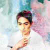
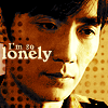
character word font song title Nathan Stark Stock Vtks Dirty 2 I Think About You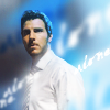
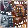
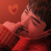
trope song challenge praise The Old Convict The Sound of Silence Muted (+Bright) Colors+Use of Text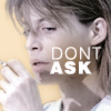
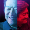
tutorial textures remake other icon


cap palette art cap pool

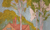

quote poster album book 'people who wear
headphones while
they walk, are much
happier, more
confident, and more
beautiful individuals'
- Jason Mraz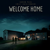
Ramblings
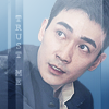
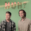
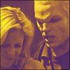
Since this is someone else's set, it's natural that I would get caps and characters I don't know. I have not seen enough of Eureka to know Nathan Stark, but from googling him, I gathered that he's some kind of immortal (or at least death-resistant), so I chose an ethereal look with the text "walk on alone", hoping it would make sense for the character. The cap pool was Supernatural, and I know that of course, so that wasn't a problem. For the Divergent cap, I went with something futuristic that reminded me of the structured society the book is set in, because while I haven't seen the show, I have read the book.
I couldn't really think of any character from shows I know who fit the Old Convict trope, so I went with Sarah Connor from the Terminator movies. She's definitely an old hand and knows a lot more than the people around her during the time she's imprisoned. You have to squint a little, but I guess it's close enough. ;)
One of the "worst" themes of this set was the song: The Sound of Silence. It's such an earworm! Whenever I was working on the set, I started singing it. :D I knew I wanted to use the lyrics "the words of the prophets are written on the subway walls", and I intended to use some real subway grafitti for the icon. But then I came across this awesome grafitti that shows subway trains, and I loved it so much I used that instead. It's not exactly the thing I wanted to express with that icon (or that the song expresses), but it was too neat to pass up.
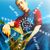
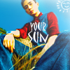
The random challenge I was assigned was "Muted", which I thought was a bit boring, so I just used another challenge from that same comm ("Bright") and combined the themes, ending up with "Muted + Bright". The praise was much less specific than the one I had last time: "I love the colors and the use of text", so I could basically do whatever I wanted as long as I used text. I decided to use primary colors and use the text in an unusual way (to paint a sun, in this case), trying to make the praise sound a little more specific. :) The text as well as the hand-drawn sun are from a Zhu Yilong song where he sings about "shining for you" (为你而发光), and I used both the Chinese lyrics and their English translation in the icon (but the Chinese is too small to read).
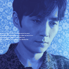
The tutorial I got was very specific, and I followed it to the letter. (Except for working with 200x200. I'd planned to do that but forgot.) And then I added a few things in the end, because the cap I chose was very green (as opposed to the relativel neutral cap the author of the tutorial used), so the first result was only blue, not purple (see alts). So I added another purple color layer to really make it purple. And I had to desaturate his face, because the original cap was relatively saturated and his face ended up looking very red/green and ugly. Otherwise, that one was really easy, and the use of color layers is something I don't usually do, so it was interesting, too.
About "other icon": it makes me chuckle that I ended up replacing Dylan O'Brien's Stiles with Chen Minghao's Wang Yang from an absolutely unkown show nobody but me has seen. The palette was extremely hard, consisting solely of dark reds, but I think it came out better than I had first feared.
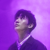
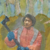
The artwork was amazing. I love recreating specific art styles! I used a mixture of directly stamping some of the artwork into the icon (for the trees in the background) and manually painting over the cap (for the subject) to get a result approximating the coloring and texture of the artwork. And then I was unhappy with the subject's face (he is wearing a face mask in that cap), so I had to fiddle with replacement faces a lot until I finally found one that fit. Phew.
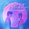
The quote I got is: "'I’ve come to the conclusion that people who wear headphones while they walk, are much happier, more confident, and more beautiful individuals than someone making the solitary drudge to work without acknowledging their own interests and power.' - Jason Mraz". What I made of it is a little bit of a stretch. I couldn't think of any characters in shows that I watch who wear headphones. The only one who came to mind is the princess from Spaceballs, so I iconed her. :D You have to have seen Spaceballs to know that her Leia-style curls are headphones.
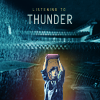
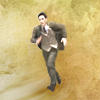
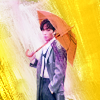
The poster was *a lot of work*. The only thing I could think of with a home in dark colors was Wushanju, so I iconed Wu Xie with his tape recorder in the rain 'listening to thunder' in front of his house. I tried getting the colors and fonts right, and I had to manip a few caps together to make him visible and to make Wushanju a little more recognizable. Worth it. My fave from the set (along with the Stock icon).
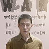
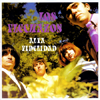
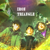
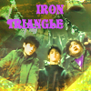
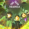
The music album cover is hilariously ugly. The purple band name on green is barely legible. :D I tried getting it exactly right, but it was so ugly I relegated it to the alts section. I decided to only use the white text because at least that's halfway legible. :D As for the angle of the cap, the only thing that came to mind was Wu Xie and Pangzi looking down into that... well-like thing... in one of the early Lost Tomb Reboot episodes. But I wanted the icon to show the iron triangle, because the cover shows the whole band (presumably), so I manipped Xiaoge into that. It's still pretty ugly :D, but it's the closest I could get to the album cover.
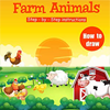
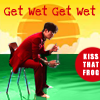
At first, I despaired over the book cover. It's not very well suited to be made into an icon - too many small details on it. But then I realized that the sun/clouds background is quite nice, so I used it as-is in the icon, and I'm actually not unhappy with how that turned out. I chose a subject with a hunched pose (like the rooster on the book cover) and dressed in red (also like the rooster and the barn), and colored the water around him green. I tried to get the styles of both pieces of text exactly like they're on the book, even though that red circle looks odd on the icon. :D The text is from the Peter Gabriel song "Kiss that Frog", and it alludes to the fact that the photoshoot takes place in the water (and one of the other pics from that shoot actually shows him lying in the water with his pants undone). I think it fits. :D
ALTS:
All comments and concrit are loved. <3 Take and use as many icons as you like! To see who made the textures and brushes I use: see my resource post.
Previous icon posts:
x-posted from dw (comments:
)
Teasers:
In the last three table rows, the upper row are clickable and take you to the full size of the inspiration (like the covers and the caps). Note that in the third row, the upper icons are not my work (specifically: tutorial, texture, and other icon. Please hover for maker. The icon to remake is mine, of course.)
Hover for fandom.
character word font song title Nathan Stark Stock Vtks Dirty 2 I Think About You
trope song challenge praise The Old Convict The Sound of Silence Muted (+Bright) Colors+Use of Text
tutorial textures remake other icon
cap palette art cap pool
quote poster album book 'people who wear
headphones while
they walk, are much
happier, more
confident, and more
beautiful individuals'
- Jason Mraz


Ramblings
Since this is someone else's set, it's natural that I would get caps and characters I don't know. I have not seen enough of Eureka to know Nathan Stark, but from googling him, I gathered that he's some kind of immortal (or at least death-resistant), so I chose an ethereal look with the text "walk on alone", hoping it would make sense for the character. The cap pool was Supernatural, and I know that of course, so that wasn't a problem. For the Divergent cap, I went with something futuristic that reminded me of the structured society the book is set in, because while I haven't seen the show, I have read the book.
I couldn't really think of any character from shows I know who fit the Old Convict trope, so I went with Sarah Connor from the Terminator movies. She's definitely an old hand and knows a lot more than the people around her during the time she's imprisoned. You have to squint a little, but I guess it's close enough. ;)
One of the "worst" themes of this set was the song: The Sound of Silence. It's such an earworm! Whenever I was working on the set, I started singing it. :D I knew I wanted to use the lyrics "the words of the prophets are written on the subway walls", and I intended to use some real subway grafitti for the icon. But then I came across this awesome grafitti that shows subway trains, and I loved it so much I used that instead. It's not exactly the thing I wanted to express with that icon (or that the song expresses), but it was too neat to pass up.
The random challenge I was assigned was "Muted", which I thought was a bit boring, so I just used another challenge from that same comm ("Bright") and combined the themes, ending up with "Muted + Bright". The praise was much less specific than the one I had last time: "I love the colors and the use of text", so I could basically do whatever I wanted as long as I used text. I decided to use primary colors and use the text in an unusual way (to paint a sun, in this case), trying to make the praise sound a little more specific. :) The text as well as the hand-drawn sun are from a Zhu Yilong song where he sings about "shining for you" (为你而发光), and I used both the Chinese lyrics and their English translation in the icon (but the Chinese is too small to read).
The tutorial I got was very specific, and I followed it to the letter. (Except for working with 200x200. I'd planned to do that but forgot.) And then I added a few things in the end, because the cap I chose was very green (as opposed to the relativel neutral cap the author of the tutorial used), so the first result was only blue, not purple (see alts). So I added another purple color layer to really make it purple. And I had to desaturate his face, because the original cap was relatively saturated and his face ended up looking very red/green and ugly. Otherwise, that one was really easy, and the use of color layers is something I don't usually do, so it was interesting, too.
About "other icon": it makes me chuckle that I ended up replacing Dylan O'Brien's Stiles with Chen Minghao's Wang Yang from an absolutely unkown show nobody but me has seen. The palette was extremely hard, consisting solely of dark reds, but I think it came out better than I had first feared.
The artwork was amazing. I love recreating specific art styles! I used a mixture of directly stamping some of the artwork into the icon (for the trees in the background) and manually painting over the cap (for the subject) to get a result approximating the coloring and texture of the artwork. And then I was unhappy with the subject's face (he is wearing a face mask in that cap), so I had to fiddle with replacement faces a lot until I finally found one that fit. Phew.
The quote I got is: "'I’ve come to the conclusion that people who wear headphones while they walk, are much happier, more confident, and more beautiful individuals than someone making the solitary drudge to work without acknowledging their own interests and power.' - Jason Mraz". What I made of it is a little bit of a stretch. I couldn't think of any characters in shows that I watch who wear headphones. The only one who came to mind is the princess from Spaceballs, so I iconed her. :D You have to have seen Spaceballs to know that her Leia-style curls are headphones.
The poster was *a lot of work*. The only thing I could think of with a home in dark colors was Wushanju, so I iconed Wu Xie with his tape recorder in the rain 'listening to thunder' in front of his house. I tried getting the colors and fonts right, and I had to manip a few caps together to make him visible and to make Wushanju a little more recognizable. Worth it. My fave from the set (along with the Stock icon).
The music album cover is hilariously ugly. The purple band name on green is barely legible. :D I tried getting it exactly right, but it was so ugly I relegated it to the alts section. I decided to only use the white text because at least that's halfway legible. :D As for the angle of the cap, the only thing that came to mind was Wu Xie and Pangzi looking down into that... well-like thing... in one of the early Lost Tomb Reboot episodes. But I wanted the icon to show the iron triangle, because the cover shows the whole band (presumably), so I manipped Xiaoge into that. It's still pretty ugly :D, but it's the closest I could get to the album cover.
At first, I despaired over the book cover. It's not very well suited to be made into an icon - too many small details on it. But then I realized that the sun/clouds background is quite nice, so I used it as-is in the icon, and I'm actually not unhappy with how that turned out. I chose a subject with a hunched pose (like the rooster on the book cover) and dressed in red (also like the rooster and the barn), and colored the water around him green. I tried to get the styles of both pieces of text exactly like they're on the book, even though that red circle looks odd on the icon. :D The text is from the Peter Gabriel song "Kiss that Frog", and it alludes to the fact that the photoshoot takes place in the water (and one of the other pics from that shoot actually shows him lying in the water with his pants undone). I think it fits. :D
ALTS:
All comments and concrit are loved. <3 Take and use as many icons as you like! To see who made the textures and brushes I use: see my resource post.
Previous icon posts:
x-posted from dw (comments:
)