20 icons - a full set - for somein30's Random Round
jsfunction really outdid himself with this round at somein30. We got 20 random things to get inspired by, and omg it was so much fun! I passed on another icon challenge I usually always do, just to make a full set for this one. I hope you like it!
Teasers:


1-4


5-8


9-12


13-16


17-20
The same table again, but this time with explanations and inspirations:
Hover for fandom... and in the last two rows (+trope +palette +tutorial), you can click on the inspo row to get to the full size.
character word font song title Molly Hooper Wake Franklin Gothic T.V. Nut
trope palette quote praise Vein-o-Vision
"It is harder
to crack prejudice
than an atom." central neg. space
with the location
in the bg
tutorial textures remake other icon


cap song art cap pool


challenge poster album book


5. Trope "Vein-o-Vision" : the first thing that I could think of for "visible veins" was the evil blob thingy from Agent Carter. Not sure this is in the spirit of the trope, but there are vein-like things visible in her face. O_o
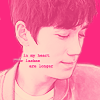
7. Quote "It is harder to crack prejudice than an atom" - Albert Einstein : I immediately thought of LGBT people who are struggling to overcome prejudice. The characters that suffered the most from this are undoubtedly the OT3 from Black Sails. The text on the icon is a quote from Guardian: "Some tragedies are destined from the start"
8. Praise "i really like the coloring used in this icon and the idea of creating a central negative space with the location on the background is very original! in addition, the light on the left corner is perfect, just the place where it should be!" : Oh man, that is some very specific praise! I struggled a lot with it - creating an icon with a central negative space is something that had never occurred to me before. When I finally had one, I realized I also needed to fit in some light in a left corner. Oops. :D I'm not unhappy with the final result, and this was one of the most challenging icons I have ever made.
9. Tutorial by justmyb0nes : I started with the "use something contrasting" base and texture, then I used a color balance layer, which I've never done before *ever*, and I tried to "add movement" using a texture that looks like it was painted with a sweeping brush. I'm happy with the result, and I learned something, too. \o/
10. Textures : I used the one by regularamanda. The other two textures didn't inspire me at all, and the one I did use is mostly obscured now. Ah, well. Still a nice texture, I'll keep it.
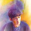
11. Remake : The original pic is already a very close crop, and it has a very monochrome coloring, too, so there wasn't much else I could do with it. So I decided to go for a thematic remake with a close crop on Zhu Yilong's face, focus on his eye, and something obscuring him in the lower left corner - plus monochromatic coloring again. It's not particularly similar to the original icon, but I like it a lot, anyway.
12. Icon (by novindalf) : I don't usually make icons with a lot of negative space, so this was hard. I kept two of my first attempts as alts (see below). But then the light in novindalf's icon reminded me of the copper reeds in Lost Tomb, so I ended up filling the negative space with those. My only gripe with this icon is that Zhu Yilong is barely recognizable in it - there's something about the light limning his face that distorts his features. I kept thinking I should redo it with a different cap, but then didn't have the time.
14. Song "S.O.A.P. - This Is How We Party" (YouTube | Spotify | Lyrics) : I took the video as inspiration, and what especially impressed me was that unusual yellow mirror, so I tried to create a texture that mimics that mirror. I also liked the "making big boys cry" part of the lyrics, but it didn't fit Zhu Yilong's pose in that icon, so I decided to leave it out. :D
15. Art "Still Life with Apples and Peaches (Paul Cézanne, ~1905)" : I love that painting! I love Cezanne's style in general, and I knew I wanted to make something that has his broad contours. And then, for good measure, I threw in the curtain from the actual painting as a background, and chose a cap with a fruit bowl in the foreground. The contours turned out to be relatively tricky to achieve (none of the "Find Edges" filters are ever any good), I ended up painting about half of them by hand. Another difficulty was to try and get gradient lighting without a gradient - it was supposed to look painted, after all. So I made the curtain lighter in sections, approximating a gradient. I very much like how it turned out. One of my faves in this set!
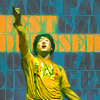
16. Cap Pool "Bones" : not much to say about this one, except that I lacked inspiration for what to do with her, so I made a lot of very texturized alts.
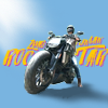
18. Poster "Billy Boy" : When I read "Boy", I was immediately reminded of
trickytricky's Lost Tomb fanvid "Sexy Boy", so that's where that text - and also the idea for using a warehouse screencap - comes from. Funny side-effect: that alt icon was 100% accidental! I copied the text layer into the wrong document, a Lost Tomb warehouse cap, and then laughed so hard I had to keep it. :DD Enjoy the vid: https://archiveofourown.org/works/28439022 "Sexy Boy"
19. and 20. I have nothing in particular to say about the process itself, except that it was THE MOST FUN! Trying to match the style/mood/composition of something is something I barely ever do, and it surprised me how much fun it is. (Now I have another idea for an icon challenge community! And still no time to run one...)
ALTS:


All my icons are shareable. Take, credit, enjoy! Texture makers are listed here in my resource post.
Previous icon posts:
x-posted from dw (comments:
)
Teasers:
1-4
5-8
9-12
13-16
17-20
The same table again, but this time with explanations and inspirations:
Hover for fandom... and in the last two rows (+trope +palette +tutorial), you can click on the inspo row to get to the full size.
character word font song title Molly Hooper Wake Franklin Gothic T.V. Nut
trope palette quote praise Vein-o-Vision
"It is harder
to crack prejudice
than an atom." central neg. space
with the location
in the bg
tutorial textures remake other icon
cap song art cap pool
challenge poster album book


5. Trope "Vein-o-Vision" : the first thing that I could think of for "visible veins" was the evil blob thingy from Agent Carter. Not sure this is in the spirit of the trope, but there are vein-like things visible in her face. O_o
7. Quote "It is harder to crack prejudice than an atom" - Albert Einstein : I immediately thought of LGBT people who are struggling to overcome prejudice. The characters that suffered the most from this are undoubtedly the OT3 from Black Sails. The text on the icon is a quote from Guardian: "Some tragedies are destined from the start"
8. Praise "i really like the coloring used in this icon and the idea of creating a central negative space with the location on the background is very original! in addition, the light on the left corner is perfect, just the place where it should be!" : Oh man, that is some very specific praise! I struggled a lot with it - creating an icon with a central negative space is something that had never occurred to me before. When I finally had one, I realized I also needed to fit in some light in a left corner. Oops. :D I'm not unhappy with the final result, and this was one of the most challenging icons I have ever made.
9. Tutorial by justmyb0nes : I started with the "use something contrasting" base and texture, then I used a color balance layer, which I've never done before *ever*, and I tried to "add movement" using a texture that looks like it was painted with a sweeping brush. I'm happy with the result, and I learned something, too. \o/
10. Textures : I used the one by regularamanda. The other two textures didn't inspire me at all, and the one I did use is mostly obscured now. Ah, well. Still a nice texture, I'll keep it.
11. Remake : The original pic is already a very close crop, and it has a very monochrome coloring, too, so there wasn't much else I could do with it. So I decided to go for a thematic remake with a close crop on Zhu Yilong's face, focus on his eye, and something obscuring him in the lower left corner - plus monochromatic coloring again. It's not particularly similar to the original icon, but I like it a lot, anyway.
12. Icon (by novindalf) : I don't usually make icons with a lot of negative space, so this was hard. I kept two of my first attempts as alts (see below). But then the light in novindalf's icon reminded me of the copper reeds in Lost Tomb, so I ended up filling the negative space with those. My only gripe with this icon is that Zhu Yilong is barely recognizable in it - there's something about the light limning his face that distorts his features. I kept thinking I should redo it with a different cap, but then didn't have the time.
14. Song "S.O.A.P. - This Is How We Party" (YouTube | Spotify | Lyrics) : I took the video as inspiration, and what especially impressed me was that unusual yellow mirror, so I tried to create a texture that mimics that mirror. I also liked the "making big boys cry" part of the lyrics, but it didn't fit Zhu Yilong's pose in that icon, so I decided to leave it out. :D
15. Art "Still Life with Apples and Peaches (Paul Cézanne, ~1905)" : I love that painting! I love Cezanne's style in general, and I knew I wanted to make something that has his broad contours. And then, for good measure, I threw in the curtain from the actual painting as a background, and chose a cap with a fruit bowl in the foreground. The contours turned out to be relatively tricky to achieve (none of the "Find Edges" filters are ever any good), I ended up painting about half of them by hand. Another difficulty was to try and get gradient lighting without a gradient - it was supposed to look painted, after all. So I made the curtain lighter in sections, approximating a gradient. I very much like how it turned out. One of my faves in this set!
16. Cap Pool "Bones" : not much to say about this one, except that I lacked inspiration for what to do with her, so I made a lot of very texturized alts.
18. Poster "Billy Boy" : When I read "Boy", I was immediately reminded of
trickytricky's Lost Tomb fanvid "Sexy Boy", so that's where that text - and also the idea for using a warehouse screencap - comes from. Funny side-effect: that alt icon was 100% accidental! I copied the text layer into the wrong document, a Lost Tomb warehouse cap, and then laughed so hard I had to keep it. :DD Enjoy the vid: https://archiveofourown.org/works/28439022 "Sexy Boy"
19. and 20. I have nothing in particular to say about the process itself, except that it was THE MOST FUN! Trying to match the style/mood/composition of something is something I barely ever do, and it surprised me how much fun it is. (Now I have another idea for an icon challenge community! And still no time to run one...)
ALTS:
All my icons are shareable. Take, credit, enjoy! Texture makers are listed here in my resource post.
Previous icon posts:
x-posted from dw (comments:
)