emiv
in
sweet__tea
The evolution of one iconmaker
(last edit on 9/12/09)
emiv's icon-making evolutionary timeline
Backstory
I started making icons and graphics about six years ago while part of a role-playing game. One of the main reasons I keep this journal is as a portfolio of sorts-to see my own progression as an icon maker. I regularly go back to look at what I’ve done and to find ways to improve. My minimal icons may seem simple, but it has taken me years to learn techniques and to find my focus.
2003 - 2004
001
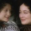
This is one of my very earliest icons-certainly the earliest one that I can find. The first weapon in my Photoshop arsenal was the Gaussian Blur. This is painfully obvious in my early icons. I had also quickly learned how to add “glow” to text-cause, you know, that’s a really helpful thing to know.
002

This one is a product of me exploring artistic filters. It is also an example of why Photoshop filters should be used sparingly and only by those who know how. I think it also might be Gaussian blurred. Eh.
003
My first attempt at black and white with a single part of the image in color-I thought I was pretty darn clever after I figured out how to do it. By this point, I believe I had discovered the Soft Light layer, which I still use to this day (though I admit, with far more restraint).
004
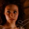
Ah, more Gaussian Blur-apparently I thought that everyone in my icons needed to glow. Also, around this time I had just discovered brushes-and consequently overused and misused them horribly. Here is that dreadful heart brush, haphazardly placed. ( It was also about this time when I started entering icon challenges-this was an early entry. And I wondered why I never placed!)
005
Ah, my brief foray into animated icons. Notice, the Phantom and Christine are still glowing. That was one habit that took quite a while to break. Also around this time, I was using a lot of gradients on text, as well as
icon-inappropriate fonts.
2005
006
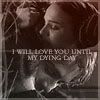
OK, so this is the first icon I ever remember being really happy about when I was finished with it. I was starting to use text brushes at this point. Not a good thing, really, but I wasn’t yet able to use my own text efficiently. I was also experimenting with gradients and blending images together. Unfortunately, I was still heavily misusing brushes.
007
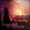
I was really proud of this icon-in coloring, in text and in theme. I look back on it fondly, but technically it has a lot of problems. Blurry, dark, cropping, etc. At this point, I was still adding borders to everything; another
newbie-ism that took a while to break.
2006
008
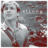
Still using text brushes here and there, but by now I was getting braver with using my own text. I also started playing around more with different colorings using color layers.
009
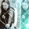
And then I found light textures and went sort of batshit with them. I mean, I put them on everything I made, but I didn’t manipulate them at all, just slapped them on and set to screen. On everything. Also, I realized around now that text can be rotated.
010
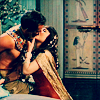
At this point, I started paying more attention to the color and cropping of the icon than to the embellishments. I began using various soft light and color burn fill layers to create certain colorings. Still, the coloring is muted, but it is a step forward from where my coloring was before.
011
Even though I was starting to gear my icons more minimal, I was still experimenting with text. I was so excited when I finished this icon-and got the hang of warping and manipulating text.
012
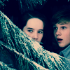
Up until this point, I was making icons mostly for icon challenges, or for 100 icon challenges. With the Minimal!Narnia set (so named with the '!' from my fanfiction days), I started making icons in sets and batches, rather than at random. This marked the real beginning of my minimal phase-well, it was a phase, now it’s more of a style. I was also abusing the blue exclusion layer at this time, as is somewhat evident in the Minimal!Narnia set.
013
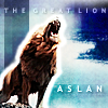
I started using textures more artistically. Also, working more with text, I discovered drop shadow.
014

At this point, I was starting to get more creative with my crops, taking more risks. Also, I was starting to use simpler fonts and more creative text placement with somewhat better results.
015
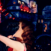
A different coloring, more natural than the blue/green of the Minimal!Narnia set, overtakes my icons.
2007
016
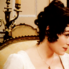
At this point, I start to really play around with different color layers and come up with another coloring, this one a bit more realistic than my previous ones, created at first for my P&P icons. I also was trying to use less of the dreaded blue exclusion layer. I become much more courageous with my cropping, sometimes to the extreme.
017
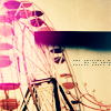
Eventually, I started working with stock icons as well as in fandoms. I also dipped back into light textures, with mixed results. For a while here I tried to make more textured icons, but eventually I came back to the my minimal style.
018

I start to play around with selective coloring to enhance certain colors. I am starting to lean away from heavily colored icons and more towards a more realistic coloring style.
019
I dabble in light textures once more, now with a bit more favorable results.
020
Another break from the minimal. Playing more with text and coloring, as well as textures.
021

Though my style at this point had become primarily minimal, I still enjoyed, from time to time, pushing myself to do the slightly more complex.
2008
022
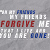
I dabble in text-only icons a bit, with mixed results.
023
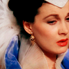
I begin to ‘up the reds’ a bit as I dabble with different colorings, though at first the results were a bit too strong. It would take awhile for me to learn to use it more subtly.
024
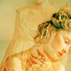
With my fashion sets, I branched out into some new territory; a non-fandom subject. I also became a bit more adventurous and experimental, playing around extensively with different types layers and filters
025
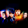
Another short return to light textures, with improved results.
026
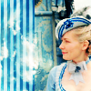
In between my minimal sets, I experiment a bit more with different textures.
027
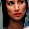
Over time, my minimal! sets continue to evolve.
This is especially true in terms of cropping, which gets slightly more focused.
2009
028
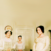
Within my minimal! sets, I begin to experiment with negative space.
Present
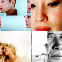
Well, we are just about up to the present. While I maintain a primarily minimal style, I am trying as of late to refine my icon sets, to make them more focused and of an overall higher quality. I have begun experimenting with different techniques, branching out creatively, and breaking out of my comfort zone in my ongoing quest to evolve as an icon maker.
This is, by no means, a finished thing. I will continue to evolve as an icon maker and, as I do, I intend on adding to this graphic timeline. At any rate, I hope that this has been an interesting read. I certainly enjoyed writing it up. I like to think that this reflects the phrase “we all start somewhere”.