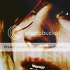
Tutorial #6

Steps: 9
Difficulty: 8/10
Translatable: Yes,No SC.
We are going to try the colouring of this icon by princessbloomy. that was requested by davyjonessays in coloring_help
Thiscolouring might not work for all kind of images,and you will have to change a lot of the settings

>

1. The image is too bright,so we need to make it darker.
Levels
110,0.35,255
>

2. Hue sat
Master:
Saturation: +25
That was because the image needed a little more of saturation.
The next layer is going to make the icon a little,just a little blue.
>

3. New Layer: fill with #4ee0fb set to multiply at 15%
The next two steps are going to make it brighter and with more contrast,as well as give the skin a stronger color.
>

4. Duplicate your base,drag it to the top and set it to overlay at 100%
>

5. New layer, fill with f#6c792 set to burn at 50%
>

6. New layer, fill with #663705,set your layer to screen at 15% ,and then duplicate it and set it to substract at 30%
(If Im not wrong for Photoshop users you should use only one layer and set it to exclusion at 30%)
The original icon is a little more bright so we need to fix that:
>

7.Duplicate your base drag it to the top and set it to screen at 35%
Merge Down (ctrl + m)
It looks a lot like the original now,but the bright areas,in this case the cheeks,are too yellow:
>

8.Color Balance
MIDTONES
5,5,10
hIGHTLIGHTS
0,0,10
Extra:
>

9. I like to use fog textures so finally,add this texture and set it to Lighten Only at at 60%
Original Version >

My Version >
Examples:
For some of the examples I had to set my burn layer to 100,and didnt used the screen layer.And this examples have the fog texture too.
Original >


My version >


