Tutorial | Icon #031
How to go from 
to
For Photoshop CS2. The .psd file can be found here.
I'm using two Curves Layers, three Color Balance Layers and one Selective Color Layer.
S T E P : O N E - T H E : B A S E

Crop your image down to 100x100.
Sharpen it once and smooth the skin.

S T E P : T W O - C U R V E S : 0 1

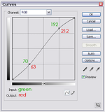
Go to Layer >> New Adjustment Layer >> Curves
Use the settings you see in the screencap.
This makes the light color in the icon more shiny :).

S T E P : T H R E E - C O L O R : B A L A N C E : 0 1

Go to Layer >> New Adjustment Layer >> Color Balance.
For Midtones use -36 | -15 | +17.
Leave Shadows and Highlights untouched.

S T E P : F O U R - S E L E C T I V E : C O L O R

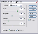
Go to Layer >> New Adjustment Layer >> Selective Color.
Select from the menu Neutrals.
Cyan: +26% | Magenta: -21% | Yellow: -54% | Black: -18%
This gives the icon the blue-ish tone :)

S T E P : F I V E - D U P L I C A T E : B A S E

Merge (Ctrl+Shift+E) all layers.
Duplicate your new base and set the copy to Multiply.

S T E P : S I X - C U R V E S : 0 2

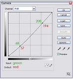
Go to Layer >> New Adjustment Layer >> Curves
Use the settings you see in the screencap.
This intensifies the colors a little bit.

S T E P : S E V E N - C O L O R : B A L A N C E : 0 2

Go to Layer >> New Adjustment Layer >> Color Balance.
For Midtones use +10 | -5 | 0.
For Shadows use +10 | +5 | +5.
For Highlights use -5 | -10 | -5.

S T E P : E I G H T - C O L O R : B A L A N C E : 0 3

Go to Layer >> New Adjustment Layer >> Color Balance.
For Midtones use +29 | -8 | +10.
For Shadows use +11 | +5 | +9.
For Highlights use 0 | +5 | -5

T H E : E N D
to
For Photoshop CS2. The .psd file can be found here.
I'm using two Curves Layers, three Color Balance Layers and one Selective Color Layer.
S T E P : O N E - T H E : B A S E
Crop your image down to 100x100.
Sharpen it once and smooth the skin.
S T E P : T W O - C U R V E S : 0 1
Go to Layer >> New Adjustment Layer >> Curves
Use the settings you see in the screencap.
This makes the light color in the icon more shiny :).
S T E P : T H R E E - C O L O R : B A L A N C E : 0 1
Go to Layer >> New Adjustment Layer >> Color Balance.
For Midtones use -36 | -15 | +17.
Leave Shadows and Highlights untouched.
S T E P : F O U R - S E L E C T I V E : C O L O R
Go to Layer >> New Adjustment Layer >> Selective Color.
Select from the menu Neutrals.
Cyan: +26% | Magenta: -21% | Yellow: -54% | Black: -18%
This gives the icon the blue-ish tone :)
S T E P : F I V E - D U P L I C A T E : B A S E
Merge (Ctrl+Shift+E) all layers.
Duplicate your new base and set the copy to Multiply.
S T E P : S I X - C U R V E S : 0 2
Go to Layer >> New Adjustment Layer >> Curves
Use the settings you see in the screencap.
This intensifies the colors a little bit.
S T E P : S E V E N - C O L O R : B A L A N C E : 0 2
Go to Layer >> New Adjustment Layer >> Color Balance.
For Midtones use +10 | -5 | 0.
For Shadows use +10 | +5 | +5.
For Highlights use -5 | -10 | -5.
S T E P : E I G H T - C O L O R : B A L A N C E : 0 3
Go to Layer >> New Adjustment Layer >> Color Balance.
For Midtones use +29 | -8 | +10.
For Shadows use +11 | +5 | +9.
For Highlights use 0 | +5 | -5
T H E : E N D