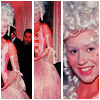
Icon Tutorial - 1st Ever
1st tutorial ever.
As requested by sugared. :)
-Made on PS CS 2
-Involves Selective Coloring
-Not Translatable, Sorry!
From this example picture
to
1. Open up a 100x100 base with a white background.
2. Take three pictures from the same set, or the same picture cropped three different ways and apply the following coloring to all three of them. (Since my 3 pictures are from the same set, I just made the coloring on one and dropped it into the original just like you would for a .psd.)
3. Open pictures and lighten them, sharpen them, whatever. For this picture I made one screen layer and reduced the opacity to 33%
4. Selective Color Layer #1
REDS: -100, +100, +19, 0
YELLOWS: -100, +31, -100, +15
NEUTRALS: +25, +9, -5, +7
5. Selective Color Layer #2
REDS: -21, -29, +7, +11, 0
YELLOWS: -100, +9, +100, 0
BLACKS: 0, 0, 0, +40
6. HUE/SATURATION Layer
MASTER: Saturation +7
REDS: Saturation +11
7. After you’ve done that for all 3 pictures, crop and position them on your white base. Use the arrow keys to “nudge” them into place. For this icon, I think I had about two nudges between the spaces.
8. Flatten your image.
9. In your Layers Palette, double click your layer which is now set to “background.” Then click the Add Layer Style button (the one that looks like a little f), and hit Stroke. Change your Size to 1, Position Inside, and change color to white (#ffffff).
- Tip: You can also just place three pictures on the same base and use your rectangle marquee tool to make a divider section, fill with white and get the same effect.
- Hope all this helps/makes sense.
- Questions and suggestions welcome. :)
As requested by sugared. :)
-Made on PS CS 2
-Involves Selective Coloring
-Not Translatable, Sorry!
From this example picture

to

1. Open up a 100x100 base with a white background.
2. Take three pictures from the same set, or the same picture cropped three different ways and apply the following coloring to all three of them. (Since my 3 pictures are from the same set, I just made the coloring on one and dropped it into the original just like you would for a .psd.)
3. Open pictures and lighten them, sharpen them, whatever. For this picture I made one screen layer and reduced the opacity to 33%
4. Selective Color Layer #1
REDS: -100, +100, +19, 0
YELLOWS: -100, +31, -100, +15
NEUTRALS: +25, +9, -5, +7
5. Selective Color Layer #2
REDS: -21, -29, +7, +11, 0
YELLOWS: -100, +9, +100, 0
BLACKS: 0, 0, 0, +40
6. HUE/SATURATION Layer
MASTER: Saturation +7
REDS: Saturation +11
7. After you’ve done that for all 3 pictures, crop and position them on your white base. Use the arrow keys to “nudge” them into place. For this icon, I think I had about two nudges between the spaces.
8. Flatten your image.
9. In your Layers Palette, double click your layer which is now set to “background.” Then click the Add Layer Style button (the one that looks like a little f), and hit Stroke. Change your Size to 1, Position Inside, and change color to white (#ffffff).
- Tip: You can also just place three pictures on the same base and use your rectangle marquee tool to make a divider section, fill with white and get the same effect.
- Hope all this helps/makes sense.
- Questions and suggestions welcome. :)