I-tutorial - Speedle
FROM 
TO
-PS CS (translatable, I believe)
-Hue/Sat, Color Balance, slight Selective Coloring (no, there are no neon people)
EDIT: Fixed one of the steps, sorry. The blue layer, should be set to multiply, not normal ;_;
1] Start with your base and crop it down.
2] Duplicate it once, set to screen (100%)

3] Add a Hue/Saturation layer: Saturation +50

4] Add a Color Balance layer: -100, -66, -50

5] Add a color fill layer: #A7E5E6, multiply, 61%

6] Duplicate your screen layer, bring to the top and desaturate

>>
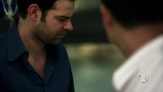
7] Grab this texture by _adhara_, crop it down to your liking, and set to Multiply, 88%

8] Add another Hue/Saturation layer: Saturation +27

9] Make a selective coloring layer and play around until you get something you like. I don't mean making your icon radioactive and blinding! For the curious, I used these settings, but they probably won't work on all icons. EXPERIMENTATION IS YOUR FRIEND :D

10] Then add in a Brightness/Contrast layer:
Brightness: +5
Contrast: +12

11] Go back to your desaturated screen later and sharpen, then merge, and you're done!
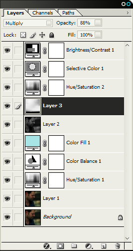
For those who're curious, here is what my layers looked like at the end:
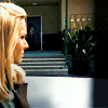
..and other examples of what this tutorial can achieve (with minor opacity/selective coloring changes):


Comments are ♥
TO
-PS CS (translatable, I believe)
-Hue/Sat, Color Balance, slight Selective Coloring (no, there are no neon people)
EDIT: Fixed one of the steps, sorry. The blue layer, should be set to multiply, not normal ;_;
1] Start with your base and crop it down.
2] Duplicate it once, set to screen (100%)
3] Add a Hue/Saturation layer: Saturation +50
4] Add a Color Balance layer: -100, -66, -50
5] Add a color fill layer: #A7E5E6, multiply, 61%
6] Duplicate your screen layer, bring to the top and desaturate
>>
7] Grab this texture by _adhara_, crop it down to your liking, and set to Multiply, 88%
8] Add another Hue/Saturation layer: Saturation +27
9] Make a selective coloring layer and play around until you get something you like. I don't mean making your icon radioactive and blinding! For the curious, I used these settings, but they probably won't work on all icons. EXPERIMENTATION IS YOUR FRIEND :D
10] Then add in a Brightness/Contrast layer:
Brightness: +5
Contrast: +12
11] Go back to your desaturated screen later and sharpen, then merge, and you're done!
For those who're curious, here is what my layers looked like at the end:
..and other examples of what this tutorial can achieve (with minor opacity/selective coloring changes):
Comments are ♥