(no subject)
Kenyon's course catalog (known until last year as the Course of Study) is finally getting the redesign it deserves. I basically have a clean slate, and I could go in any direction--although there are, of course, some budgetary restraints that affect design.
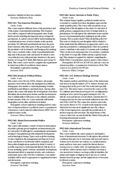
Here's the old design:
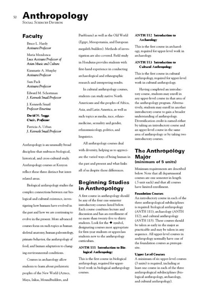
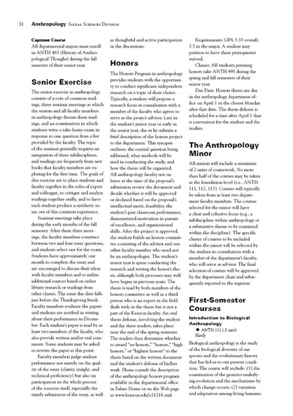
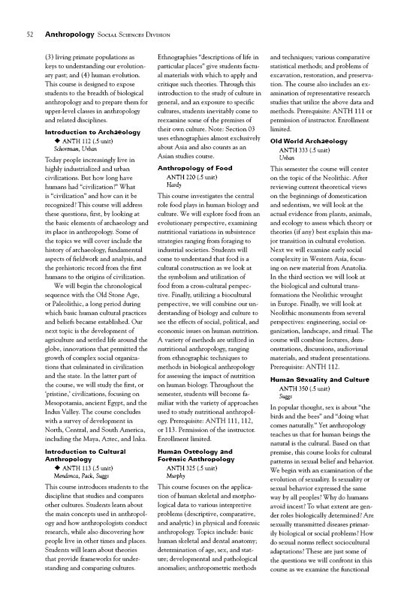
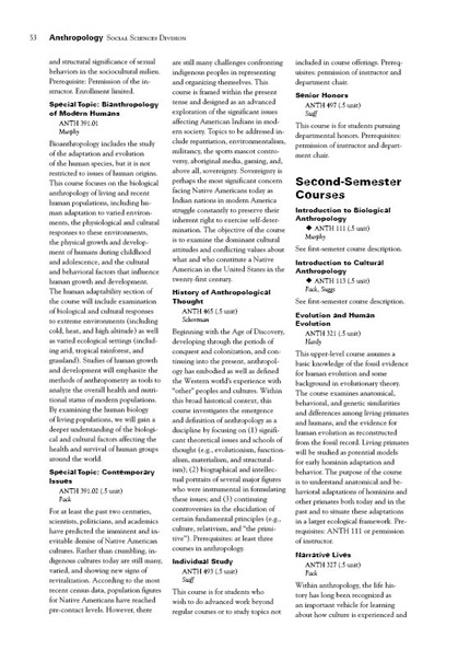
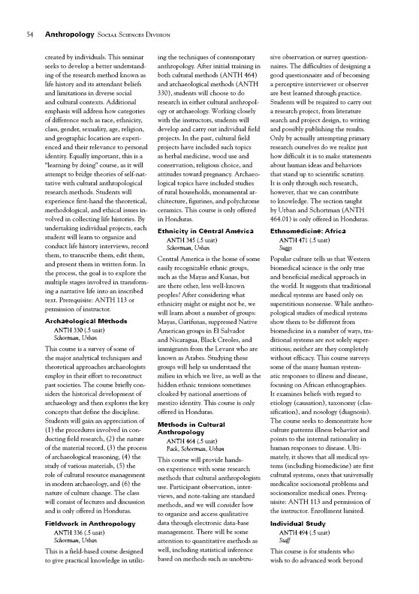

So, what's wrong with that? The design, basically, just needs an update. This is the year to do it, as the book is going from one that only listed the current year's courses to one that lists all courses in the curriculum.
In redesigning the book, I've decided that I want a stronger typeface to replace the Goudy Old Style body type. I want to replace the heavy Univers sans-serif headline type; as I look at the page, the headlines stand out way too much. I want to refine the sections to give them more of a rhythm and elegance, because the book now feels like one single piece of text running for about 200 pages. I also want to eliminate the three narrow columns. They make the book difficult to read.
I do have constraints--namely, that this book, being long and costly, uses one color only (black) in order to save money. I might try to sneak a second color on some of the pages, but I probably won't be able. I also realize that I'm not the boss. All of my design decisions need to be approved by more than one person, and when you introduce an approval process like that, conservative approaches tend to be favored. So, with those goals and restraints in mind, here are some of my initial plans. I'm still refining all of them, and none of them are quite there yet. But, I feel they are a significant step in the right direction.
I want each departmental section to be easily identifiable as separate from the one previous. From the beginning, I've wanted to accomplish that by giving each section an opening on the left-facing page, allowing each section to start with a full spread. Recently, I've arrived at the idea of separating the sections with a page of black ink. The first three layouts below provide three variations on this idea. Each variation feature Electra LH as the large opening font, followed by Minion body type. I am also, however, considering setting the department name in Minion, Akzidenz Grotesk bold, or possibly even Goudy Old Style.

If two-color printing proves not to be impossibly expensive, the opener could look like this:


I could keep with the high-contrast opening by using a photo screened over black. The trick is finding the right photo--one that adequately illustrates the department, can be understood while screened lightly against a back background, and provides enough contrast for the reversed introductory type. The photo in my example is not the ideal photo, but it at least illustrates the concept:


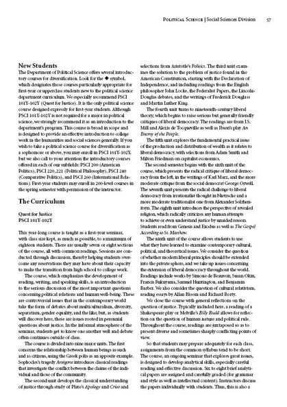
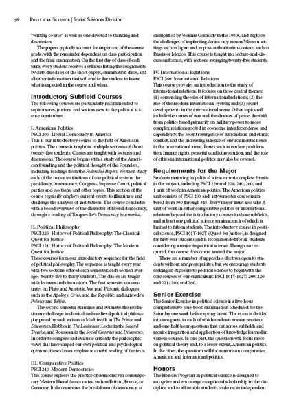
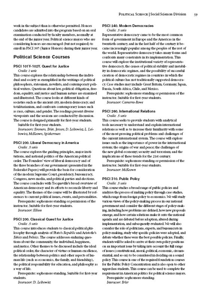
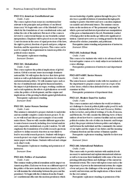
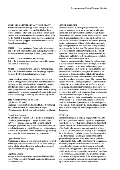
The next few sample pages show how each departmental section might be designed. I've changed the look of the course listings quite a bit, and I've provided a less dark level one headline. You might notice that I am not consistent with the level one headline in the front material--that is, in the curricular information that begins the section. On page one of this section, the header is set in Minion bold, while the inside headers are set Azkidenz Grotesk bold. The examples above use Minion small caps bold. I am trying to find the right balance between making the headlines stand out and not allowing them to overwhelm the page.


Here's the old design:


So, what's wrong with that? The design, basically, just needs an update. This is the year to do it, as the book is going from one that only listed the current year's courses to one that lists all courses in the curriculum.
In redesigning the book, I've decided that I want a stronger typeface to replace the Goudy Old Style body type. I want to replace the heavy Univers sans-serif headline type; as I look at the page, the headlines stand out way too much. I want to refine the sections to give them more of a rhythm and elegance, because the book now feels like one single piece of text running for about 200 pages. I also want to eliminate the three narrow columns. They make the book difficult to read.
I do have constraints--namely, that this book, being long and costly, uses one color only (black) in order to save money. I might try to sneak a second color on some of the pages, but I probably won't be able. I also realize that I'm not the boss. All of my design decisions need to be approved by more than one person, and when you introduce an approval process like that, conservative approaches tend to be favored. So, with those goals and restraints in mind, here are some of my initial plans. I'm still refining all of them, and none of them are quite there yet. But, I feel they are a significant step in the right direction.
I want each departmental section to be easily identifiable as separate from the one previous. From the beginning, I've wanted to accomplish that by giving each section an opening on the left-facing page, allowing each section to start with a full spread. Recently, I've arrived at the idea of separating the sections with a page of black ink. The first three layouts below provide three variations on this idea. Each variation feature Electra LH as the large opening font, followed by Minion body type. I am also, however, considering setting the department name in Minion, Akzidenz Grotesk bold, or possibly even Goudy Old Style.


If two-color printing proves not to be impossibly expensive, the opener could look like this:


I could keep with the high-contrast opening by using a photo screened over black. The trick is finding the right photo--one that adequately illustrates the department, can be understood while screened lightly against a back background, and provides enough contrast for the reversed introductory type. The photo in my example is not the ideal photo, but it at least illustrates the concept:


The next few sample pages show how each departmental section might be designed. I've changed the look of the course listings quite a bit, and I've provided a less dark level one headline. You might notice that I am not consistent with the level one headline in the front material--that is, in the curricular information that begins the section. On page one of this section, the header is set in Minion bold, while the inside headers are set Azkidenz Grotesk bold. The examples above use Minion small caps bold. I am trying to find the right balance between making the headlines stand out and not allowing them to overwhelm the page.

