some graphics experiments
No icons yet, because I'm just experimenting. I haven't looked at any of the tutorials, but I tried out some of the tips people said over at iconseeyou's icon seminar post. Here are two pics that I experimented with (warning: they're kinda big, lol), and a little blurb about what I did with them.

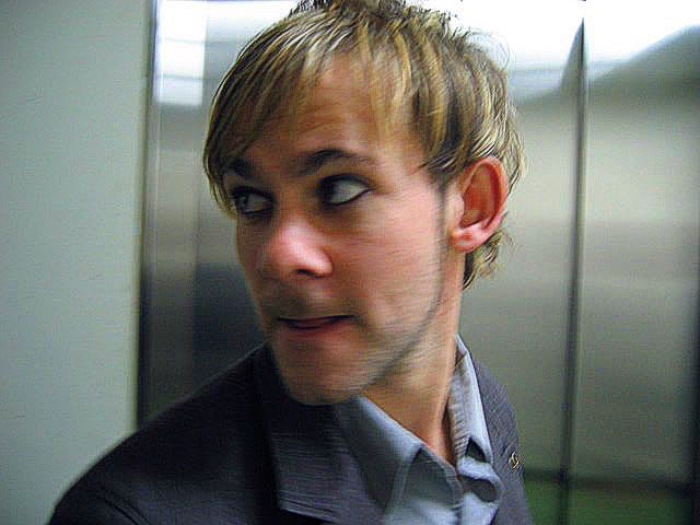
On this one, duplicated the base layer and sharpened it in the quick-fix (because I am lazy and not a photoshop expert). I dunno how much I sharpened it, but it was a lot, because this pic is really blurry and it actually didn't get too grainy and weird looking. Anyway, I then upped the saturation a little and set the layer to about 50% opacity. Then I made a new dark blue fill layer and set it to about 15 or 20% opacity (I don't remember off the top of my head), and I think I ended up setting it to Exclusion (though Color worked well too). I also experimented with a yellow fill layer, and it made it look slightly greenish. It was a cool effect, but it didn't work as well with this particular picture.
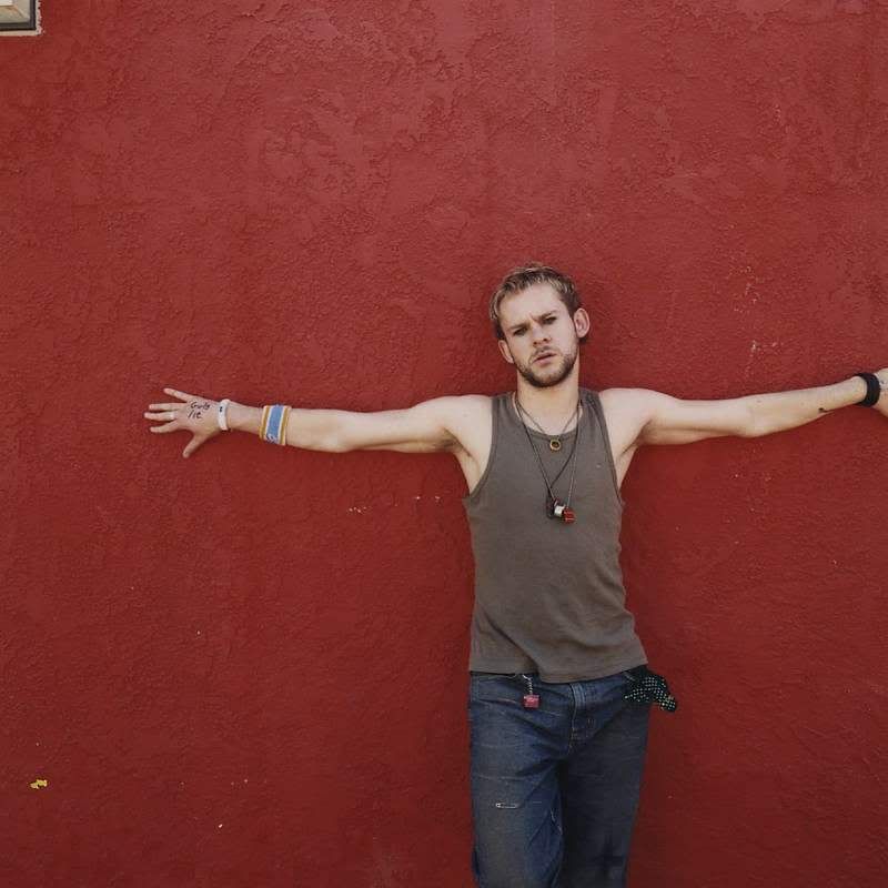
On this, I duplicated the base a few times. I left the first normal, and at 100% opacity. The second, I made sharper and more saturated, and set it to 50% opacity on Screen. The third, I made even more saturated, to the point that his face started to look weird, and set it on Exclusion (I think) at 25% (or a little less) opacity. I experimented with fill layers on this one too, but the yellow made everything look orange, the red made Dominic look strange, and the blue, while I liked what it did for his skin tones, made the wall look purplish and subdued, which wasn't what I was going for. I tried using the blue fill layer on just Dominic, but then he looked a bit out of place against the wall, so I just left it like this.
On this one, duplicated the base layer and sharpened it in the quick-fix (because I am lazy and not a photoshop expert). I dunno how much I sharpened it, but it was a lot, because this pic is really blurry and it actually didn't get too grainy and weird looking. Anyway, I then upped the saturation a little and set the layer to about 50% opacity. Then I made a new dark blue fill layer and set it to about 15 or 20% opacity (I don't remember off the top of my head), and I think I ended up setting it to Exclusion (though Color worked well too). I also experimented with a yellow fill layer, and it made it look slightly greenish. It was a cool effect, but it didn't work as well with this particular picture.
On this, I duplicated the base a few times. I left the first normal, and at 100% opacity. The second, I made sharper and more saturated, and set it to 50% opacity on Screen. The third, I made even more saturated, to the point that his face started to look weird, and set it on Exclusion (I think) at 25% (or a little less) opacity. I experimented with fill layers on this one too, but the yellow made everything look orange, the red made Dominic look strange, and the blue, while I liked what it did for his skin tones, made the wall look purplish and subdued, which wasn't what I was going for. I tried using the blue fill layer on just Dominic, but then he looked a bit out of place against the wall, so I just left it like this.