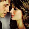
Tutorial #004
Icon Tutorial 004
Male Model
Not Translatable!

to
DISCLAIMER
*** All tutorials belong to me and are created and written by me; credit is not required, but do not claim as your own! If you have any questions, please do not hesitate to email me: leleah[at]keepitpumpin.net
*** Please also note that while I've created this tutorial, it's not guaranteed to work for everyone. It will most likely vary from picture to person; I've simply created a good color scheme that I hope people will like. A slight adjustment in Hue/Saturation, Brightness/Constrast and even the layers themselves might help for the people who didn't get the result. Also, it helps if your image at least somewhat good quality, although this can fixed. Enjoy! ;)
*** (Tutorial 4; Icon 4) Please make sure that while you'retrying out this tutorial, that your image as some sort of blue/green color, and of course yellow/orange/red. Else, it would be pointless to try it. Like I've said many times before, it'd also help a whole lot if you play around with the settings. It's always different for everybody. xD
TUTORIAL #004
STEP 001

Duplicate your base and set it to Screen 100%.
(*** Tip: This setting is a definite must, but if it's too bright/too dark, try lowering the opacity or duplicating the layer.)
STEP 002

Go to Layer>>New Adjustment Layer>>Selective Coloring and use these setttings:
REDS: -100, 100, 100, 30
YELLOWS: 100, -30, 30, 30
GREENS: 100, -100, 100, 100
CYANS: 100, -100, 100, 100
BLACKS: 10, 10, 10, 10
STEP 003

Go back to Selective Coloring (Layer>>New Adjustment Layer>>Selective Coloring) and use these settings:
GREENS: -100, 100, -100, 100
STEP 004

For the last time (thank, God!) go back to Selective Coloring and use these settings:
(*** Tip: This layer is completely optional. It in no way takes away from the icon, however, it's a fail-safe for images with more pink/red than anything else. It adds more green/yellow to the image; the opacity can be lowered or it can be ignored.)
NEUTRALS: -20, -20, 10, 5
STEP 005

Go to Layer>>New Adjustment Layer>>Channel Mixer and use these settings:
(*** Tip: The result (before you set it to multiply) makes it really green/orange. For every image it's different, so if you don't like Multiply, set it to Color Burn, Screen, Overlay, ect. Try it all out. It'd also recommend setting the opacity a little lower than normal if it is going to dark/bright.)
RED: 106, -100, 94
GREEN: 38, 66, -6
BLUE: -22, 102, -14
Set it to Multiply 50%. (This varies with every picture; mine was 40%.)
TIPS AND TRICKS
No Reds/Oranges or Too Blue? Have no fear! Variations (Image>>Adjustments>>Variations) is here! Just go to "Midtones" and click "More Red" two or three times and "More Yellow" one or two times.
Too Yellow/Orange? If Selective Coloring doesn't do it (and playing around is getting you nowhere) try Color Balance (Layer>>New Adjustment Layer>>Color Balance) or Brightness/Contrast (L>>NAL>>B/C). It might help, but it's a little more difficult with the yellows - they are what makes the image.
It's too Green! Honestly, that's what the tutorial is about - and the colors of Channel Mixer are set to that for that purpose. Like I've said above, try Color Balance (Midtones only!) or, though it's rare, Variations. It's a little less tricky then the yellows, but green is second to yellow, so be aware: if you take away green, there's a chance you'll take away the yellow also, and vice versa.
EXAMPLE ICONS
ICON 1
ICON 2
ICON 3
ICON 4
ICON 5


OTHER OPTIONS
1.) .PSD FILE (Adobe Photoshop 7 Format!)
2.) .TXT TUTORIAL FILE
3.) FULL .ZIP FILE (Including Images/.PSD/.TXT)
Male Model
Not Translatable!

to

DISCLAIMER
*** All tutorials belong to me and are created and written by me; credit is not required, but do not claim as your own! If you have any questions, please do not hesitate to email me: leleah[at]keepitpumpin.net
*** Please also note that while I've created this tutorial, it's not guaranteed to work for everyone. It will most likely vary from picture to person; I've simply created a good color scheme that I hope people will like. A slight adjustment in Hue/Saturation, Brightness/Constrast and even the layers themselves might help for the people who didn't get the result. Also, it helps if your image at least somewhat good quality, although this can fixed. Enjoy! ;)
*** (Tutorial 4; Icon 4) Please make sure that while you'retrying out this tutorial, that your image as some sort of blue/green color, and of course yellow/orange/red. Else, it would be pointless to try it. Like I've said many times before, it'd also help a whole lot if you play around with the settings. It's always different for everybody. xD
TUTORIAL #004
STEP 001

Duplicate your base and set it to Screen 100%.
(*** Tip: This setting is a definite must, but if it's too bright/too dark, try lowering the opacity or duplicating the layer.)
STEP 002

Go to Layer>>New Adjustment Layer>>Selective Coloring and use these setttings:
REDS: -100, 100, 100, 30
YELLOWS: 100, -30, 30, 30
GREENS: 100, -100, 100, 100
CYANS: 100, -100, 100, 100
BLACKS: 10, 10, 10, 10
STEP 003

Go back to Selective Coloring (Layer>>New Adjustment Layer>>Selective Coloring) and use these settings:
GREENS: -100, 100, -100, 100
STEP 004

For the last time (thank, God!) go back to Selective Coloring and use these settings:
(*** Tip: This layer is completely optional. It in no way takes away from the icon, however, it's a fail-safe for images with more pink/red than anything else. It adds more green/yellow to the image; the opacity can be lowered or it can be ignored.)
NEUTRALS: -20, -20, 10, 5
STEP 005

Go to Layer>>New Adjustment Layer>>Channel Mixer and use these settings:
(*** Tip: The result (before you set it to multiply) makes it really green/orange. For every image it's different, so if you don't like Multiply, set it to Color Burn, Screen, Overlay, ect. Try it all out. It'd also recommend setting the opacity a little lower than normal if it is going to dark/bright.)
RED: 106, -100, 94
GREEN: 38, 66, -6
BLUE: -22, 102, -14
Set it to Multiply 50%. (This varies with every picture; mine was 40%.)
TIPS AND TRICKS
No Reds/Oranges or Too Blue? Have no fear! Variations (Image>>Adjustments>>Variations) is here! Just go to "Midtones" and click "More Red" two or three times and "More Yellow" one or two times.
Too Yellow/Orange? If Selective Coloring doesn't do it (and playing around is getting you nowhere) try Color Balance (Layer>>New Adjustment Layer>>Color Balance) or Brightness/Contrast (L>>NAL>>B/C). It might help, but it's a little more difficult with the yellows - they are what makes the image.
It's too Green! Honestly, that's what the tutorial is about - and the colors of Channel Mixer are set to that for that purpose. Like I've said above, try Color Balance (Midtones only!) or, though it's rare, Variations. It's a little less tricky then the yellows, but green is second to yellow, so be aware: if you take away green, there's a chance you'll take away the yellow also, and vice versa.
EXAMPLE ICONS
ICON 1
ICON 2
ICON 3
ICON 4
ICON 5


OTHER OPTIONS
1.) .PSD FILE (Adobe Photoshop 7 Format!)
2.) .TXT TUTORIAL FILE
3.) FULL .ZIP FILE (Including Images/.PSD/.TXT)