Tutorial #003
Icon Tutorial 003
Kagome
Not Translatable!

to
DISCLAIMER
*** All tutorials belong to me and are created and written by me; credit is not required, but do not claim as your own! If you have any questions, please do not hesitate to email me: leleah[at]keepitpumpin.net
*** Please also note that while I've created this tutorial, it's not guaranteed to work for everyone. It will most likely vary from picture to person; I've simply created a good color scheme that I hope people will like. A slight adjustment in Hue/Saturation, Brightness/Constrast and even the layers themselves might help for the people who didn't get the result. Also, it helps if your image is at least somewhat good quality, although this can fixed. Enjoy! ;)
*** (Tutorial 3; Icon 3) Please make sure that while you're trying out this tutorial, that your image as some sort of cartoon/anime image. Else, it would be pointless to try it. Like I've said many times before, it'd also help a whole lot if you play around with the settings. It's always different for everybody. xD
TUTORIAL #003
STEP 001
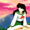
Duplicate your base three times. Set the first one to Screen 100%. Desaturate the second and set it to Soft Light 100%. For the third one, go to Image>>Adjustments>>Hue/Saturation, set the Saturation to -50 and set the layer mode to Soft Light 100%.
STEP 002
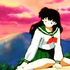
Go to Layer>>New Adjustment Layer>>Levels and use these settings:
OUTPUT LEVELS: 2, 0.81, 255
INPUT LEVELS: 0, 255
STEP 003
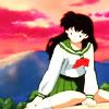
Go Selective Coloring (Layer>>New Adjustment Layer>>Selective Coloring) and use these settings:
REDS: -100, 54, 73, -8
YELLOWS: -100, 15, 47, -100
GREENS: -100, -100, 56, 9
NEUTRALS: 4, 9, -7, -8
STEP 004
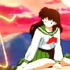
Copy (Select>>Edit>>Copy or Ctrl+C) the light texture below (from Afterglow) and paste it (Edit>>Paste or Ctrl+V) into a new layer (you can create one or not, usually it does it for you) and set it to Lighten 100%.
STEP 005
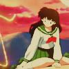
Create a new layer, fill it with (#AD985A) and set it to Multiply 30%. Duplicate that layer three times. Set the first one to Multiply 15%, second one to Screen 12% and the third to Color Burn 11%.
(*** Tip: You can stop at this point, the icon hardly changes, except the blues/cyans of the image, so it's up to you now to go forward or stop. =])
STEP 006

Duplicate your base, drag it to the top and set it to Screen 20%. Go to Layer>>New Adjustment Layers>>Selective Coloring and use these settings:
BLUES: -100, -100, 50, 20
STEP 007

This can go with Cyans, also. I've tried it out on Magentas, also, and it's had the same effect. =] Doesn't it look a whole lot better? xD Next the text. Nothing special, really; Tahoma set at 3pt, duplicated the layer and set it to Multiply and used a Color Overlay.
Duplicate the base, drag it to the top and set it to Multiply 20%. Select your icon (Select>>Select All), copy and paste it (Edit>>Copy and Edit>>Paste) sharpen it and set it to 20%.
TIPS AND TRICKS
Too Bright? With the 4 duplicated layers (with this color #AD985A), duplicate the first color layer (Multiply 30%) once or twice. On the first step (where you duplicate your background three times) duplicate you screen layer and set it to Multiply/Color Burn with a lowered opacity.
Too Dark? On the second step (with the Levels) play around with the settings. Also, on the first step (with the Screen layers) try to up the opacity or add another screen layer.
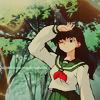
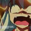
EXAMPLE ICONS
ICON 1
ICON 2
ICON 3

OTHER OPTIONS
1.) .PSD FILE (Adobe Photoshop 7 Format!)
2.) SCREENSHOT FILE
Kagome
Not Translatable!

to

DISCLAIMER
*** All tutorials belong to me and are created and written by me; credit is not required, but do not claim as your own! If you have any questions, please do not hesitate to email me: leleah[at]keepitpumpin.net
*** Please also note that while I've created this tutorial, it's not guaranteed to work for everyone. It will most likely vary from picture to person; I've simply created a good color scheme that I hope people will like. A slight adjustment in Hue/Saturation, Brightness/Constrast and even the layers themselves might help for the people who didn't get the result. Also, it helps if your image is at least somewhat good quality, although this can fixed. Enjoy! ;)
*** (Tutorial 3; Icon 3) Please make sure that while you're trying out this tutorial, that your image as some sort of cartoon/anime image. Else, it would be pointless to try it. Like I've said many times before, it'd also help a whole lot if you play around with the settings. It's always different for everybody. xD
TUTORIAL #003
STEP 001

Duplicate your base three times. Set the first one to Screen 100%. Desaturate the second and set it to Soft Light 100%. For the third one, go to Image>>Adjustments>>Hue/Saturation, set the Saturation to -50 and set the layer mode to Soft Light 100%.
STEP 002

Go to Layer>>New Adjustment Layer>>Levels and use these settings:
OUTPUT LEVELS: 2, 0.81, 255
INPUT LEVELS: 0, 255
STEP 003

Go Selective Coloring (Layer>>New Adjustment Layer>>Selective Coloring) and use these settings:
REDS: -100, 54, 73, -8
YELLOWS: -100, 15, 47, -100
GREENS: -100, -100, 56, 9
NEUTRALS: 4, 9, -7, -8
STEP 004

Copy (Select>>Edit>>Copy or Ctrl+C) the light texture below (from Afterglow) and paste it (Edit>>Paste or Ctrl+V) into a new layer (you can create one or not, usually it does it for you) and set it to Lighten 100%.
STEP 005

Create a new layer, fill it with (#AD985A) and set it to Multiply 30%. Duplicate that layer three times. Set the first one to Multiply 15%, second one to Screen 12% and the third to Color Burn 11%.
(*** Tip: You can stop at this point, the icon hardly changes, except the blues/cyans of the image, so it's up to you now to go forward or stop. =])
STEP 006

Duplicate your base, drag it to the top and set it to Screen 20%. Go to Layer>>New Adjustment Layers>>Selective Coloring and use these settings:
BLUES: -100, -100, 50, 20
STEP 007

This can go with Cyans, also. I've tried it out on Magentas, also, and it's had the same effect. =] Doesn't it look a whole lot better? xD Next the text. Nothing special, really; Tahoma set at 3pt, duplicated the layer and set it to Multiply and used a Color Overlay.
Duplicate the base, drag it to the top and set it to Multiply 20%. Select your icon (Select>>Select All), copy and paste it (Edit>>Copy and Edit>>Paste) sharpen it and set it to 20%.
TIPS AND TRICKS
Too Bright? With the 4 duplicated layers (with this color #AD985A), duplicate the first color layer (Multiply 30%) once or twice. On the first step (where you duplicate your background three times) duplicate you screen layer and set it to Multiply/Color Burn with a lowered opacity.
Too Dark? On the second step (with the Levels) play around with the settings. Also, on the first step (with the Screen layers) try to up the opacity or add another screen layer.
EXAMPLE ICONS
ICON 1
ICON 2
ICON 3


OTHER OPTIONS
1.) .PSD FILE (Adobe Photoshop 7 Format!)
2.) SCREENSHOT FILE