Round 3, Challenge 2: Results
There wasn't more votes so I thought it was pointless to wait for more people to vote. Anyway, here are the results for Round 3, Challenge 2.
ELIMINATED:
By that_was_cheesy.
I'm so sorry to see you go! :(
PEOPLE'S CHOICE:

By theweasley. [ BANNER ]
MOD'S CHOICE:
By fanplastico. [ BANNER ]
BANNERS ARE NOT ONLINE RIGHT NOW, I'LL UPLOAD THEM ASAP
TALLIES:
01. +1 -1 = 0
02. +1 -2 = -1
03. -1
04. -3
05. +2 -1 = +1
Comments:
#01:
- The border makes the icon seem claustrophobic, and you can't read the text.
+ Very creative icon.
#02:
- The colors are too green and dingy.
- lovely crop but it looks a little too blue
+ NO COMMENT
#03:
- The levels are really off... one side of his face is way too hot; the cropping is awkward... just enough of his left eye is still showing for it to look like a mistake
#04:
- the fuzzy black border looks wrong, especially because it's heavier on the top and on one side
- the icon could be less dark
- the colouring and the border make it look too dark
#05:
+ I really like the text placement! Also, the colors aren't too boring or too crazy.
+ NO COMMENT
- the icon is both really dark and really red
Challenge 3 will be post in a few minutes.
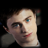
ELIMINATED:
By that_was_cheesy.
I'm so sorry to see you go! :(
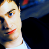
PEOPLE'S CHOICE:
By theweasley. [ BANNER ]
MOD'S CHOICE:
By fanplastico. [ BANNER ]
BANNERS ARE NOT ONLINE RIGHT NOW, I'LL UPLOAD THEM ASAP
TALLIES:
01. +1 -1 = 0
02. +1 -2 = -1
03. -1
04. -3
05. +2 -1 = +1
Comments:
#01:
- The border makes the icon seem claustrophobic, and you can't read the text.
+ Very creative icon.
#02:
- The colors are too green and dingy.
- lovely crop but it looks a little too blue
+ NO COMMENT
#03:
- The levels are really off... one side of his face is way too hot; the cropping is awkward... just enough of his left eye is still showing for it to look like a mistake
#04:
- the fuzzy black border looks wrong, especially because it's heavier on the top and on one side
- the icon could be less dark
- the colouring and the border make it look too dark
#05:
+ I really like the text placement! Also, the colors aren't too boring or too crazy.
+ NO COMMENT
- the icon is both really dark and really red
Challenge 3 will be post in a few minutes.