Definitely no crescendo
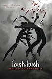
You're one of those Hush Hush cover lovers? I am. I'm not obsessed over it (or the book) but I think the cover is pretty damn eye-watering:
So now it's finally time for the cover of book 2 (entitled Crescendo, hence the pun in the headline) to be revealed. I'll let you make your own opinion first:

So? What do you think? Not as cool, right? At least that's what I think. On it's own Crescendo might not look bad at all but compared to its companion it's a decrescendo (urm, why, yes, those piano lessons were useful after all!). I think I really like the photo itself but the whole black/white/red and the font just makes it look kind of ... cheap? The thunder combined with the title is neat though (with regards to content, not optically).