Goodbye Old Icons, Hello New Icons!
I have deleted and replaced my userpics. Well, not all, but quite a few. Behind the link, you will find comments on all of them. The old ones, the new ones and the ones I kept.
GONERS
Des

A Lost icon I made myself and that is not too special but I liked because I love Desmond and Henry Ian Cusick. Also, it represents one of my favorite fandoms, Lost. But I decided that no matter how much I love Desmond, I still prefer Locke and I decided that I needed a Locke icon instead of a Desmond one although this one is very cool. I mean, everything featuring Desmond is cool. I think that this image is from either “Orientation” (203) or “Live Together, Die Alone” (223). I’m not sure right now.
Live
This was one of the first icons I had. I think it was the second one and I found it somewhere on modthesims2 and it was cool for a time. I’ve used it for a very long time sporadically here and there and when I was sweeping my stuff, I had to discover that I had actually already deleted it. But I needed to comment on it because I had it for so long and there were times when I was using it all the time, but now I think it’s time for it to go. Well, actually it’s already gone.
Magneto
Magneto is a perfect character and I have used the icon very frequently, but, well … it’s time to say goodbye. It might be replaced by a new Magneto icon at some moment in time, but not now. I can’t really explain why I’m giving up on this one, I just think that I need a clean slate and Magneto too cool in comics right now. (Xorn … let’s pretend Xorn never existed). I have no idea where I got it from.
Mystify
I decided to upload this when I chose the Wiki Woman and well, it just doesn’t mean very much to me, so goodbye, baby! It had no meaning to me, I didn’t have a connection to it and although the quote might look witty when first looked at, it stops being witty and turns stupid after a very, very short time.
Sunglasses

This icon reminds me of the end of 2006 / beginning of 2007 in Fortaleza that was just totally awesome but it’s time to say goodbye to it because somehow I don’t like it too much right now and I’m not always sure what to use it for. It reminds me of good, crazy times that don’t really make sense but it’s not icon material, not now.
Wiki Woman

This is not a very old one and not one I love too much. When I first saw it, I just found it cool and decided that I wanted it. It was uploaded at the same time with the one that says, “Mystify people with your intelligence. If you can’t, mystify them with your bullshit.” I will be saying goodbye to both of them because I am not attached to them and well, I need to get rid of some to get new ones because in retrospective it never meant too much to me.
I found it somewhere on modthesims2.
KEEPERS
Ali+Nath

I needed icons with friends and this one looks nice and shows Ali and I and I just LOVE Ali because she is the best. She listens to me rambling about stuff she doesn’t even get and can stand me loving all the strange characters and Ali is just patient with me and listens to the shit I need to talk about but don’t know anyone who likes it, so she is the one who has to listen to me rambling about it. So, Ali, thanks for the patience you had with me over all these years.
Bree

This is an icon with the image taken from the Desperate Housewives’ episode “Listen To The Rain On The Roof” (301) and it shows my favorite character in the foreground, Bree van de Kamp Hodge (Marcia Cross), with her love interest and now husband Orson Hodge (Kyle MacLachlan) in the background. The picture just struck me as so beautiful because of so many reasons, one of them being that Bree looks so beautiful and vulnerable and it shows an aspect of my favorite Desperate Housewives’ pairing ever.
Cap
This image is from the infamous Captain America (4th series) #25 and it was the shocking times just after Steve Roger was killed by a sniper and at that time it just felt right to have a Cap icon and this one was the one I really liked. It was the first time someone really got me interested in Captain America and I want to keep it. This is a legend, a symbol, dying, and I think that this is very harsh and not what you really want as an icon, but I am very morbid and the death of an icon is something I found very cool to keep. Art by Steve Epting.
Corrupted

This is a simple icon once again, but I think it looks cool because there is something dirty about it and, let’s be honest, everyone is corrupt. Some people can be corrupted easily and there are others that are harder to corrupt, but if you know what it is you need to give someone to get what you want, you have power. I know exactly how easily I can be seduced by whisky. I know my vices and I am not going to list all of them because I could write a NaNoWriMo novel about them. This is a reference to me, but also on every other girl out there in the world, because we can all be corrupted.
Hulk

Getting rid of it or not getting rid of it? This was a very serious question for me because this was the very first icon I ever created and even though it isn’t the greatest work I’ve done in my life, I am very attached to it. It’s been my default icon for so long and I have considered getting rid of it, but I just can’t. While reading this, I have been thinking about whether or not I should delete it and in the end I decided that I just wasn’t able to.
Joker

A fairly new icon depicting Heath Ledger as the Joker as he will look in “The Dark Knight” and as I said before, I was so astonished by what they did to this man who I could never ever imagine as the crazy, psychopathic Joker but this image changed my mind and Ledger even manages to look scary which is cool.
And next to Lex Luthor, the Joker is my favorite DC villain, so I think this is a very appropriate icon I can use for comic and movie talk. And for everything else.
Obvious
This icon is just so simple and cute *pouting* I don’t want to get rid of it, it’s so cute and useful. I remember that I first uploaded it for a post about Silly and although it is used in many contexts now, this was why I originally chose it. I don’t know where I found it but it’s not going away. I thought about it, but I want to keep it. Should I ever fall in love, it could come in handy. Now the only problem is falling in love because this isn’t something I really do.
Renee
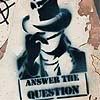
This is Renee Montoya as the Question as seen on the cover of 52 Week 45 (art by JG Jones). It looks so cool and Renee really kicks ass. An alcoholic lipstick lesbian ex-cop? How can she not be cool? What Greg Rucka (and the other “52” guys) did with her just made her even more awesome. I love Renee as the Question, maybe because I never had any emotional attachment to Vic Sage because he was pretty obscure to me. But Renee … She is an awesome, she kicks ass and I have an affinity for her.
Spidey-Night

I need an icon that just shows myself and the one with the sunglasses didn’t show me too well and this one shows me, just me, with nothing else, and I like it. It’s very plain and nice and … I don’t know, I like it.
NEWBIES
Charlie

This was the last one I chose and it wasn’t by me. I considered making one of Willem Dafoe or JK Simmons as Norman Osborn or J. Jonah Jameson respectively, but I changed my mind for a very stupid reason: I didn’t want to have more icons related to Marvel than I have icons related to DC. So, I decided to go with another Lost icon, but not one that I had created myself, but one from an icon community I am a member of,
Fangirl
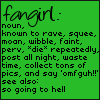
I found this cool icon that belongs to lysythe and I knew that I had to have it. So, she is the one to be credited for this. And really, isn’t that a perfect definition for me in many ways? I mean, I still can’t confirm that I didn’t piss my pants at Madame Tussaud’s when I saw the Hulk and the other superheroes.
Locke

This image was chosen to portray one of my favorite TV series, Lost, and my favorite character, John Locke (Terry O’Quinn). This icon was done by me and is based on a screen cap from “The Man Behind The Curtain” (320) and I thought it expressed so much emotion with lying Locke in this pit full of corpses and to contrast it a little more, I desaturated the background with only Locke being in color instead of grayscale.
Six Feet Under

I love Six Feet Under and I wanted an icon to represent it, but I found myself realizing that I couldn’t settle on a single favorite character. In Lost, I know that Locke is my #1, followed by Desmond and Ben. In Desperate Housewives, Bree is my absolute favorite housewife. But I love all the characters in Six Feet Under and I couldn’t settle on one of them, so I decided to go with the series’ logo because it is simple yet interesting. Who would connect a tree on a hill to a funeral home straight away? - Nobody, I guess, but it is so fitting and beautiful. And when I came up with this idea, I just knew it was a good idea and the simplicity, the lack of colors, adds something very strong to it.
Tardis
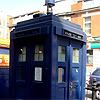
I wanted a Doctor Who icon and decided to use a photograph of the last blue police box in the city of London where I was in the end of April for a few days. This was not the photo I originally wanted to use, I wanted one with me and the Tardis, but the photos aren’t on my computer any longer and the CD Rom with the photos is with my loving sister (which means that I might never see it again). I made this with the only original picture I had left and I am not TOO happy about its looks, but it’s okay right now and will be replaced by a cooler icon of the Tardis as soon as I get my hand on the CD with the pictures.
Wisdom & Pryde
A perfect pairing that did not last long enough: Kitty “Shadowcat” Pryde and Pete Wisdom. This is an icon I created using a scan from Excalibur #90. Not much to say about it. It’s one of fifty Wisdom & Pryde icons I created for Ali a short time ago. And now I have a pairing icon! The first one if you don’t count “so obvious” that isn’t really one.
lost_awards. I went in not knowing what I was looking for, I only knew I wanted one of the guys, not Locke: Desmond, Sawyer, Boone, Sayid, Charlie, Ben … one of those, preferably Desmond, Ben or Sawyer. But I didn’t really care, I was just looking for something beautiful and there were so many options … Heck, there was even a cool Jack icon (granted, it was from “Through A Looking Glass” (322) in the flash forward, but it’s still Jack).
And the more Charlie icons I saw, the more obvious it became that I needed a Charlie icon right now. But it was hard to resist the Jack/Juliet ones and others. I’ll need to change icons more frequently, I saved a few that are awesome. This one was found in this post, I don’t know who created it.
GONERS
Des
A Lost icon I made myself and that is not too special but I liked because I love Desmond and Henry Ian Cusick. Also, it represents one of my favorite fandoms, Lost. But I decided that no matter how much I love Desmond, I still prefer Locke and I decided that I needed a Locke icon instead of a Desmond one although this one is very cool. I mean, everything featuring Desmond is cool. I think that this image is from either “Orientation” (203) or “Live Together, Die Alone” (223). I’m not sure right now.
Live
This was one of the first icons I had. I think it was the second one and I found it somewhere on modthesims2 and it was cool for a time. I’ve used it for a very long time sporadically here and there and when I was sweeping my stuff, I had to discover that I had actually already deleted it. But I needed to comment on it because I had it for so long and there were times when I was using it all the time, but now I think it’s time for it to go. Well, actually it’s already gone.
Magneto
Magneto is a perfect character and I have used the icon very frequently, but, well … it’s time to say goodbye. It might be replaced by a new Magneto icon at some moment in time, but not now. I can’t really explain why I’m giving up on this one, I just think that I need a clean slate and Magneto too cool in comics right now. (Xorn … let’s pretend Xorn never existed). I have no idea where I got it from.
Mystify
I decided to upload this when I chose the Wiki Woman and well, it just doesn’t mean very much to me, so goodbye, baby! It had no meaning to me, I didn’t have a connection to it and although the quote might look witty when first looked at, it stops being witty and turns stupid after a very, very short time.
Sunglasses
This icon reminds me of the end of 2006 / beginning of 2007 in Fortaleza that was just totally awesome but it’s time to say goodbye to it because somehow I don’t like it too much right now and I’m not always sure what to use it for. It reminds me of good, crazy times that don’t really make sense but it’s not icon material, not now.
Wiki Woman
This is not a very old one and not one I love too much. When I first saw it, I just found it cool and decided that I wanted it. It was uploaded at the same time with the one that says, “Mystify people with your intelligence. If you can’t, mystify them with your bullshit.” I will be saying goodbye to both of them because I am not attached to them and well, I need to get rid of some to get new ones because in retrospective it never meant too much to me.
I found it somewhere on modthesims2.
KEEPERS
Ali+Nath
I needed icons with friends and this one looks nice and shows Ali and I and I just LOVE Ali because she is the best. She listens to me rambling about stuff she doesn’t even get and can stand me loving all the strange characters and Ali is just patient with me and listens to the shit I need to talk about but don’t know anyone who likes it, so she is the one who has to listen to me rambling about it. So, Ali, thanks for the patience you had with me over all these years.
Bree
This is an icon with the image taken from the Desperate Housewives’ episode “Listen To The Rain On The Roof” (301) and it shows my favorite character in the foreground, Bree van de Kamp Hodge (Marcia Cross), with her love interest and now husband Orson Hodge (Kyle MacLachlan) in the background. The picture just struck me as so beautiful because of so many reasons, one of them being that Bree looks so beautiful and vulnerable and it shows an aspect of my favorite Desperate Housewives’ pairing ever.
Cap
This image is from the infamous Captain America (4th series) #25 and it was the shocking times just after Steve Roger was killed by a sniper and at that time it just felt right to have a Cap icon and this one was the one I really liked. It was the first time someone really got me interested in Captain America and I want to keep it. This is a legend, a symbol, dying, and I think that this is very harsh and not what you really want as an icon, but I am very morbid and the death of an icon is something I found very cool to keep. Art by Steve Epting.
Corrupted
This is a simple icon once again, but I think it looks cool because there is something dirty about it and, let’s be honest, everyone is corrupt. Some people can be corrupted easily and there are others that are harder to corrupt, but if you know what it is you need to give someone to get what you want, you have power. I know exactly how easily I can be seduced by whisky. I know my vices and I am not going to list all of them because I could write a NaNoWriMo novel about them. This is a reference to me, but also on every other girl out there in the world, because we can all be corrupted.
Hulk
Getting rid of it or not getting rid of it? This was a very serious question for me because this was the very first icon I ever created and even though it isn’t the greatest work I’ve done in my life, I am very attached to it. It’s been my default icon for so long and I have considered getting rid of it, but I just can’t. While reading this, I have been thinking about whether or not I should delete it and in the end I decided that I just wasn’t able to.
Joker
A fairly new icon depicting Heath Ledger as the Joker as he will look in “The Dark Knight” and as I said before, I was so astonished by what they did to this man who I could never ever imagine as the crazy, psychopathic Joker but this image changed my mind and Ledger even manages to look scary which is cool.
And next to Lex Luthor, the Joker is my favorite DC villain, so I think this is a very appropriate icon I can use for comic and movie talk. And for everything else.
Obvious
This icon is just so simple and cute *pouting* I don’t want to get rid of it, it’s so cute and useful. I remember that I first uploaded it for a post about Silly and although it is used in many contexts now, this was why I originally chose it. I don’t know where I found it but it’s not going away. I thought about it, but I want to keep it. Should I ever fall in love, it could come in handy. Now the only problem is falling in love because this isn’t something I really do.
Renee
This is Renee Montoya as the Question as seen on the cover of 52 Week 45 (art by JG Jones). It looks so cool and Renee really kicks ass. An alcoholic lipstick lesbian ex-cop? How can she not be cool? What Greg Rucka (and the other “52” guys) did with her just made her even more awesome. I love Renee as the Question, maybe because I never had any emotional attachment to Vic Sage because he was pretty obscure to me. But Renee … She is an awesome, she kicks ass and I have an affinity for her.
Spidey-Night
I need an icon that just shows myself and the one with the sunglasses didn’t show me too well and this one shows me, just me, with nothing else, and I like it. It’s very plain and nice and … I don’t know, I like it.
NEWBIES
Charlie
This was the last one I chose and it wasn’t by me. I considered making one of Willem Dafoe or JK Simmons as Norman Osborn or J. Jonah Jameson respectively, but I changed my mind for a very stupid reason: I didn’t want to have more icons related to Marvel than I have icons related to DC. So, I decided to go with another Lost icon, but not one that I had created myself, but one from an icon community I am a member of,
Fangirl
I found this cool icon that belongs to lysythe and I knew that I had to have it. So, she is the one to be credited for this. And really, isn’t that a perfect definition for me in many ways? I mean, I still can’t confirm that I didn’t piss my pants at Madame Tussaud’s when I saw the Hulk and the other superheroes.
Locke
This image was chosen to portray one of my favorite TV series, Lost, and my favorite character, John Locke (Terry O’Quinn). This icon was done by me and is based on a screen cap from “The Man Behind The Curtain” (320) and I thought it expressed so much emotion with lying Locke in this pit full of corpses and to contrast it a little more, I desaturated the background with only Locke being in color instead of grayscale.
Six Feet Under
I love Six Feet Under and I wanted an icon to represent it, but I found myself realizing that I couldn’t settle on a single favorite character. In Lost, I know that Locke is my #1, followed by Desmond and Ben. In Desperate Housewives, Bree is my absolute favorite housewife. But I love all the characters in Six Feet Under and I couldn’t settle on one of them, so I decided to go with the series’ logo because it is simple yet interesting. Who would connect a tree on a hill to a funeral home straight away? - Nobody, I guess, but it is so fitting and beautiful. And when I came up with this idea, I just knew it was a good idea and the simplicity, the lack of colors, adds something very strong to it.
Tardis
I wanted a Doctor Who icon and decided to use a photograph of the last blue police box in the city of London where I was in the end of April for a few days. This was not the photo I originally wanted to use, I wanted one with me and the Tardis, but the photos aren’t on my computer any longer and the CD Rom with the photos is with my loving sister (which means that I might never see it again). I made this with the only original picture I had left and I am not TOO happy about its looks, but it’s okay right now and will be replaced by a cooler icon of the Tardis as soon as I get my hand on the CD with the pictures.
Wisdom & Pryde
A perfect pairing that did not last long enough: Kitty “Shadowcat” Pryde and Pete Wisdom. This is an icon I created using a scan from Excalibur #90. Not much to say about it. It’s one of fifty Wisdom & Pryde icons I created for Ali a short time ago. And now I have a pairing icon! The first one if you don’t count “so obvious” that isn’t really one.
lost_awards. I went in not knowing what I was looking for, I only knew I wanted one of the guys, not Locke: Desmond, Sawyer, Boone, Sayid, Charlie, Ben … one of those, preferably Desmond, Ben or Sawyer. But I didn’t really care, I was just looking for something beautiful and there were so many options … Heck, there was even a cool Jack icon (granted, it was from “Through A Looking Glass” (322) in the flash forward, but it’s still Jack).
And the more Charlie icons I saw, the more obvious it became that I needed a Charlie icon right now. But it was hard to resist the Jack/Juliet ones and others. I’ll need to change icons more frequently, I saved a few that are awesome. This one was found in this post, I don’t know who created it.